Dashboard + KPI
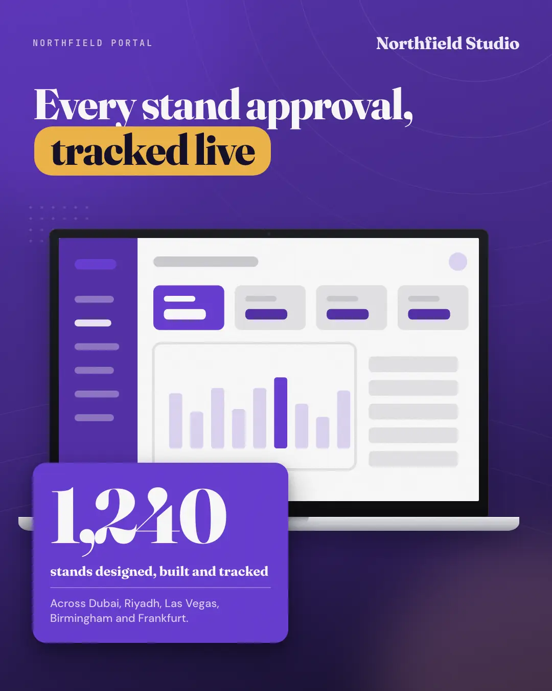
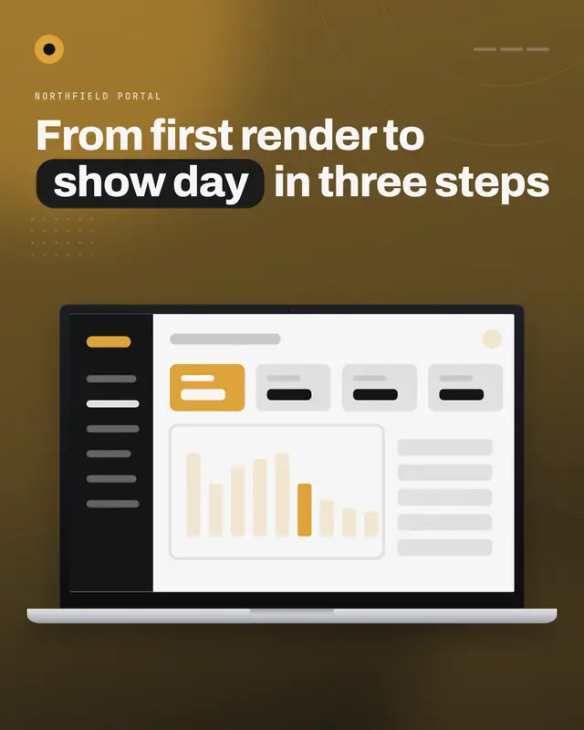
The real dashboard on a laptop on a deep brand-gradient stage, with one big real number on a bold brand card overlapping the device's corner — what it counts and a context line beneath — so the proof and the product that produces it read together.
When the AI picks it
MarketiQ’s Creative Director favours the Dashboard + KPI for posts that prove a point, get people to act or announce news, when the message is a number or one sharp insight. It is built first to prove a point.
It reads each post’s goal and shape first, then its own words, the platform and the facts you have, and offers this template only where it fits.
Who it’s for
Made for Software & apps. The Director offers it only to brands of that kind, so it never turns up for a business it does not suit.
Platforms and sizes
| Size | Where |
|---|---|
| 4:51080 × 1350 px | Instagram, Facebook, LinkedIn, Threads, Pinterest, Reddit |
| 1:11080 × 1080 px | Ads |
| 9:161080 × 1920 px | TikTok |
| 16:91600 × 900 px | X, YouTube |
| 1.91:11200 × 628 px | Newsletter, Blog |
Single image. Each size is laid out for its canvas, not cropped; the sample above is the 4:5 version.
What it needs
The Director offers it only when these exist. Without them it simply picks another template.
- A real number from your post or your brand facts
- A real desktop screen of your product, never a stand-in
The sample shows a text-free stand-in where the screens go; MarketiQ only ever places real screens of your own app or website.
Rules the AI follows
Word for word from the template library. The Director follows the copy rules when it writes into the template, and the visual review checks every creative against the visual rules.
Copy rules
- The number is copied verbatim from the post or the brand facts — never rounded, combined or estimated.
- The label says exactly what was counted; the context line only adds the period or a real comparison.
- The headline names what the dashboard shows or does — the number proves it.
Visual rules
- One real desktop dashboard capture on a laptop, shown from the top-left — never mock UI or invented charts.
- The stat card is a solid brand fill overlapping the laptop's lower-left corner with a deep shadow; the number is the largest type on the canvas.
More Device mockups templates
Watch it work
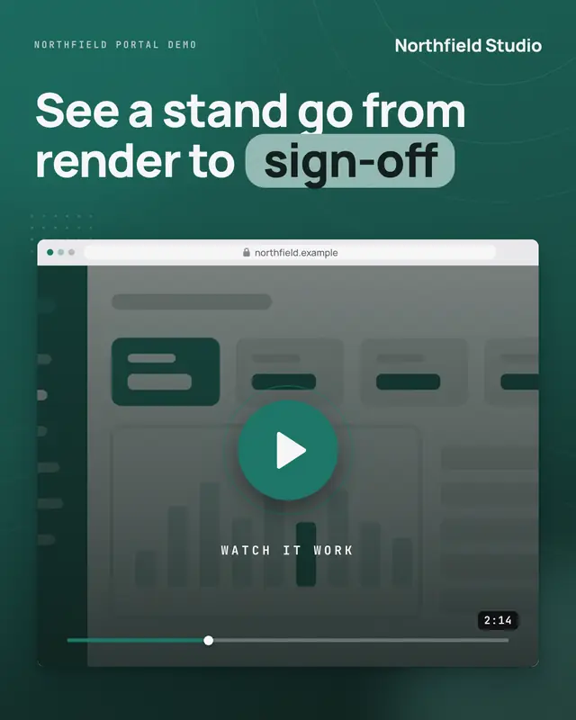
A video cover: the real product in its device on a deep brand stage, dimmed under a dark veil with a big brand play button, a 'Watch it work' label, a scrub bar and the…
New feature
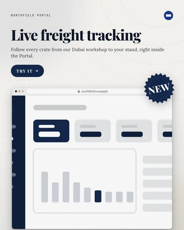
A launch card: the real product in its device on a light brand stage with a palette starburst 'NEW' badge over its corner, the feature's name set big, one line on what…
Notifications over a phone
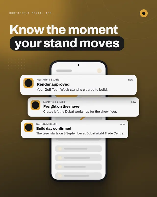
A hero phone showing the real app on a deep brand stage, with two to four generic notification cards (the brand's app tile, a title, one line, a time) stacked and…
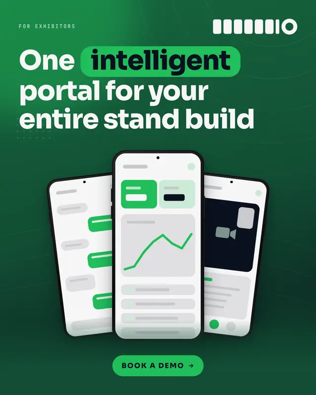
Phone trio
Three phones fanned on a deep brand-gradient stage, each showing a different REAL screen of the product, under a bold three-line headline whose key word sits in a…
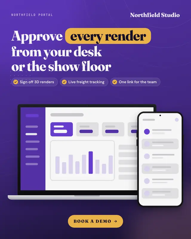
Laptop + phone
The product on a laptop with its mobile app on a phone standing in front of the laptop's corner, on a deep brand-gradient stage under a bold headline, two or three…
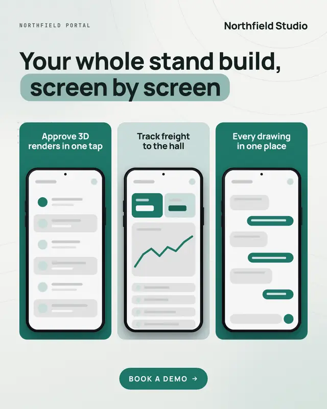
App screenshot strip
Three to five tall app-store-style panels side by side on a light stage
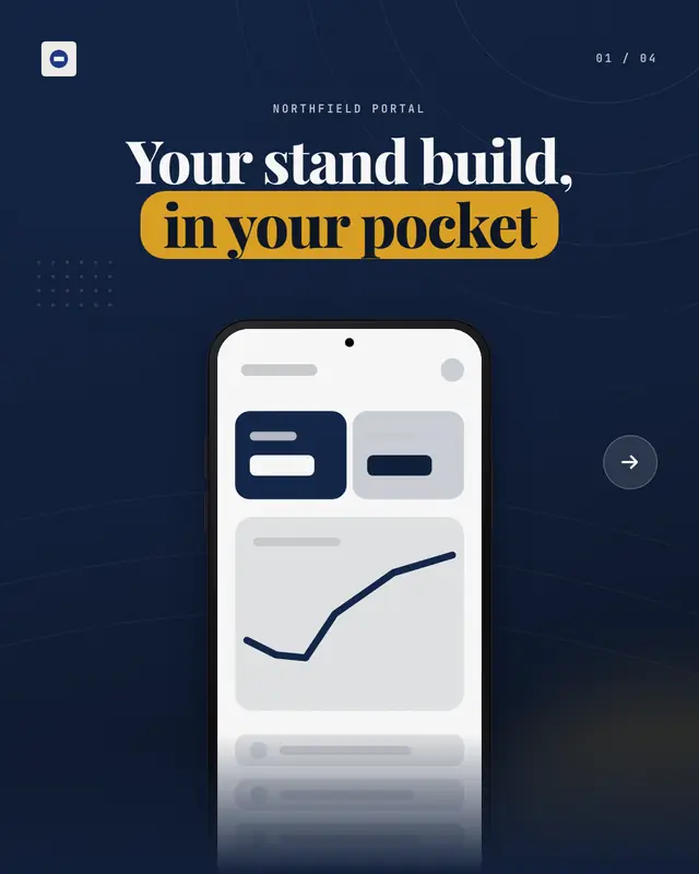
App screenshot carousel
A swipeable carousel built like an app-store listing: a deep-gradient cover with the bold headline and the hero phone, then one page per caption
Product tour
A guided tour carousel: a deep brand-gradient cover with the bold headline and the product's hero device, then light 'Step k of n' pages
Make a Dashboard + KPI with your brand.
MarketiQ writes the post, picks the template that carries it best — this one, when it fits — and fills it with your logo, colours, facts and copy.