Mistakes and fixes
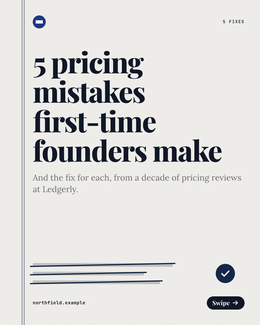
A proofreader's correction sheet, one mistake per page: the mistake struck through in the brand's ink, a caret sweeping down to the fix set bold on a slip — 'mistakes and fixes' as corrections the reader can apply, with a ruled margin down the side.
When the AI picks it
MarketiQ’s Creative Director favours the Mistakes and fixes for posts that teach or get people to act, when the message is a list or a contrast (this, not that). It is built first to teach.
It reads each post’s goal and shape first, then its own words, the platform and the facts you have, and offers this template only where it fits.
Who it’s for
Any business. Nothing in it assumes what you sell, so the Director can offer it to a software company, a café or a coaching centre alike — whenever the post fits.
Platforms and sizes
| Size | Where |
|---|---|
| 4:51080 × 1350 px | Instagram, Facebook, LinkedIn, Threads |
Carousel of 3–10 slides. Each size is laid out for its canvas, not cropped; the sample above is the 4:5 version.
What it needs
Only your post. It is made from your copy and your brand kit — there is nothing else to prepare.
Rules the AI follows
Word for word from the template library. The Director follows the copy rules when it writes into the template, and the visual review checks every creative against the visual rules.
Copy rules
- Each row pairs one mistake (the heading, as people would recognise it) with its fix (the body).
- The fix says what to do instead, concretely; never shame the reader, never invent numbers or names.
- The closing line offers the next step for readers who recognised a mistake.
Visual rules
- Paper with a ruled double margin; each page strikes one mistake through in the brand's correction colour.
- A hand-drawn caret sweeps from the struck mistake to the fix, which is set bold under a 'The fix' chip.
- The cover shows struck galley lines and a tick under the title; the closing page a large tick and the CTA.
More Teaching carousels templates
Myth-buster scratch card
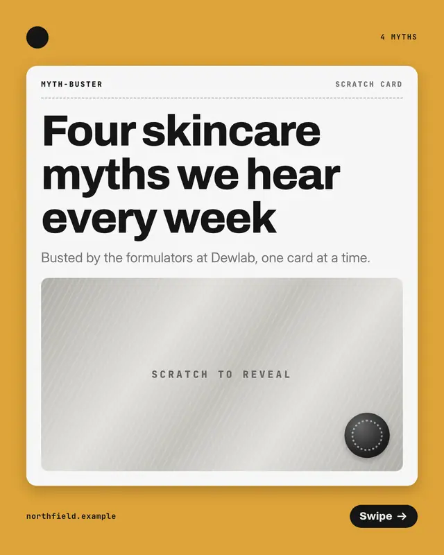
A lottery-style scratch card per myth: the myth printed and struck through at the top, the foil panel beneath scratched away to reveal the fact
Pillar-by-pillar framework
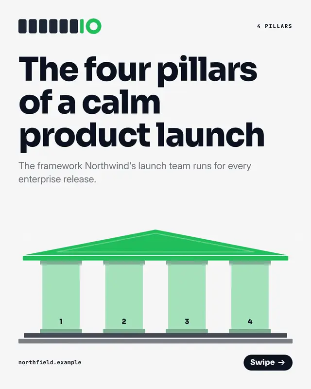
A framework drawn as a temple with one numbered column per pillar on every page, each page lighting its pillar above the pillar's name and meaning
Glossary thumb index
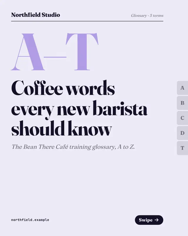
A dictionary-page glossary with thumb-index letter tabs down the edge: each page sets one headword large in serif above its plain-words definition
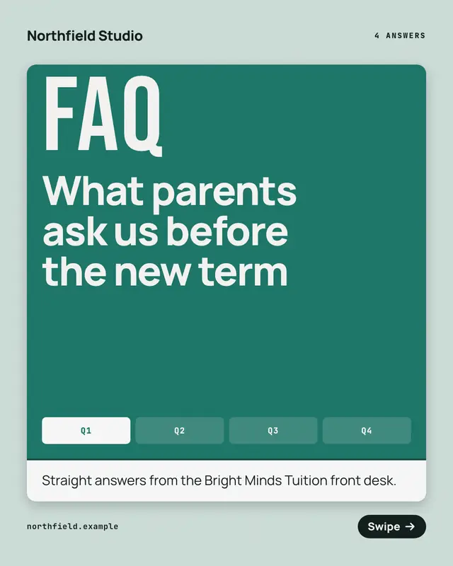
FAQ flip deck
An FAQ as a deck of folded cards: each page's brand-coloured flap carries one question under a big 'Q' and opens onto its answer under an 'A'
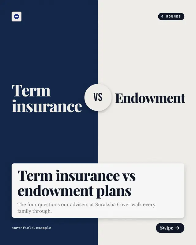
Head-to-head rounds
Two options in opposite corners, a brand half and a dark half with a 'VS' seal, compared one criterion per round with each side's answer and the verdict
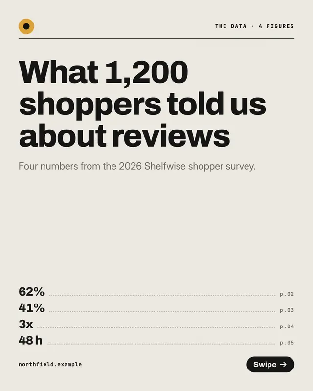
Stat-by-stat data deck
A data desk's deck, one real figure per page: the number set huge in the brand colour above a short rule, with what it means and its context beneath
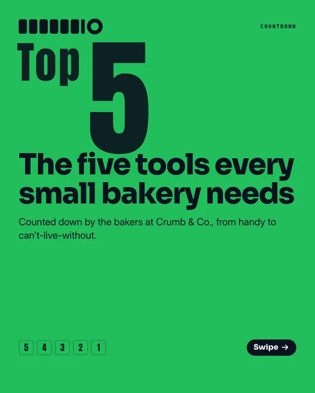
Ranked countdown
A poster-loud countdown to number one: each page sets its rank as a giant condensed numeral above the pick and why, with a ladder of ranks at the foot
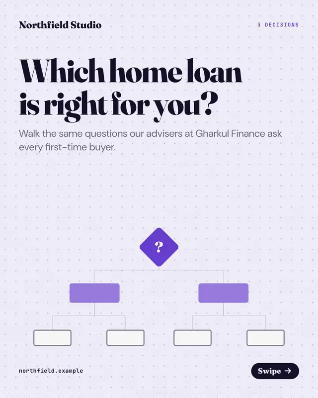
Decision-tree walkthrough
A decision tree walked one node per page on dotted flowchart paper: a yes-or-no question in a node card with its two branches beneath, the path so far as diamonds above
Make a Mistakes and fixes with your brand.
MarketiQ writes the post, picks the template that carries it best — this one, when it fits — and fills it with your logo, colours, facts and copy.