Critic's review
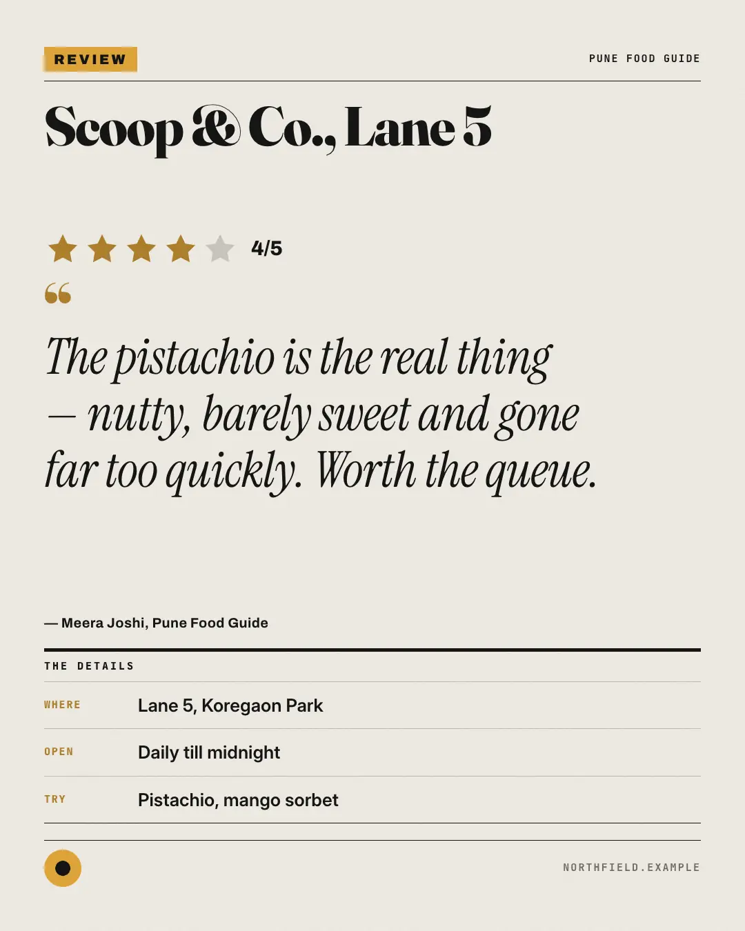
A newspaper 'REVIEW' from the arts and food pages: the place or product as a big serif headline, the star rating, the critic's verdict in italic and a details box — a real review given the weight of the printed page.
When the AI picks it
MarketiQ’s Creative Director favours the Critic's review for posts that prove a point or get people to act, when the message is a quote or one product in the spotlight. It is built first to prove a point.
It reads each post’s goal and shape first, then its own words, the platform and the facts you have, and offers this template only where it fits.
Who it’s for
Any business. Nothing in it assumes what you sell, so the Director can offer it to a software company, a café or a coaching centre alike — whenever the post fits.
Platforms and sizes
| Size | Where |
|---|---|
| 4:51080 × 1350 px | Instagram, Facebook, LinkedIn, Threads, Pinterest, Reddit |
| 1:11080 × 1080 px | Ads |
| 9:161080 × 1920 px | TikTok |
| 16:91600 × 900 px | X, YouTube, Blog |
Single image. Each size is laid out for its canvas, not cropped; the sample above is the 4:5 version.
What it needs
The Director offers it only when these exist. Without them it simply picks another template.
- Real proof to show: a testimonial, a review or a result
Rules the AI follows
Word for word from the template library. The Director follows the copy rules when it writes into the template, and the visual review checks every creative against the visual rules.
Copy rules
- Real reviews only: the verdict is quoted word for word and the reviewer is real.
- Show stars only when the reviewer gave a rating; never round a rating up.
- Details (where, when, what to try) come from the post.
Visual rules
- A newsprint page: a brand-colour REVIEW flag and the outlet over a rule.
- The subject as a large serif headline, a row of brand-colour stars with the rating, a hanging quote mark and the verdict in big italic serif, then '— reviewer'.
- A ruled THE DETAILS box of label/value rows (beside the review on 16:9), and the logo and website in the folio.
More Editorial & print templates
Photographer's proofs
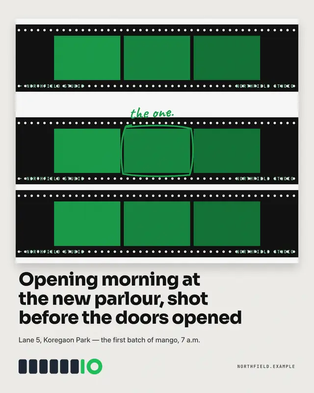
A photographer's 'contact sheet' of the brand's own photos
Research abstract
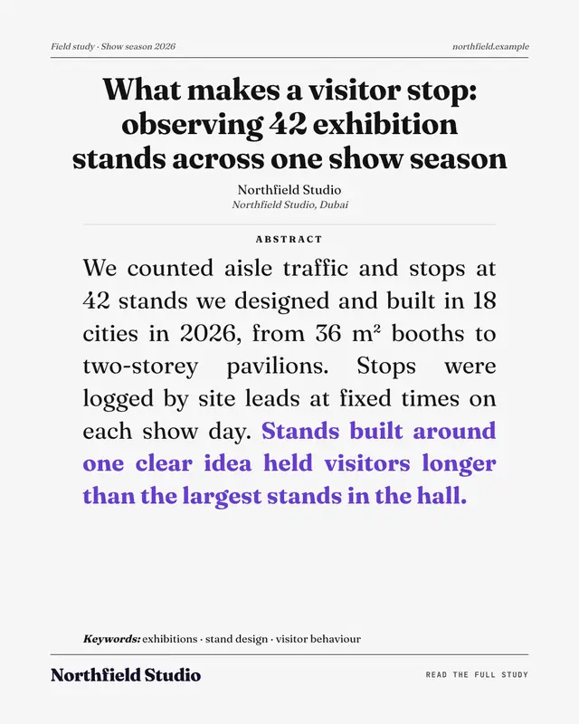
The first page of a research paper: a running head, a centred serif title, the brand as the author, an ABSTRACT with the key finding in bold brand colour and keywords
Open-letter ad
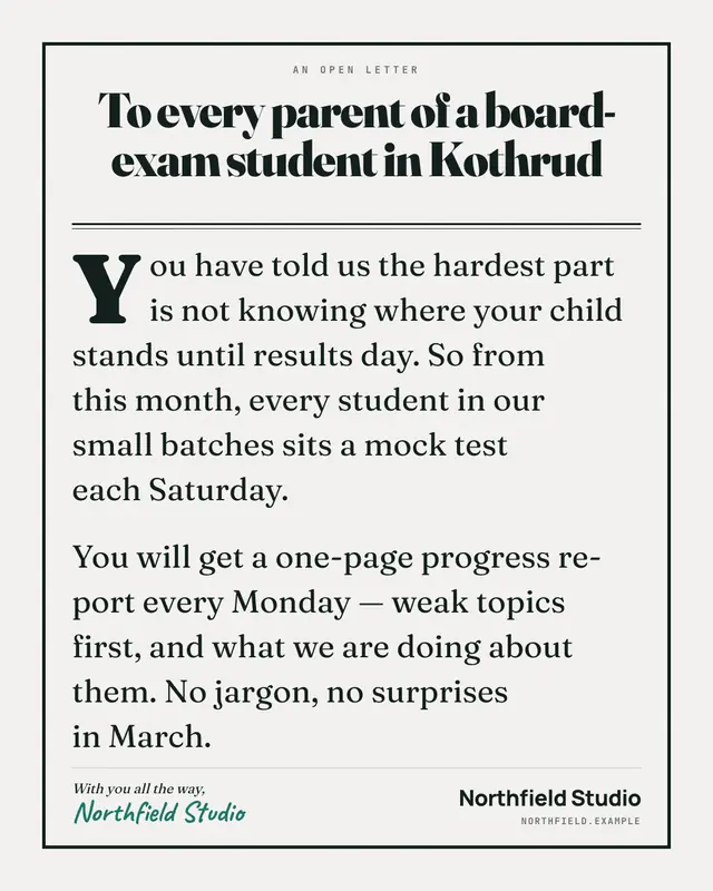
A full-page open-letter advertisement: AN OPEN LETTER over a huge serif salutation (to every parent in the neighbourhood), a drop-capped letter and a handwritten…
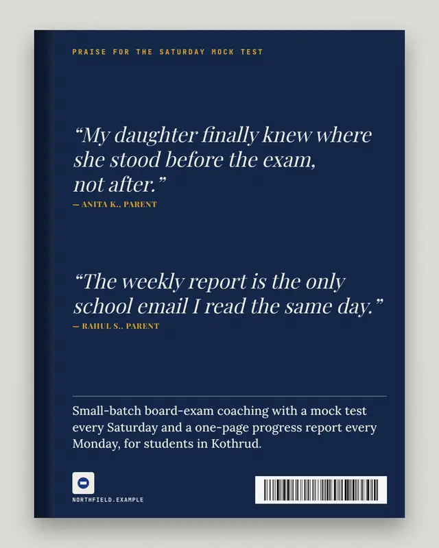
Praise blurbs
The back cover of a book: 'PRAISE FOR' the offering in spaced caps, two or three real reviews as italic blurbs with their sources, a short synopsis, the brand as the…
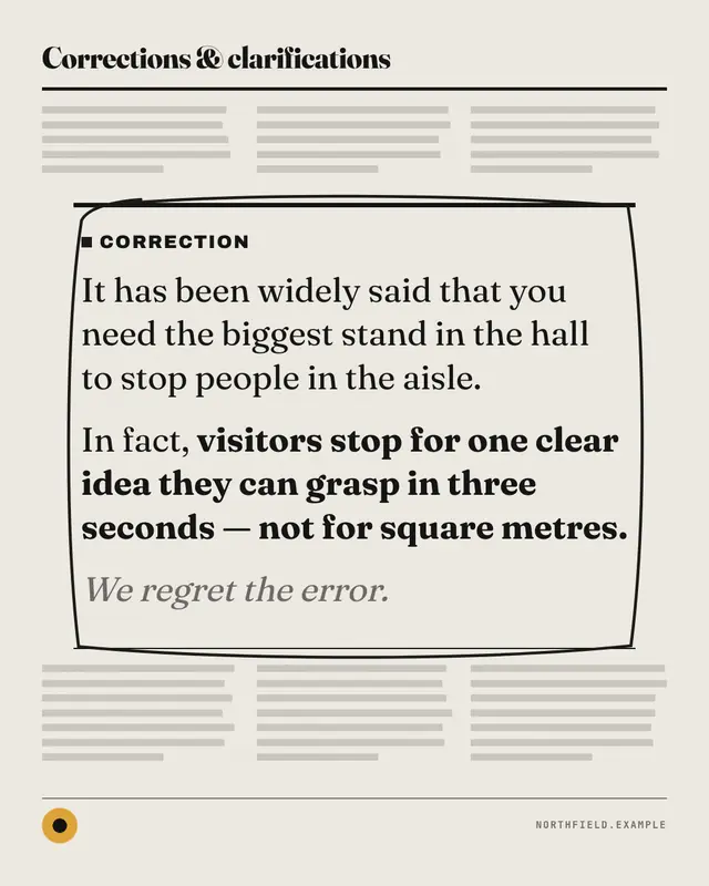
Correction box
A newspaper correction box ringed in the brand's marker: it has been widely said that … in fact, … and we regret the error
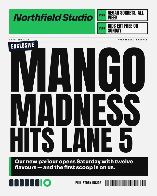
Tabloid splash
A tabloid front page: the brand as a bold red-top style masthead, teaser puffs, an EXCLUSIVE flash and a screaming splash headline in stacked condensed caps over a black…
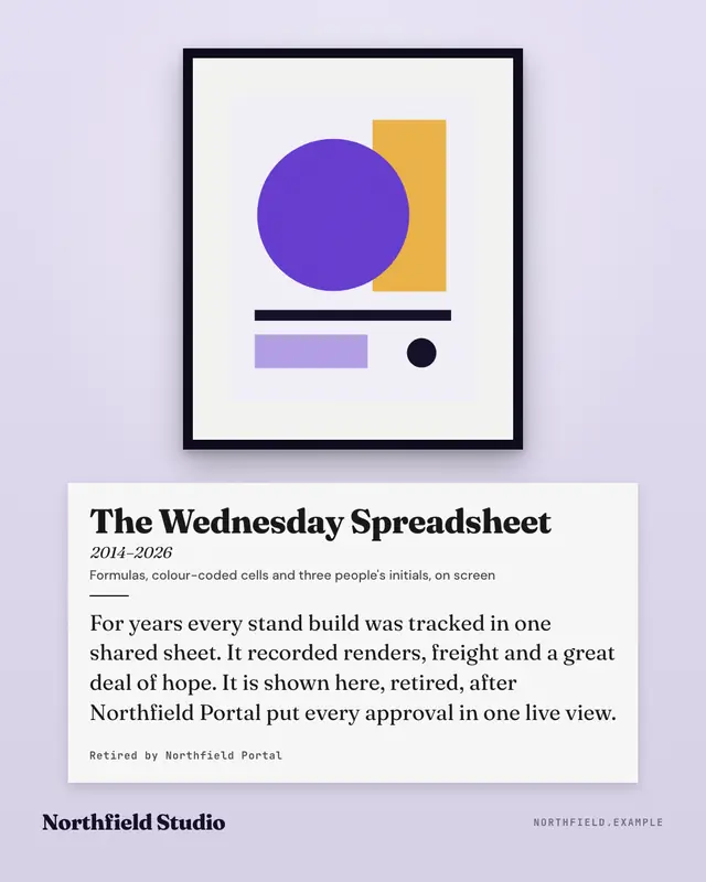
Museum wall label
A framed piece on a gallery wall with its museum label beside it
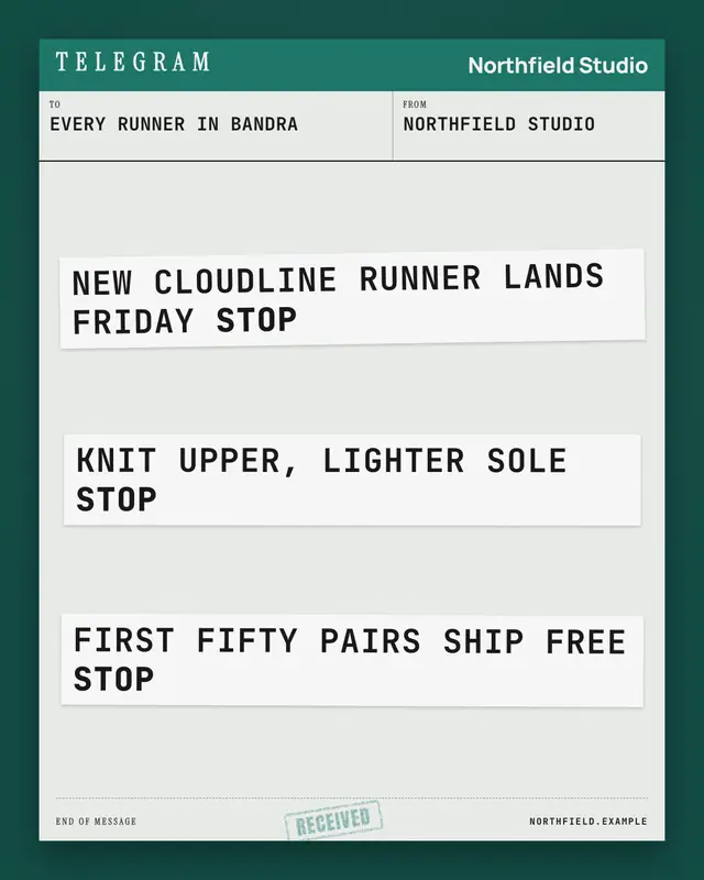
Telegram
An old-fashioned telegram form on a desk: the brand's header band, TO and FROM fields, and the message on pasted strips of ticker tape
Make a Critic's review with your brand.
MarketiQ writes the post, picks the template that carries it best — this one, when it fits — and fills it with your logo, colours, facts and copy.