Duo card
A 'perfect pairing' card: two arched panels side by side — the dish in brand colour, what goes with it in cream — joined by a big serif ampersand, each with a short note, and the price together when the post states one. Coffee and cake, chai and bun, dosa and filter coffee.
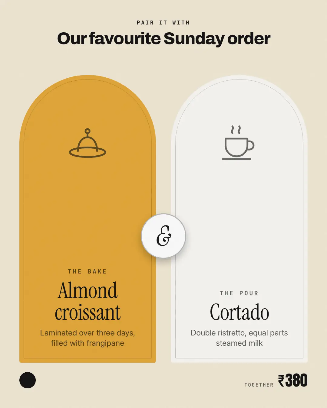
When the AI picks it
MarketiQ’s Creative Director favours the Duo card for posts that get people to act or teach, when the message is a side-by-side comparison, one product in the spotlight or an offer or deal. It is built first to get people to act.
It reads each post’s goal and shape first, then its own words, the platform and the facts you have, and offers this template only where it fits.
Who it’s for
Made for Food & drink. The Director offers it only to brands of that kind, so it never turns up for a business it does not suit.
Platforms and sizes
| Size | Where |
|---|---|
| 4:51080 × 1350 px | Instagram, Facebook, LinkedIn, Threads, Pinterest, Reddit |
| 1:11080 × 1080 px | Ads |
| 9:161080 × 1920 px | TikTok |
| 16:91600 × 900 px | X, YouTube, Blog |
Single image. Each size is laid out for its canvas, not cropped; the sample above is the 4:5 version.
What it needs
Only your post. It is made from your copy and your brand kit — there is nothing else to prepare.
Rules the AI follows
Word for word from the template library. The Director follows the copy rules when it writes into the template, and the visual review checks every creative against the visual rules.
Copy rules
- Both items, their notes and the price come from the post; never claim why they match beyond what it says.
- The labels over each item are short and generic ('The bake', 'The pour').
Visual rules
- Two tall arched panels with an inner hairline arch — the first brand-coloured, the second cream — with a line drawing at the top of each, the item names in a large serif and short notes.
- A round medallion with a serif ampersand bridges the two; kicker and title above; logo and price below.
More Menus & dishes templates
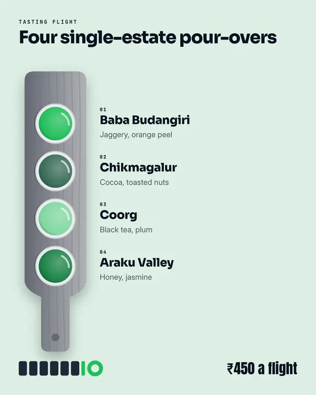
Paddle of pours
A 'tasting flight' on its paddle, seen from above: a wooden board holding three to five glasses in palette colours, each numbered and named with a short note
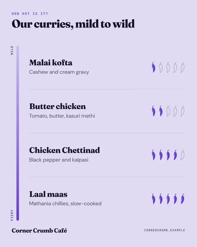
Chilli heat ladder
A chilli heat ladder: dishes ranked by 'spice level', mild to fiery, on a rail that deepens into the brand colour, each with a row of five chillies filled to its level…
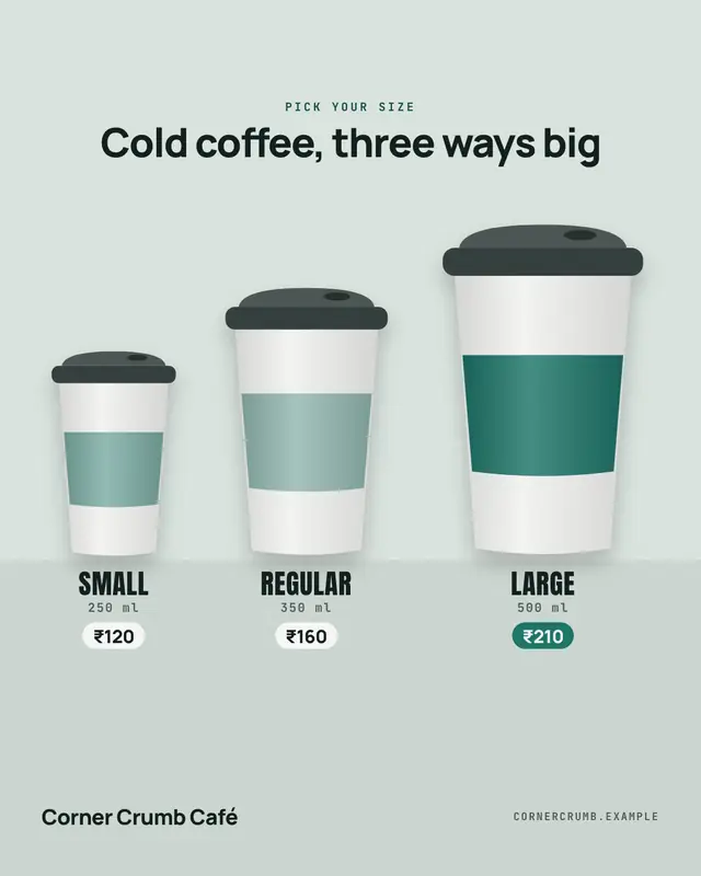
Small to jumbo
A 'pick your size' lineup: the same takeaway cup in two to four sizes standing side by side, small to large, each labelled with its size, volume and price
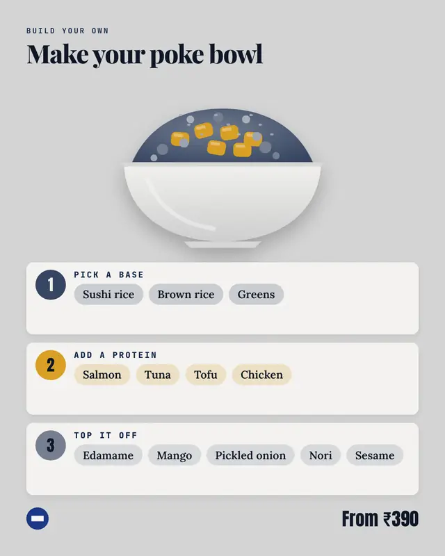
Make-your-own bowl
A 'build your bowl' card: a bowl filling up in three palette layers beside three numbered steps
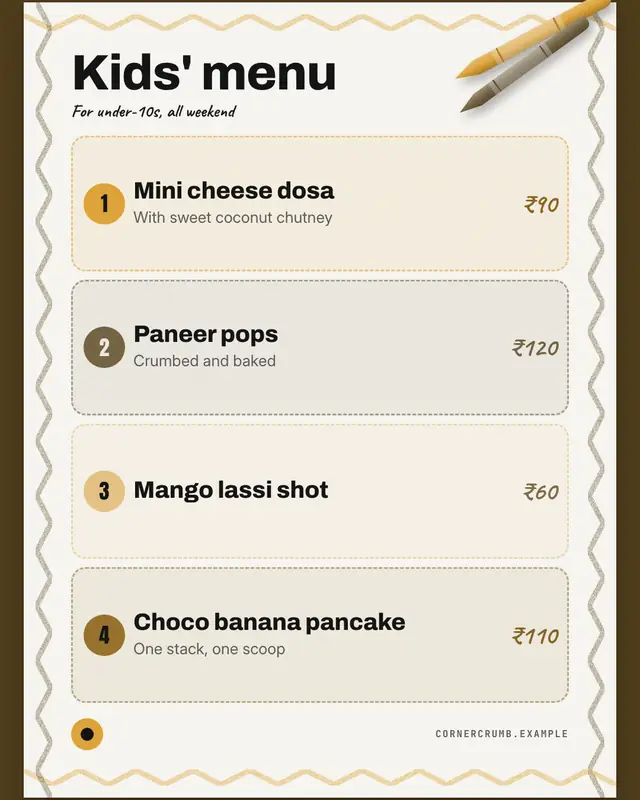
Kids' menu placemat
A 'kids' menu' paper placemat: a crayon squiggle round the edge, two crayons on top, the title in big friendly type and each dish in a dashed bubble with a numbered dot…
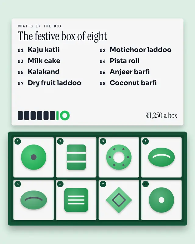
Sweet box
An open 'assortment box' from above
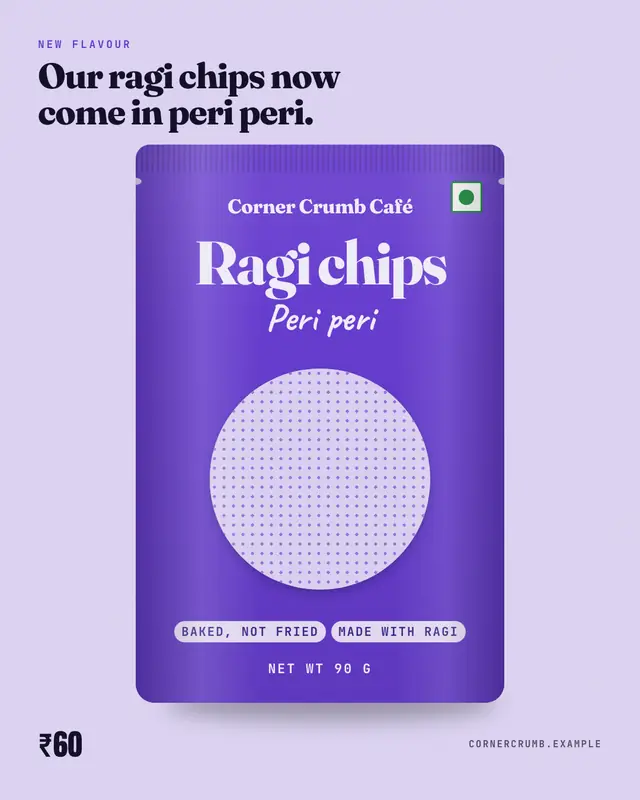
Pack front
A packaged-food 'front of pack': a stand-up pouch in the brand colour
Nutrition at a glance
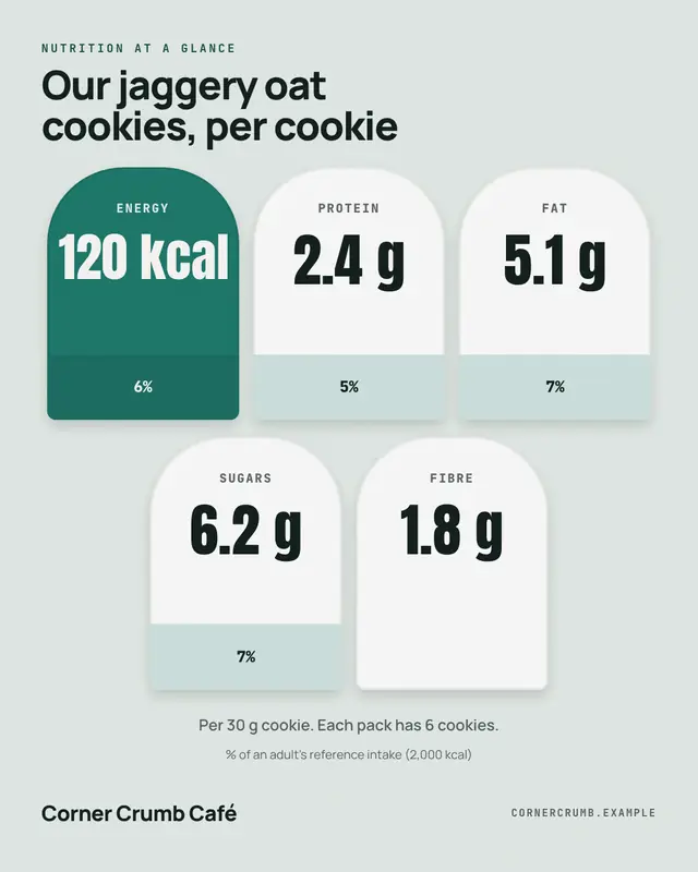
Front-of-pack 'nutrition at a glance' badges: energy first in the brand colour, then each nutrient the post lists in its own rounded badge with the amount set big and…
Make a Duo card with your brand.
MarketiQ writes the post, picks the template that carries it best — this one, when it fits — and fills it with your logo, colours, facts and copy.