WiFi picker
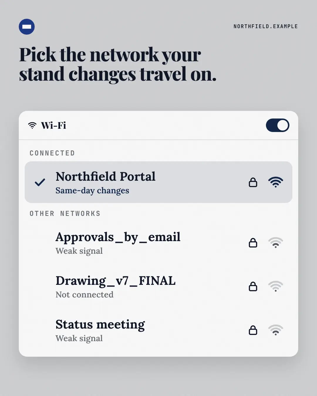
A 'Wi-Fi network' picker where the brand's way is the connected network — full signal, a tick — and the old ways are the other networks, all one weak bar. Everyone knows which network they'd rather be on.
When the AI picks it
MarketiQ’s Creative Director favours the WiFi picker for posts that entertain, teach or get people to act, when the message is a contrast (this, not that), a list or one sharp insight. It is built first to entertain.
It reads each post’s goal and shape first, then its own words, the platform and the facts you have, and offers this template only where it fits.
Who it’s for
Any business. Nothing in it assumes what you sell, so the Director can offer it to a software company, a café or a coaching centre alike — whenever the post fits.
Platforms and sizes
| Size | Where |
|---|---|
| 4:51080 × 1350 px | Instagram, Facebook, LinkedIn, Threads, Pinterest, Reddit |
| 1:11080 × 1080 px | Ads |
| 9:161080 × 1920 px | TikTok |
| 16:91600 × 900 px | X, YouTube |
| 1.91:11200 × 628 px | Newsletter, Blog |
Single image. Each size is laid out for its canvas, not cropped; the sample above is the 4:5 version.
What it needs
Only your post. It is made from your copy and your brand kit — there is nothing else to prepare.
Rules the AI follows
Word for word from the template library. The Director follows the copy rules when it writes into the template, and the visual review checks every creative against the visual rules.
Copy rules
- Network names are short and recognisable; the connected one is the brand's way, the others the reader's old habits — all from the copy, no real product names.
- Keep it light; notes are a few words.
Visual rules
- A white Wi-Fi panel on a pale brand ground: a header with an 'on' brand switch, a 'Connected' section with the brand network tinted, ticked, locked and at full signal, then 'Other networks' with weak signal icons.
- Optional headline above (left on landscape); logo top-left.
More Apps people check templates
Order tracker
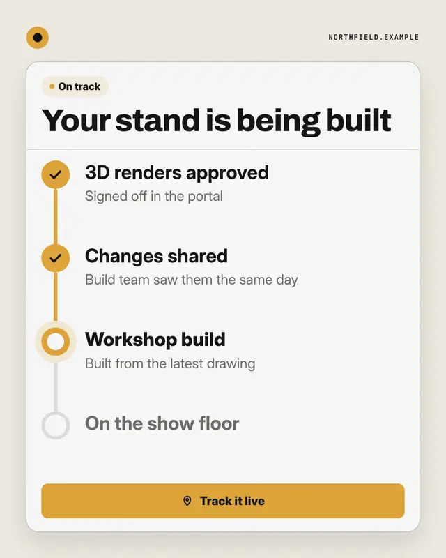
A live order tracker for the brand's process: 'On track', a headline saying where things stand, and a stepper
Share sheet
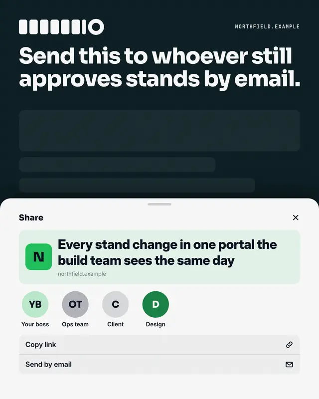
A phone share sheet sliding up over a dimmed screen: the post's point as the link preview, a row of people to send it to (as roles), under a caption that names who needs…
Story frames
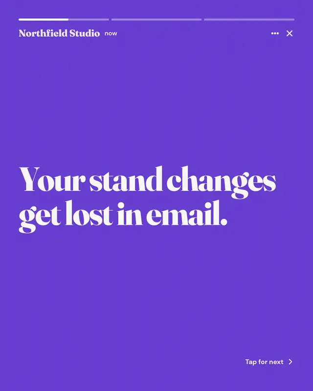
A short tap-through story sequence: segmented progress bars on top, the brand as the account, one big line per frame on alternating brand and dark grounds, a next-frame…
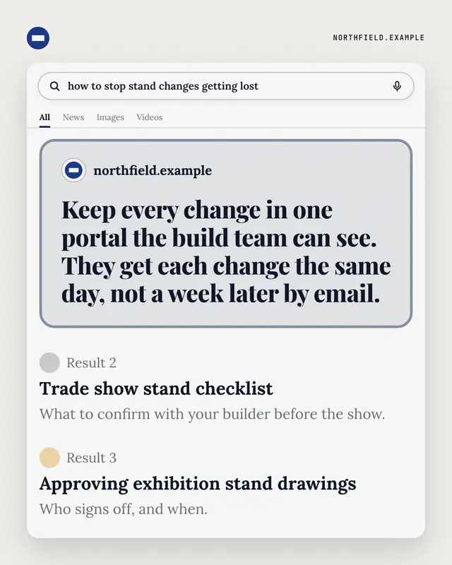
Search answer
A search results page for the buyer's own question: a featured answer box from the brand's website on top, ordinary results below.
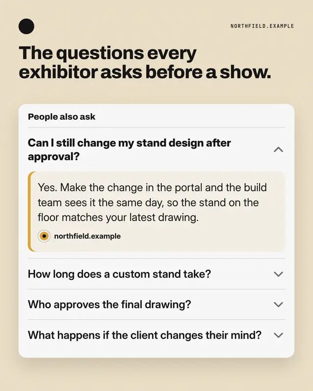
People also ask
A 'People also ask' accordion: the question buyers really type is expanded with the brand's answer, the related ones sit folded below.
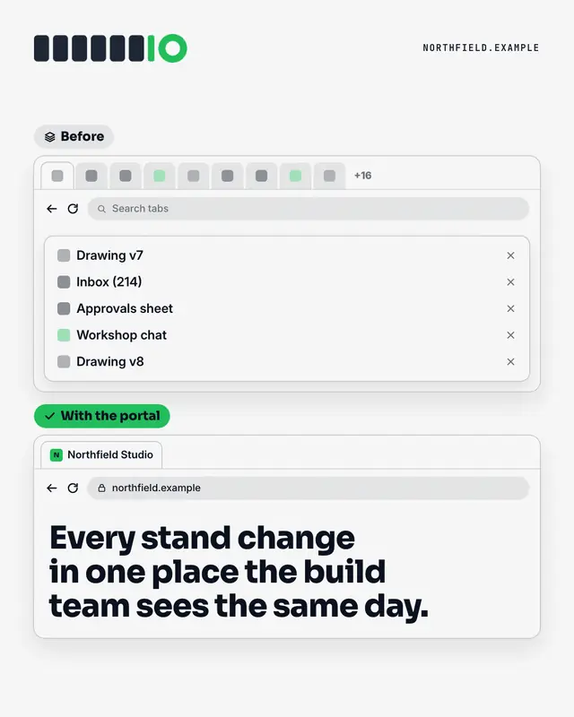
Too many tabs
Two browser windows: before, a strip of tabs so crowded their names are cut off
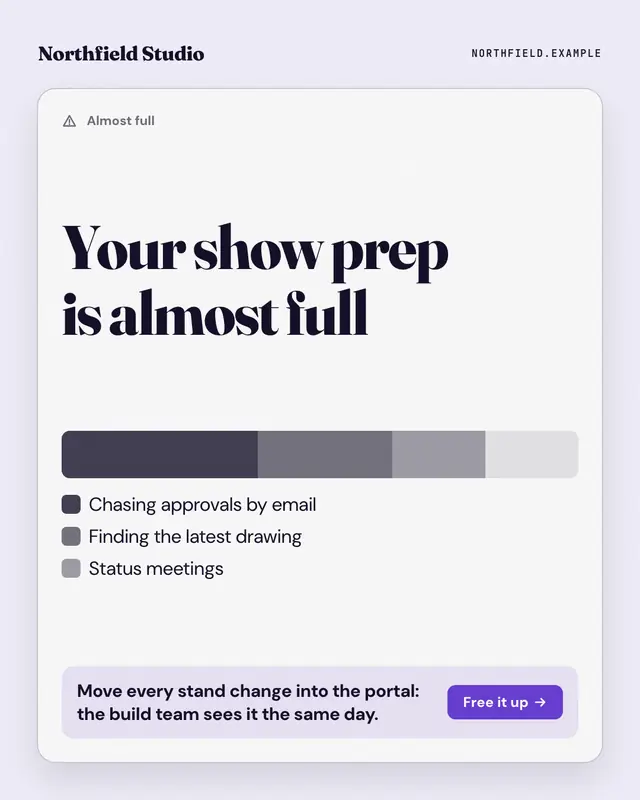
Storage almost full
The 'storage almost full' warning, applied to the reader's week: a stacked usage bar whose biggest segments are the busywork eating their time, a legend naming each, and…
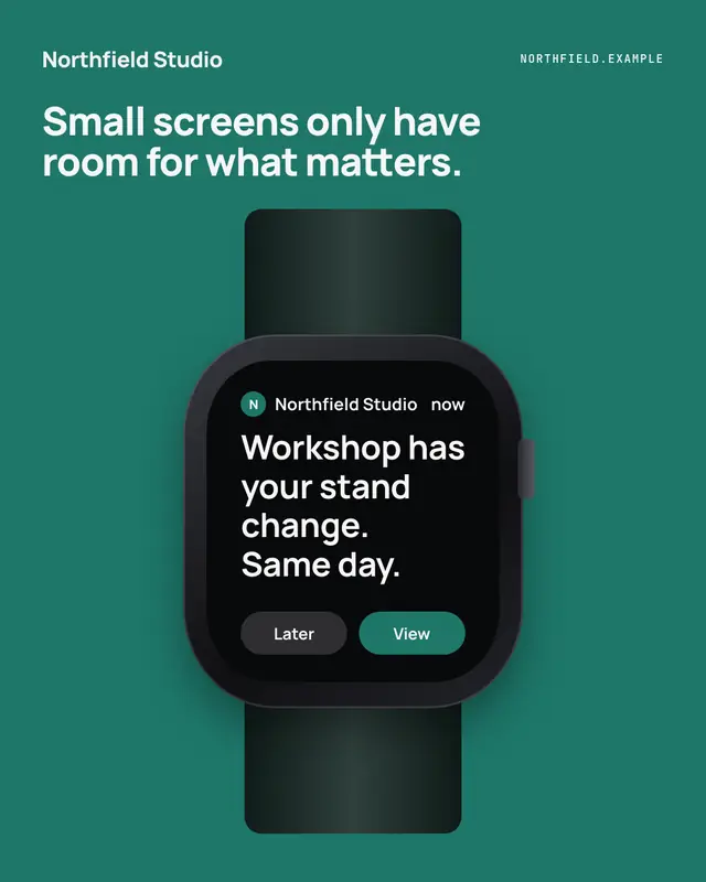
Watch glance
A notification on a smartwatch
Make a WiFi picker with your brand.
MarketiQ writes the post, picks the template that carries it best — this one, when it fits — and fills it with your logo, colours, facts and copy.