Storage almost full
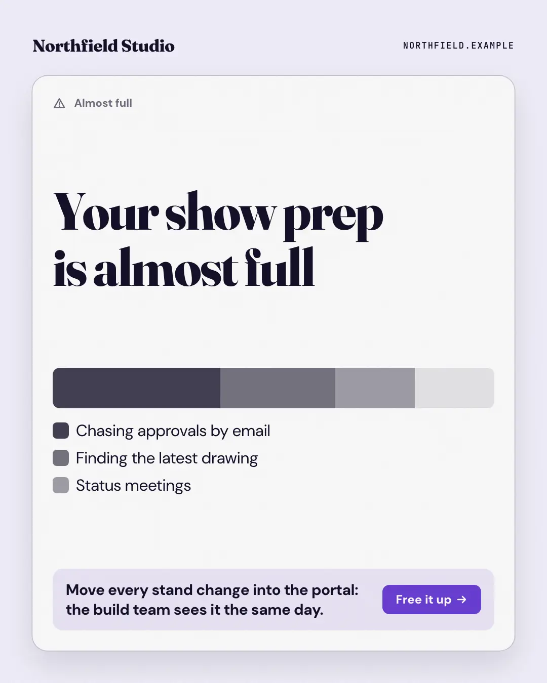
The 'storage almost full' warning, applied to the reader's week: a stacked usage bar whose biggest segments are the busywork eating their time, a legend naming each, and the brand's way to free it up as the one button.
When the AI picks it
MarketiQ’s Creative Director favours the Storage almost full for posts that teach, entertain or get people to act, when the message is a list, one sharp insight or a number. It is built first to teach.
It reads each post’s goal and shape first, then its own words, the platform and the facts you have, and offers this template only where it fits.
Who it’s for
Any business. Nothing in it assumes what you sell, so the Director can offer it to a software company, a café or a coaching centre alike — whenever the post fits.
Platforms and sizes
| Size | Where |
|---|---|
| 4:51080 × 1350 px | Instagram, Facebook, LinkedIn, Threads, Pinterest, Reddit |
| 1:11080 × 1080 px | Ads |
| 9:161080 × 1920 px | TikTok |
| 16:91600 × 900 px | X, YouTube |
| 1.91:11200 × 628 px | Newsletter, Blog |
Single image. Each size is laid out for its canvas, not cropped; the sample above is the 4:5 version.
What it needs
Only your post. It is made from your copy and your brand kit — there is nothing else to prepare.
Rules the AI follows
Word for word from the template library. The Director follows the copy rules when it writes into the template, and the visual review checks every creative against the visual rules.
Copy rules
- The items are the busywork the copy names, biggest first; the bar is a drawing, not data, so no figures.
- The fix names the brand's way in one sentence, grounded in the copy.
Visual rules
- A white system card on paper: a warning label, the title set large, a stacked grey usage bar (largest segment darkest) with a legend of what fills it.
- A tinted fix strip with the fix sentence and a brand button; logo top-left.
More Apps people check templates
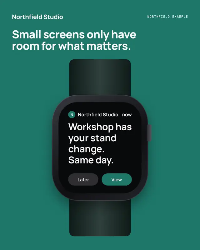
Watch glance
A notification on a smartwatch
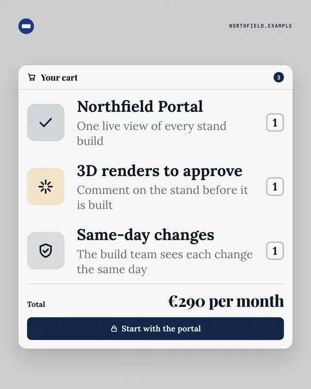
Your cart
A checkout cart where the line items are what the buyer actually gets from the offering
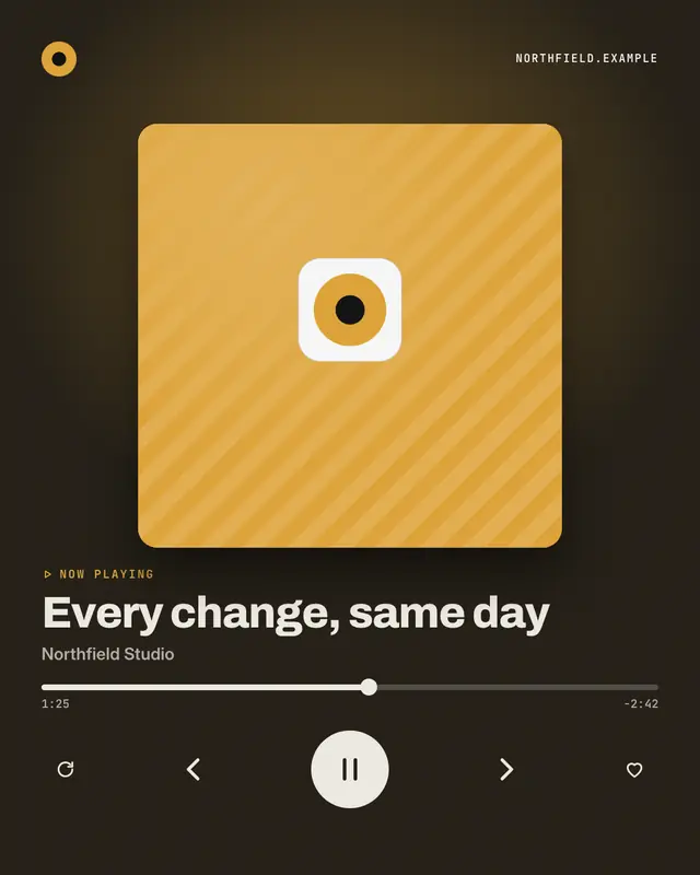
Now playing
A 'music player' on its now-playing screen where the track title is the post's idea and the artist is the brand
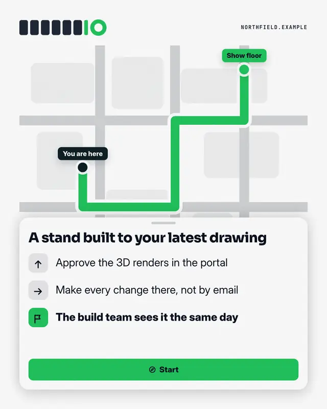
Directions
A map with a route from a dark 'You are here' pin (where the reader is stuck today) to a brand pin (where the brand gets them), and a bottom sheet of turn-by-turn steps
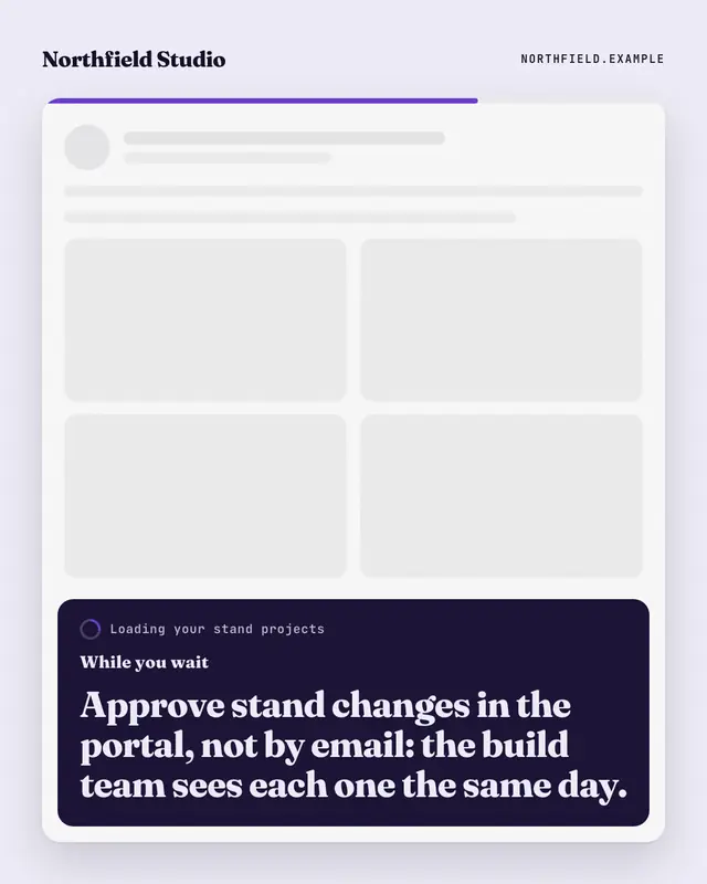
While you wait
An app caught loading
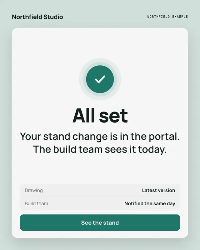
All set
The confirmation screen at the end of a flow
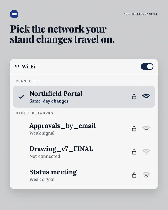
WiFi picker
A 'Wi-Fi network' picker where the brand's way is the connected network
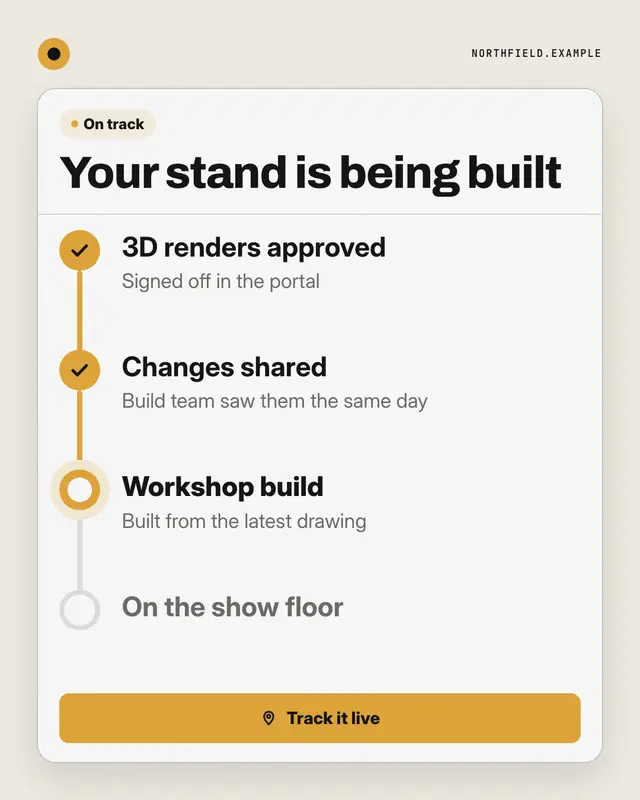
Order tracker
A live order tracker for the brand's process: 'On track', a headline saying where things stand, and a stepper
Make a Storage almost full with your brand.
MarketiQ writes the post, picks the template that carries it best — this one, when it fits — and fills it with your logo, colours, facts and copy.