Before / after
A hard split: a hatched, greyed BEFORE half and a brand-colour AFTER half, each with numbered change points that line up across the divide — the transformation the business delivers, at a glance.

When the AI picks it
MarketiQ’s Creative Director favours the Before / after for posts that prove a point, teach or get people to act, when the message is a contrast (this, not that), a side-by-side comparison or a story. It is built first to prove a point.
It reads each post’s goal and shape first, then its own words, the platform and the facts you have, and offers this template only where it fits.
Who it’s for
Any business. Nothing in it assumes what you sell, so the Director can offer it to a software company, a café or a coaching centre alike — whenever the post fits.
Platforms and sizes
| Size | Where |
|---|---|
| 4:51080 × 1350 px | Instagram, Facebook, LinkedIn, Threads, Reddit |
| 1:11080 × 1080 px | Ads |
| 9:161080 × 1920 px | TikTok |
| 2:31000 × 1500 px | |
| 16:91600 × 900 px | X, YouTube |
| 1.91:11200 × 628 px | Newsletter, Blog |
Single image. Each size is laid out for its canvas, not cropped; the sample above is the 4:5 version.
What it needs
Only your post. It is made from your copy and your brand kit — there is nothing else to prepare.
Rules the AI follows
Word for word from the template library. The Director follows the copy rules when it writes into the template, and the visual review checks every creative against the visual rules.
Copy rules
- Before and after points pair up in order; each after point answers its before point.
- Every after point is something the business really does; no invented numbers or results.
Visual rules
- A hatched pale BEFORE half in muted italic serif and a brand-colour AFTER half in the heading face.
- Huge condensed labels, numbered markers aligned across the split, a round arrow knot on the seam.
More Comparison templates
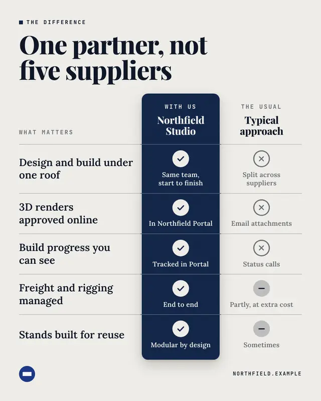
Us vs them
A feature table: criteria buyers care about down the side, the brand's column lifted in its colour with checks, beside a generic 'Typical approach' column
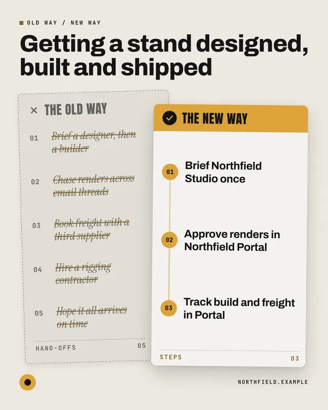
Old way / new way
The old process as a crossed-out memo, overlaid by the brand's clean numbered process card
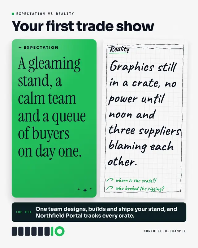
Expectation vs reality
The internet's favourite contrast: a glossy, polished EXPECTATION card beside a rough, hand-sketched REALITY page with scribbled notes
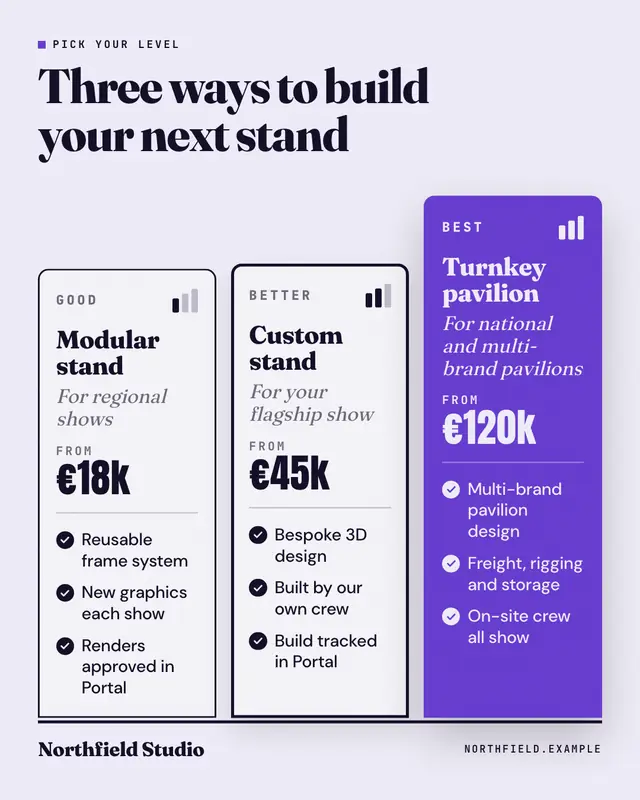
Good / better / best
Three service tiers stepping up a plinth
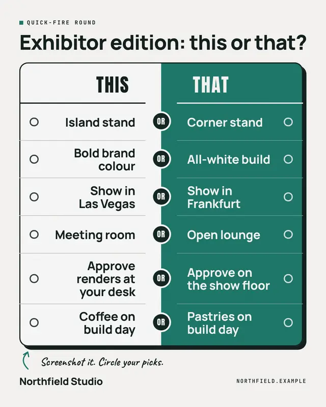
This or that
A quick-fire game board: pairs of choices from the brand's world face off across a two-tone split, with an OR knot on the seam and an empty ballot bubble beside every…
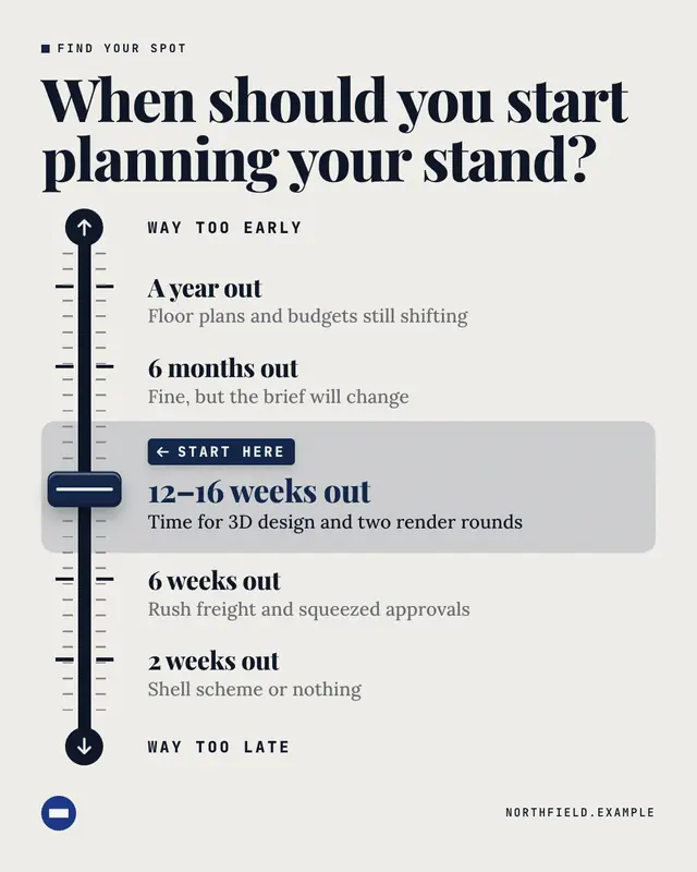
Spectrum
A fader on a mixing desk: a scale runs from one extreme to the other through labelled stops, and a brand-colour fader cap is parked on the stop the brand recommends
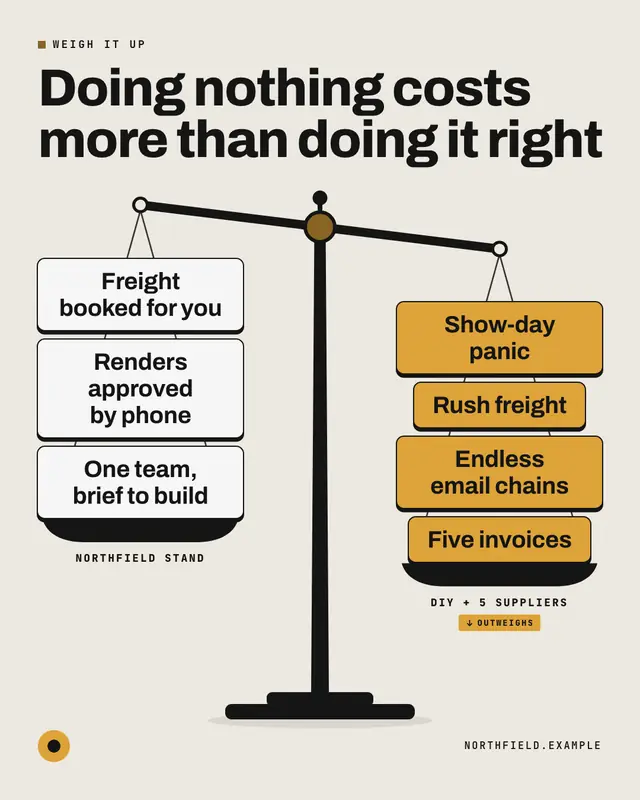
Weighing scale
An original balance scale tipped toward the heavier pan: the left pan's items against the right pan's, stacked like weights, so the reader feels which side outweighs the…
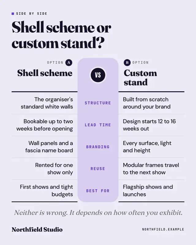
Side by side
A mirrored spec sheet: two options face each other across a central spine of attributes, row for row
Make a Before / after with your brand.
MarketiQ writes the post, picks the template that carries it best — this one, when it fits — and fills it with your logo, colours, facts and copy.