Comparison templates
Side by side: before/after, us/them, old way/new way. MarketiQ’s Creative Director picks from these 9 templates whenever a post’s message fits one of them, then fills it with your brand, facts and copy.
All Comparison templates
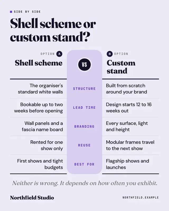
Side by side
A mirrored spec sheet: two options face each other across a central spine of attributes, row for row
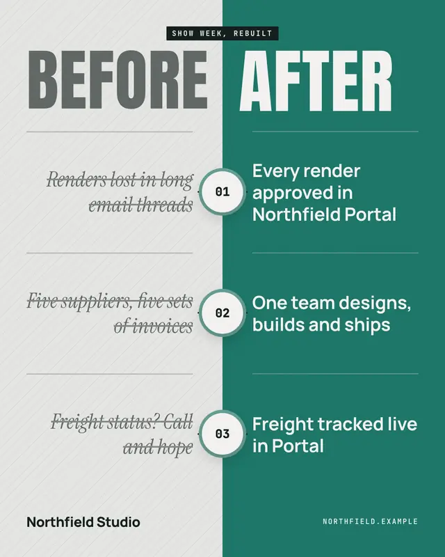
Before / after
A hard split: a hatched, greyed BEFORE half and a brand-colour AFTER half, each with numbered change points that line up across the divide
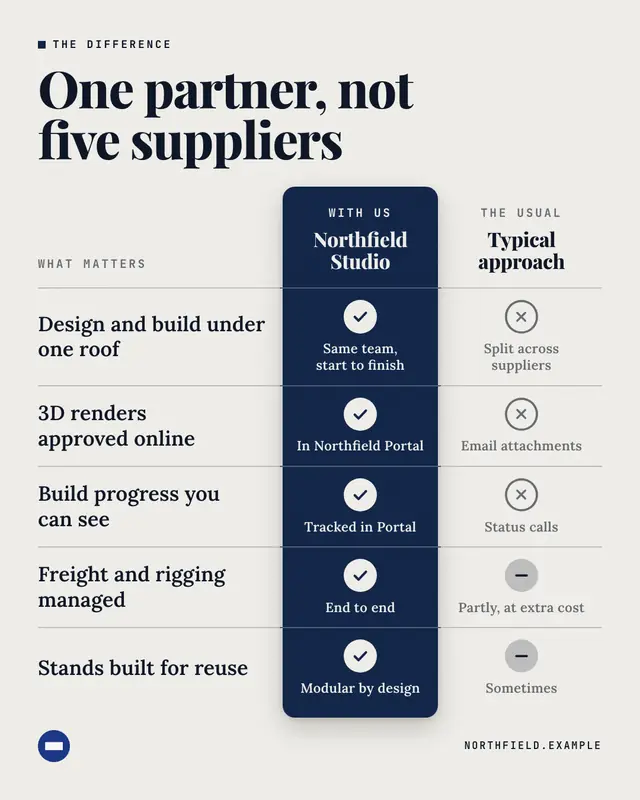
Us vs them
A feature table: criteria buyers care about down the side, the brand's column lifted in its colour with checks, beside a generic 'Typical approach' column
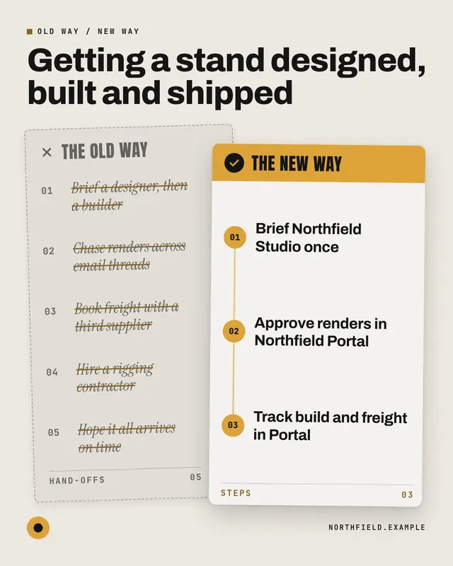
Old way / new way
The old process as a crossed-out memo, overlaid by the brand's clean numbered process card
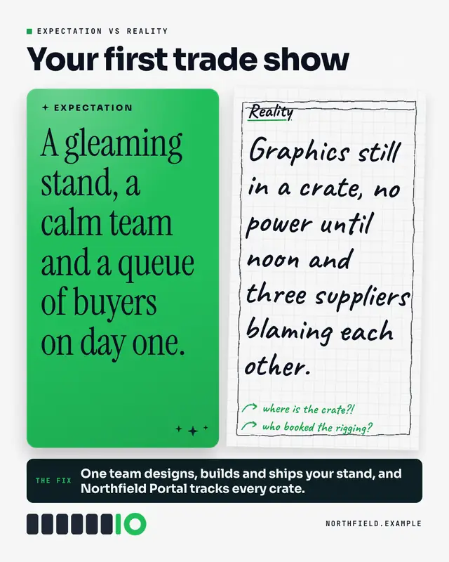
Expectation vs reality
The internet's favourite contrast: a glossy, polished EXPECTATION card beside a rough, hand-sketched REALITY page with scribbled notes
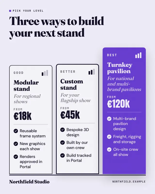
Good / better / best
Three service tiers stepping up a plinth
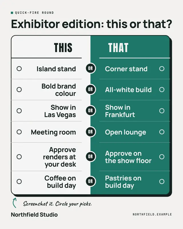
This or that
A quick-fire game board: pairs of choices from the brand's world face off across a two-tone split, with an OR knot on the seam and an empty ballot bubble beside every…
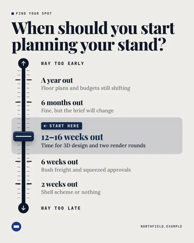
Spectrum
A fader on a mixing desk: a scale runs from one extreme to the other through labelled stops, and a brand-colour fader cap is parked on the stop the brand recommends
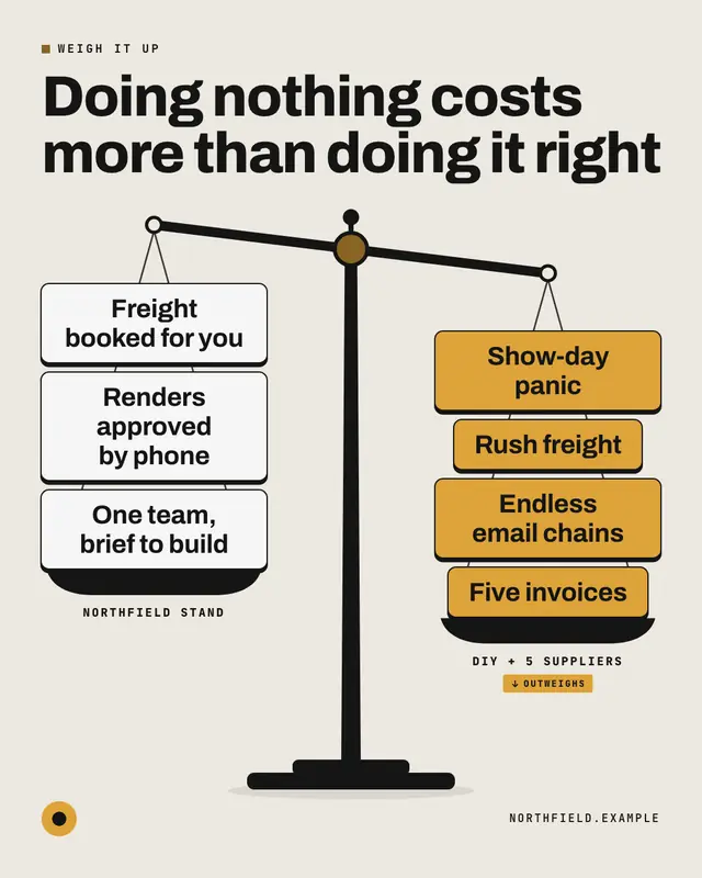
Weighing scale
An original balance scale tipped toward the heavier pan: the left pan's items against the right pan's, stacked like weights, so the reader feels which side outweighs the…
Samples use fictional brands; MarketiQ fills each template with your brand, facts and copy.
More ways to carry a message
Let the AI pick the right Comparison template.
Write the post, or let your AI team write it. The Creative Director reads it, picks the template that carries it best and fills it with your brand; it goes out on the approval rules you set.