Integration hub
The product's REAL screen in its device at the centre of a deep brand-gradient stage, with the tools it connects to as clean white name tiles around it, each joined to the device by a smooth curve — answers 'will it fit how we already work?' at a glance, with names in type and never third-party logos.
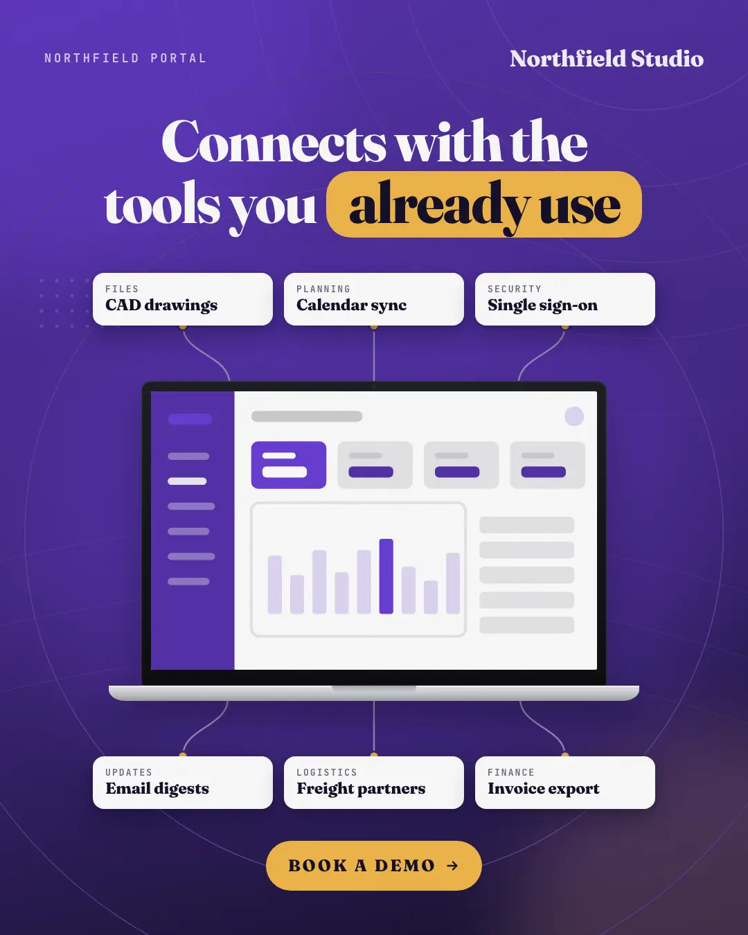
When the AI picks it
MarketiQ’s Creative Director favours the Integration hub for posts that teach, get people to act or prove a point, when the message is a list, real projects or past work or one sharp insight. It is built first to teach.
It reads each post’s goal and shape first, then its own words, the platform and the facts you have, and offers this template only where it fits.
Who it’s for
Made for Software & apps. The Director offers it only to brands of that kind, so it never turns up for a business it does not suit.
Platforms and sizes
| Size | Where |
|---|---|
| 4:51080 × 1350 px | Instagram, Facebook, LinkedIn, Threads, Pinterest, Reddit |
| 1:11080 × 1080 px | Ads |
| 9:161080 × 1920 px | TikTok |
| 16:91600 × 900 px | X, YouTube |
| 1.91:11200 × 628 px | Newsletter, Blog |
Single image. Each size is laid out for its canvas, not cropped; the sample above is the 4:5 version.
What it needs
The Director offers it only when these exist. Without them it simply picks another template.
- The tools your product really connects with
- A real desktop or phone screen of your product, never a stand-in
The sample shows a text-free stand-in where the screens go; MarketiQ only ever places real screens of your own app or website.
Rules the AI follows
Word for word from the template library. The Director follows the copy rules when it writes into the template, and the visual review checks every creative against the visual rules.
Copy rules
- Only integrations the brand's own facts list, written exactly as the brand names them.
- No third-party logos or marks — tool names in type only; categories are short plain words.
- The headline says what connecting does for the reader; one action on the button.
Visual rules
- The product's real screen (desktop on a laptop, mobile on a phone) at the centre with a soft glow and two faint rings; never mock UI.
- White name tiles in rows above and below a laptop, or in columns beside a phone, each joined by a smooth curve ending in a palette dot.
More Device mockups templates
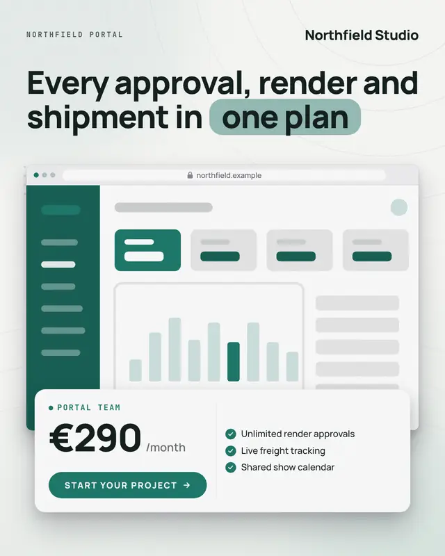
Pricing showcase
The brand's REAL pricing or product page in a browser (or its app on a phone) on a light stage, with a floating white price card over its foot
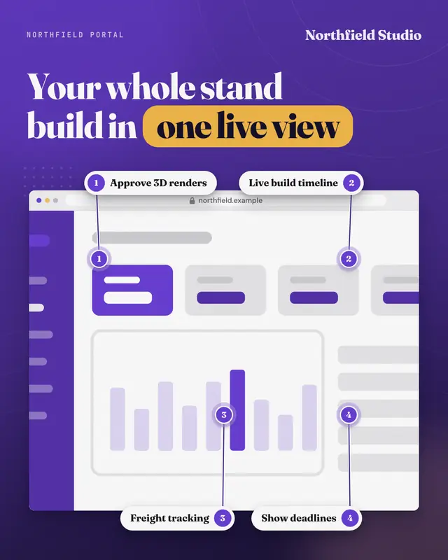
Browser hero with callouts
The real product in a large browser window (the brand's own address in the bar) on a deep brand-gradient stage, under a bold headline, with three or four numbered chips…
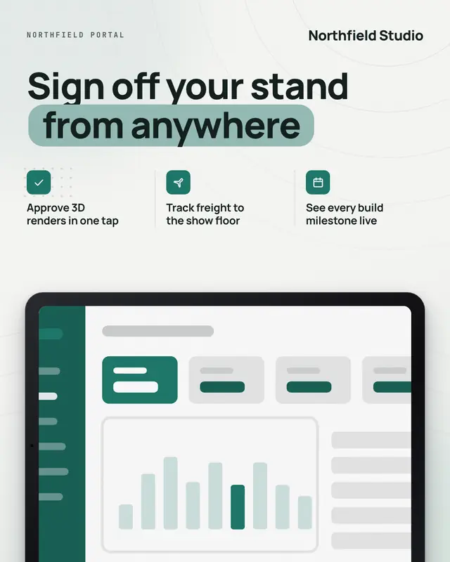
Tablet
The real product on a landscape tablet rising into a light brand stage, under a bold headline with two or three iconed benefit lines set on a ruled grid
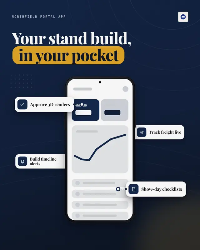
Phone with feature cards
One hero phone showing the real app on a deep brand-gradient stage, with three or four white feature cards (icon + a few words) floating around it at staggered depths…
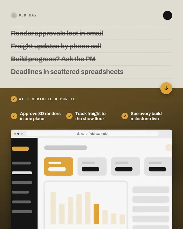
Old way / new way
A split card: the old way as a typographic panel on muted paper with three or four pains struck through, turning into the new way on a deep brand stage
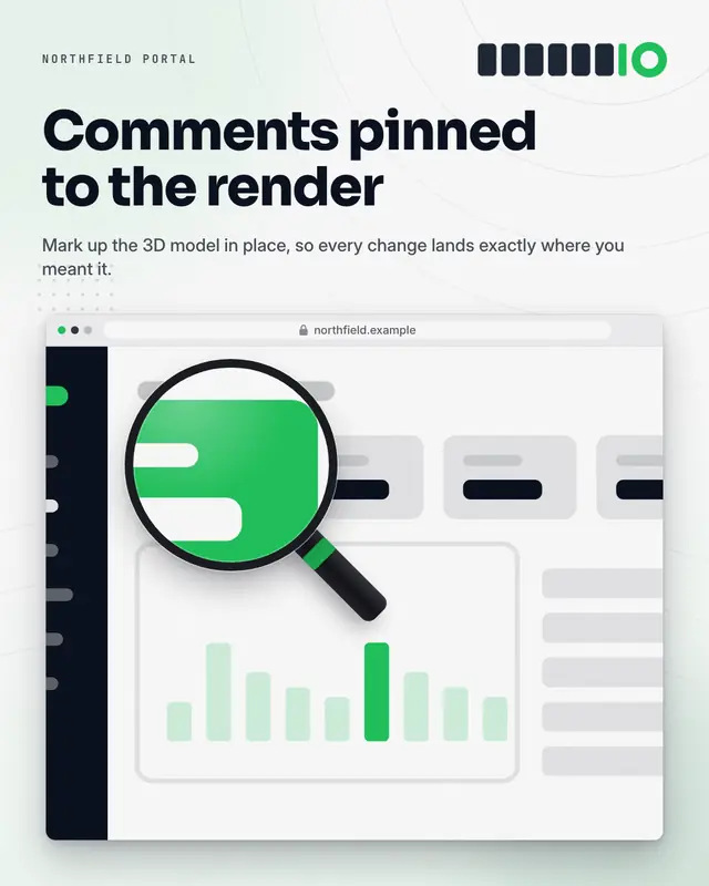
Feature zoom
The real product in its device on a light brand stage, with a magnifying lens (ring and handle) holding a sharp 2.2x close-up of one feature of the SAME capture, the…
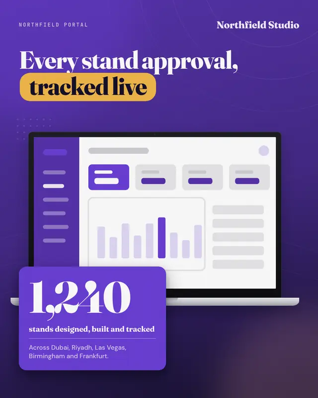
Dashboard + KPI
The real dashboard on a laptop on a deep brand-gradient stage, with one big real number on a bold brand card overlapping the device's corner
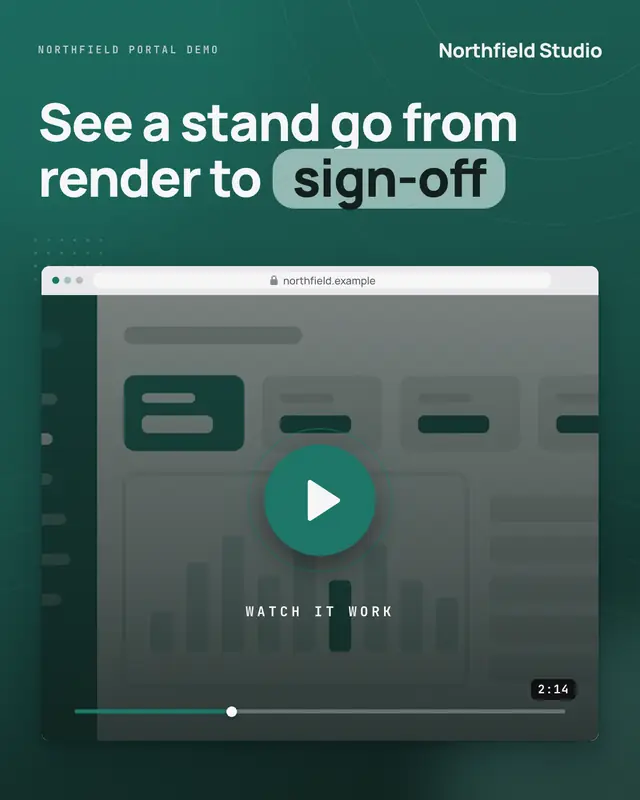
Watch it work
A video cover: the real product in its device on a deep brand stage, dimmed under a dark veil with a big brand play button, a 'Watch it work' label, a scrub bar and the…
Make a Integration hub with your brand.
MarketiQ writes the post, picks the template that carries it best — this one, when it fits — and fills it with your logo, colours, facts and copy.