Alignment chart
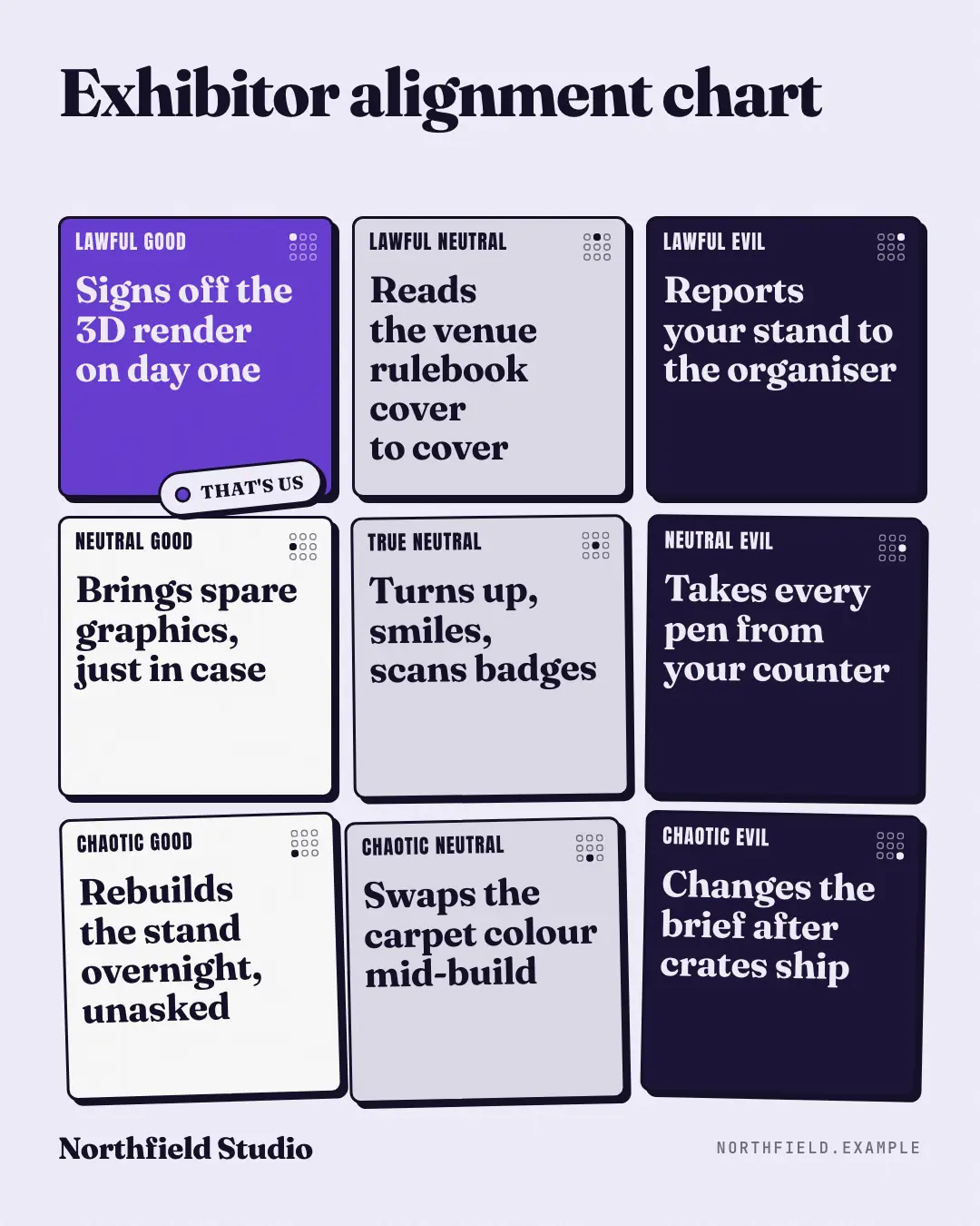
The 3×3 alignment chart — lawful to chaotic, good to evil — as nine outlined cards: lawful ones dead straight, chaotic ones knocked askew, evil ones in night ink, each with a tiny locator map; the brand's own habit sits in the brand-colour card with a 'that's us' sticker.
When the AI picks it
MarketiQ’s Creative Director favours the Alignment chart for posts that entertain or start a conversation, when the message is a list or a side-by-side comparison. It is built first to entertain.
It reads each post’s goal and shape first, then its own words, the platform and the facts you have, and offers this template only where it fits.
Who it’s for
Any business. Nothing in it assumes what you sell, so the Director can offer it to a software company, a café or a coaching centre alike — whenever the post fits.
Platforms and sizes
| Size | Where |
|---|---|
| 4:51080 × 1350 px | Instagram, Facebook, LinkedIn, Threads, Pinterest, Reddit |
| 1:11080 × 1080 px | Ads |
| 9:161080 × 1920 px | TikTok |
| 16:91600 × 900 px | X, YouTube |
| 1.91:11200 × 628 px | Newsletter, Blog |
Single image. Each size is laid out for its canvas, not cropped; the sample above is the 4:5 version.
What it needs
Only your post. It is made from your copy and your brand kit — there is nothing else to prepare.
Rules the AI follows
Word for word from the template library. The Director follows the copy rules when it writes into the template, and the visual review checks every creative against the visual rules.
Copy rules
- Nine short behaviours the audience recognises from their own work, each fitting its card's alignment; no invented numbers or names.
- The brand's own card shows a real habit of the business — proud, a little self-aware — never a dig at a named competitor.
Visual rules
- Nine ink-outlined cards with hard shadows: good on white, neutral on grey, evil on night; lawful cards straight, chaotic cards rotated; condensed category labels and a 3×3 locator in every card.
- The brand's card in brand colour with a pill sticker; title above, watermark below (left column on landscape).
More Meme templates
The iceberg
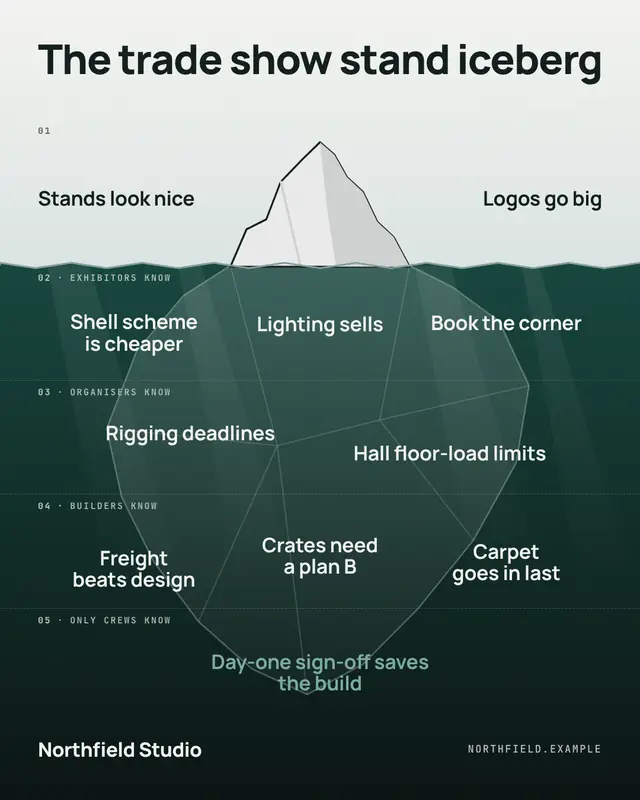
The iceberg meme as an original illustration: a crisp ice tip above a palette-coloured sea that darkens with depth, the huge translucent body below, and tiers of entries…
Tell me without telling me
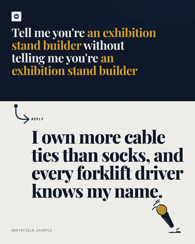
'Tell me you're ___ without telling me you're ___' set on a dark slab with the blank lit in brand colour, a hooked reply arrow dropping into the brand's punchline in…
Plot twist
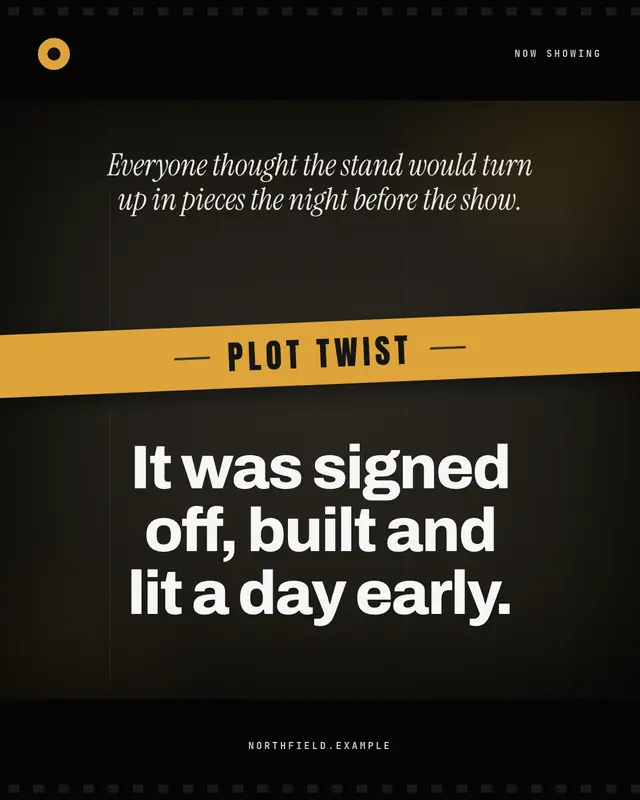
A cinematic title card: letterbox bars with film perforations, a dark frame with grain, scratches, a vignette and a brand-colour light leak; the set-up in an italic…
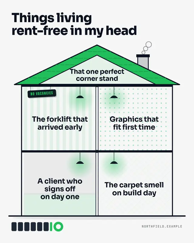
Living rent-free
'Things living rent-free in my head' over an original dollhouse cutaway: a brand-colour roof with a smoking chimney, an attic and papered rooms each lit by a hanging…
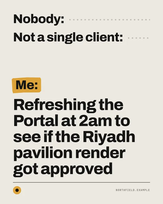
Nobody: / Me:
The 'Nobody: / Me:' text meme
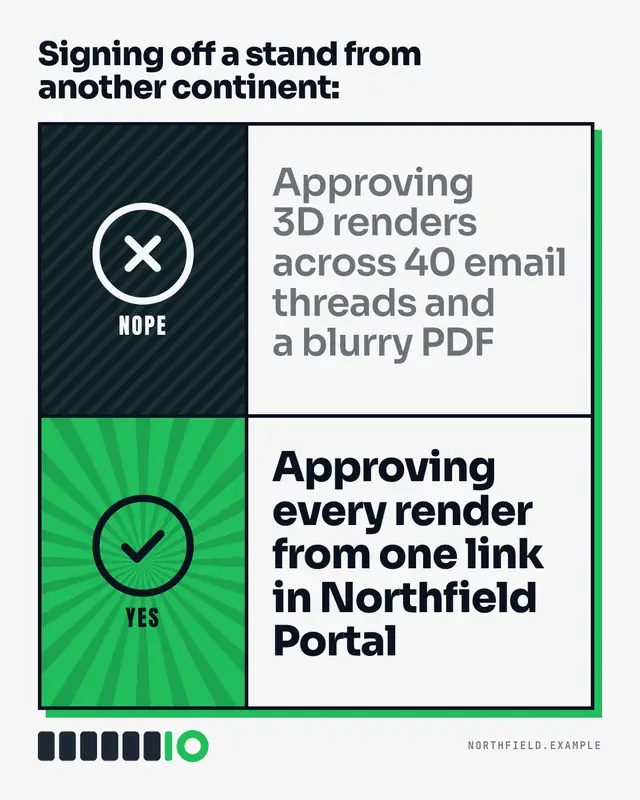
Nope / yes
The classic two-row approval meme rebuilt with bold original icon panels
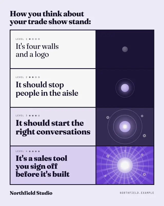
Levels of understanding
Four escalating levels of understanding, each line bolder and each panel brighter until the last one blazes
Triangle of glances
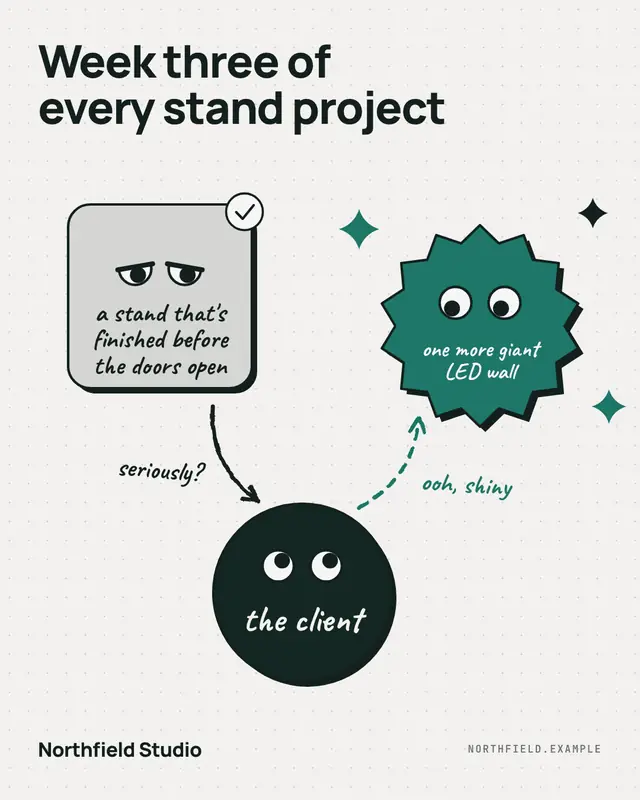
The 'distracted' meme as an original labelled diagram: one shape eyes the shiny new thing while the boring thing that works glares back, joined by hand-drawn arrows.
Make a Alignment chart with your brand.
MarketiQ writes the post, picks the template that carries it best — this one, when it fits — and fills it with your logo, colours, facts and copy.