Plot twist
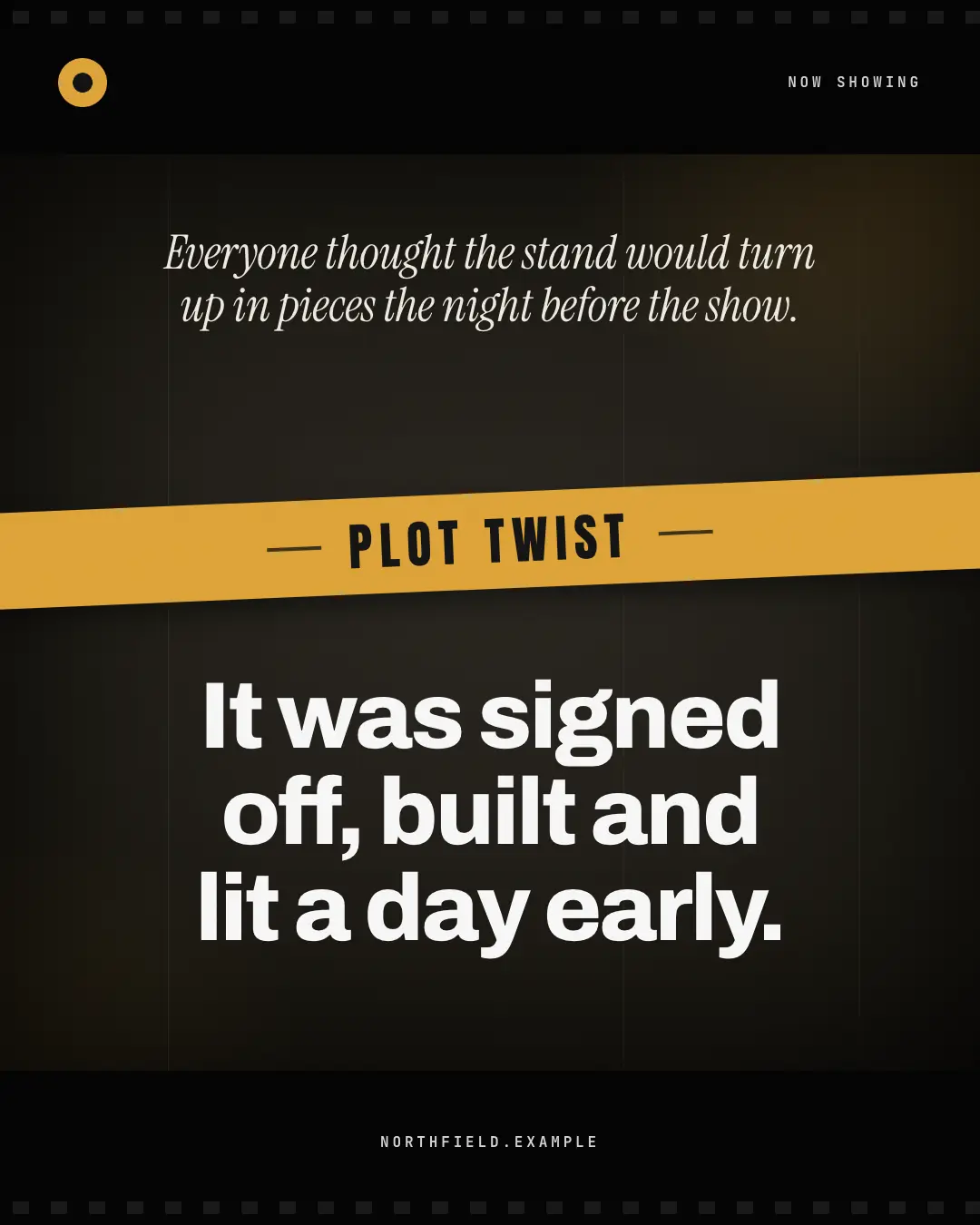
A cinematic title card: letterbox bars with film perforations, a dark frame with grain, scratches, a vignette and a brand-colour light leak; the set-up in an italic serif, a tilted brand banner shouting PLOT TWIST, then the twist in huge white type — the reveal the audience did not see coming.
When the AI picks it
MarketiQ’s Creative Director favours the Plot twist for posts that entertain, start a conversation or announce news, when the message is a contrast (this, not that), a story or one sharp insight. It is built first to entertain.
It reads each post’s goal and shape first, then its own words, the platform and the facts you have, and offers this template only where it fits.
Who it’s for
Any business. Nothing in it assumes what you sell, so the Director can offer it to a software company, a café or a coaching centre alike — whenever the post fits.
Platforms and sizes
| Size | Where |
|---|---|
| 4:51080 × 1350 px | Instagram, Facebook, LinkedIn, Threads, Pinterest, Reddit |
| 1:11080 × 1080 px | Ads |
| 9:161080 × 1920 px | TikTok |
| 16:91600 × 900 px | X, YouTube |
| 1.91:11200 × 628 px | Newsletter, Blog |
Single image. Each size is laid out for its canvas, not cropped; the sample above is the 4:5 version.
What it needs
Only your post. It is made from your copy and your brand kit — there is nothing else to prepare.
Rules the AI follows
Word for word from the template library. The Director follows the copy rules when it writes into the template, and the visual review checks every creative against the visual rules.
Copy rules
- The set-up is the familiar expectation or fear; the twist flips it with what the brand really does — both short, no invented numbers or names.
- Keep the banner to two words; the twist should land in one line of thought.
Visual rules
- Black letterbox bars with faint perforations; a dark frame with bright grain, scratches, a deep vignette and a brand-colour light leak from the corner.
- Italic serif set-up, a tilted full-width brand banner in condensed caps between rules, the twist in huge white heading type; logo and label in the top bar, website in the bottom bar.
More Meme templates
Living rent-free
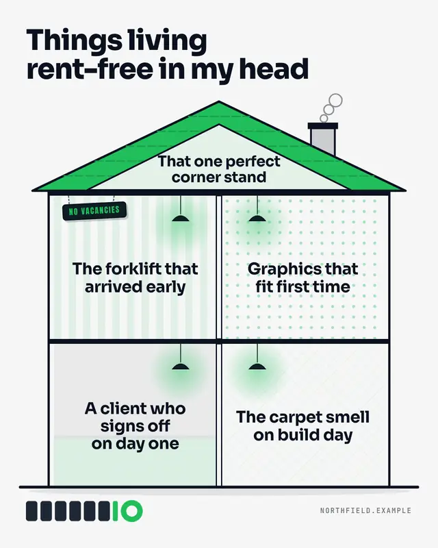
'Things living rent-free in my head' over an original dollhouse cutaway: a brand-colour roof with a smoking chimney, an attic and papered rooms each lit by a hanging…
Nobody: / Me:
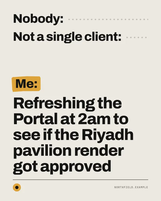
The 'Nobody: / Me:' text meme
Nope / yes
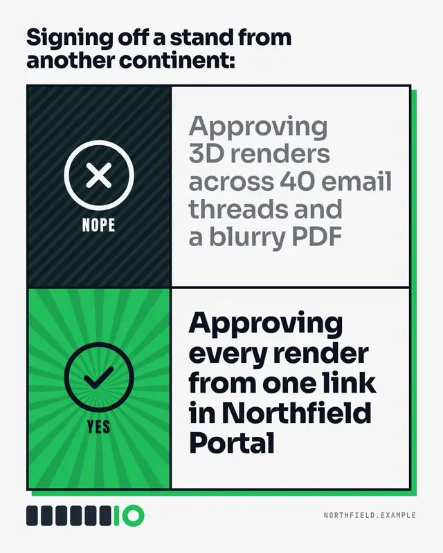
The classic two-row approval meme rebuilt with bold original icon panels
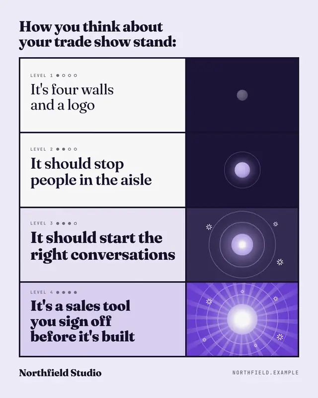
Levels of understanding
Four escalating levels of understanding, each line bolder and each panel brighter until the last one blazes
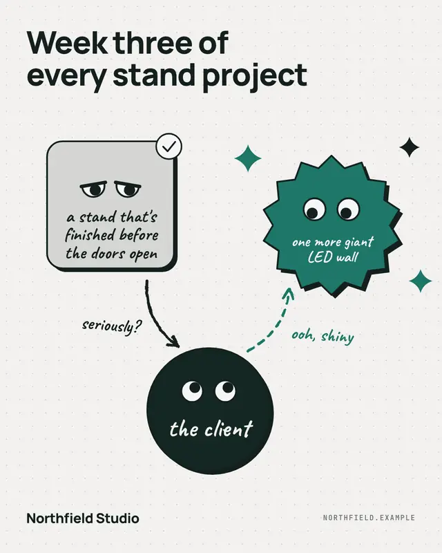
Triangle of glances
The 'distracted' meme as an original labelled diagram: one shape eyes the shiny new thing while the boring thing that works glares back, joined by hand-drawn arrows.
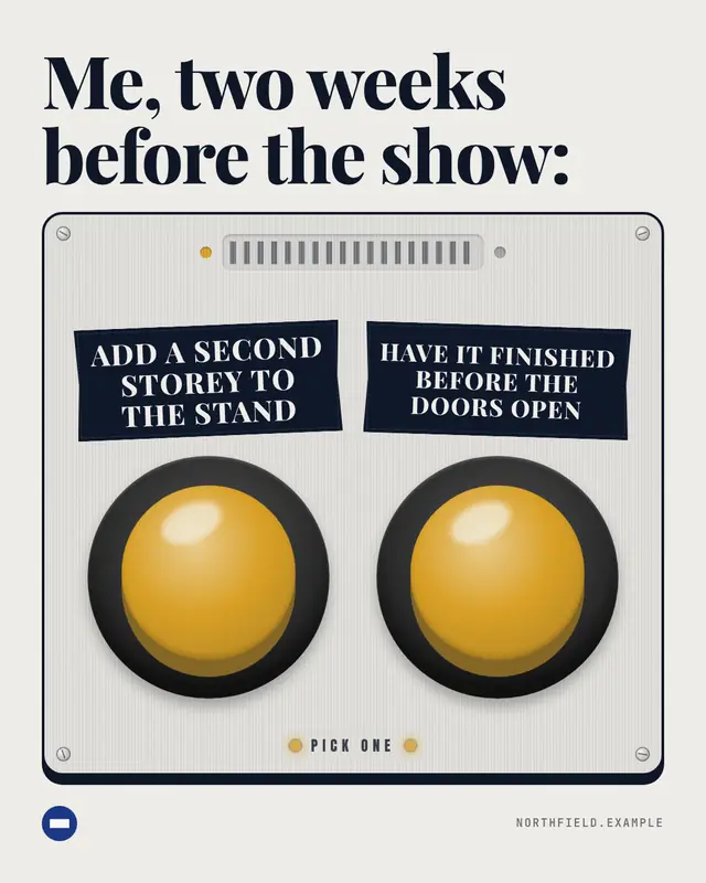
Two buttons
Two big arcade buttons on a control panel, each with a label-maker tape, under a 'Me deciding:' caption
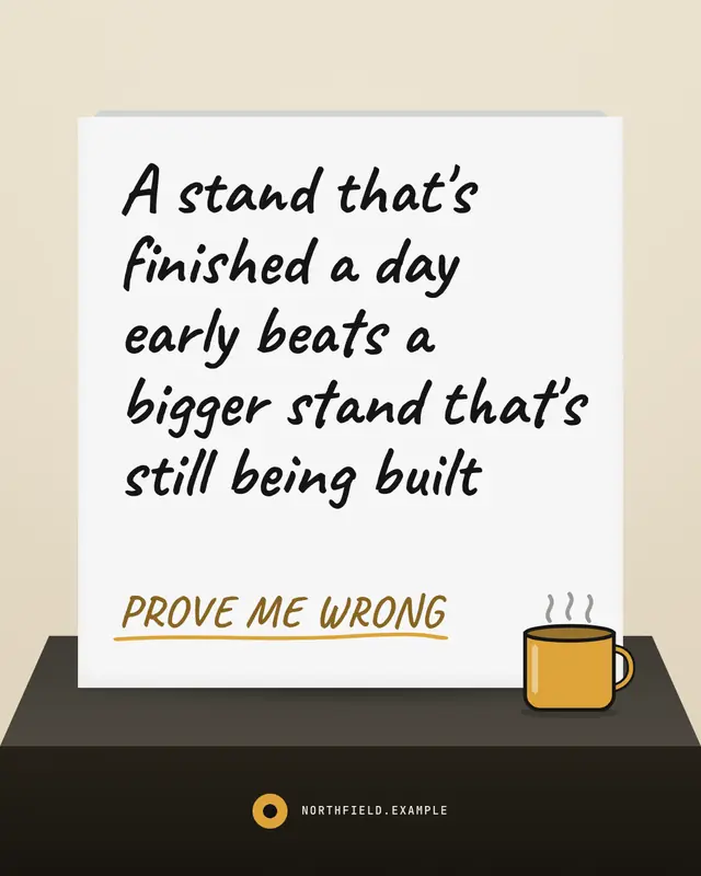
Prove me wrong
A folding sign card standing on a table edge with a hand-lettered statement and 'Prove me wrong'
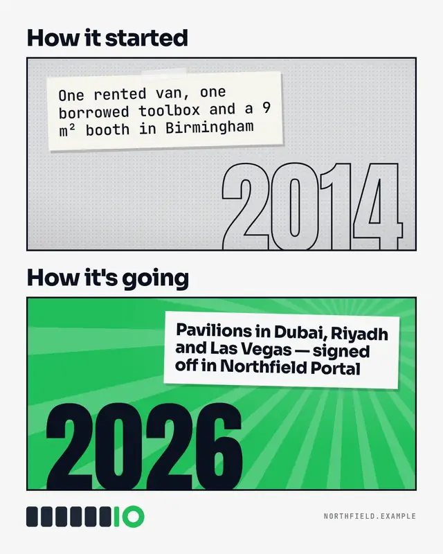
How it started / how it's going
The 'how it started / how it's going' meme as two typographic panels: a faded, taped-note past with an outlined date and a bright brand-colour present
Make a Plot twist with your brand.
MarketiQ writes the post, picks the template that carries it best — this one, when it fits — and fills it with your logo, colours, facts and copy.