Checklist preview
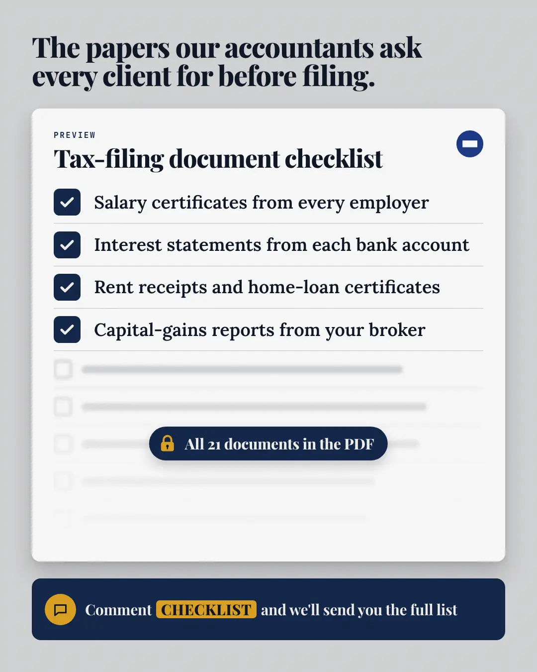
The first items of the real checklist, ticked on a white sheet; the rest of the list blurs out under a fade with a padlock badge saying how much more there is (only when the post says) — then the call to action. The reader gets a taste and a reason to comment for the whole thing.
When the AI picks it
MarketiQ’s Creative Director favours the Checklist preview for posts that get people to act, start a conversation or teach, when the message is a list or steps or a process. It is built first to get people to act.
It reads each post’s goal and shape first, then its own words, the platform and the facts you have, and offers this template only where it fits.
Who it’s for
Any business. Nothing in it assumes what you sell, so the Director can offer it to a software company, a café or a coaching centre alike — whenever the post fits.
Platforms and sizes
| Size | Where |
|---|---|
| 4:51080 × 1350 px | Instagram, Facebook, LinkedIn, Threads, Reddit |
| 1:11080 × 1080 px | X, Ads |
| 9:161080 × 1920 px | TikTok |
| 2:31000 × 1500 px | |
| 1.91:11200 × 628 px | Newsletter, Blog |
Single image. Each size is laid out for its canvas, not cropped; the sample above is the 4:5 version.
What it needs
The Director offers it only when these exist. Without them it simply picks another template.
- Lead magnet
Rules the AI follows
Word for word from the template library. The Director follows the copy rules when it writes into the template, and the visual review checks every creative against the visual rules.
Copy rules
- Every title, chapter, item, count and page number comes from the post or the brand's recorded lead magnets — never invent what the asset contains or how long it is.
- The call to action is the post's own; the keyword is copied exactly from it.
- Visible items are checks the post itself lists; the count in 'what is locked' only when the post states it.
Visual rules
- A white rounded sheet on a pale brand ground: the checklist title and logo at its head, the visible items with filled brand tick boxes, then empty boxes and grey bars that blur and fade to white.
- A dark pill with a padlock (and the locked count when given) sits over the fade; the call to action is a dark rounded bar with the keyword as a pill.
More Lead-magnet teasers templates
Redacted swipe file
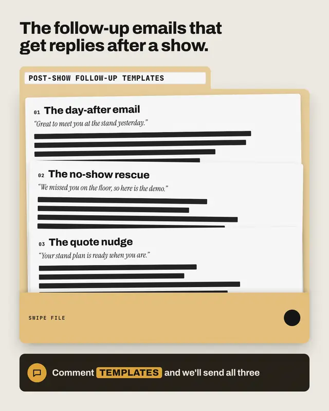
A brand-tinted file folder labelled with the swipe file's name: template sheets fanned inside, each showing its real name and the opening line the post shares…
Padlocked preview
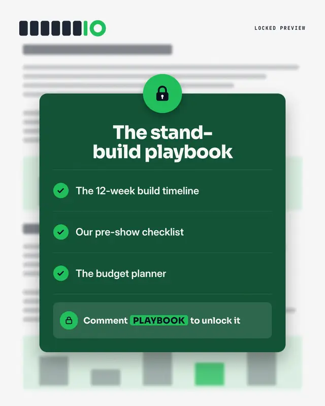
The asset as 'gated content': a blurred document behind a dark lock panel
Magnifier peek
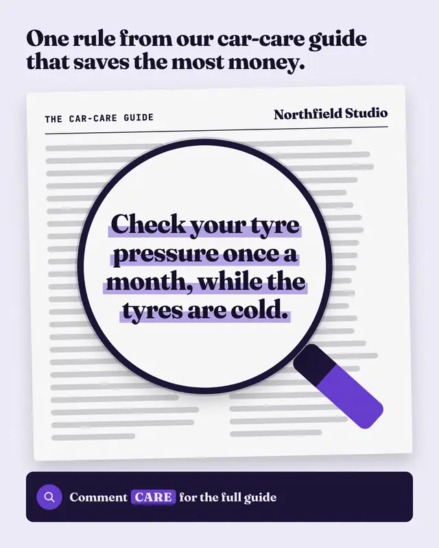
A 'sneak peek' of the asset under a magnifying glass: the page itself is wordless lines, but inside the lens one real line from it
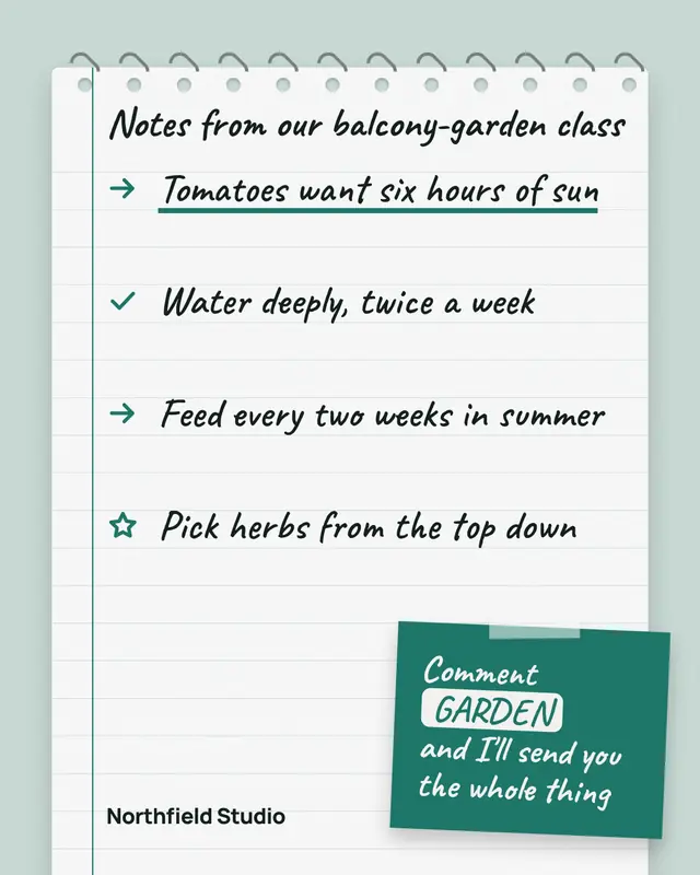
Notebook notes
A spiral notebook page of handwritten notes taken from the asset
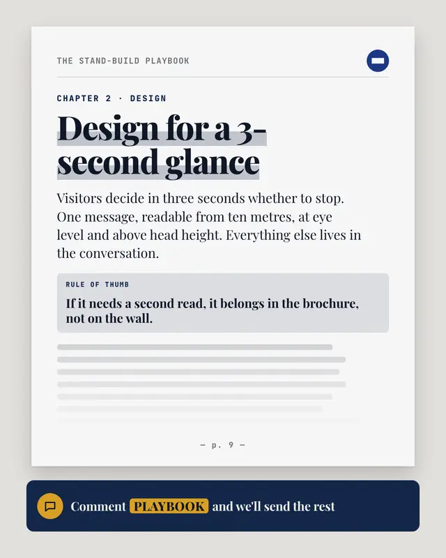
Excerpt page
One real page of the asset, set like the asset itself: a running header with its title and the logo, the chapter, a big highlighted section heading, an opening paragraph…
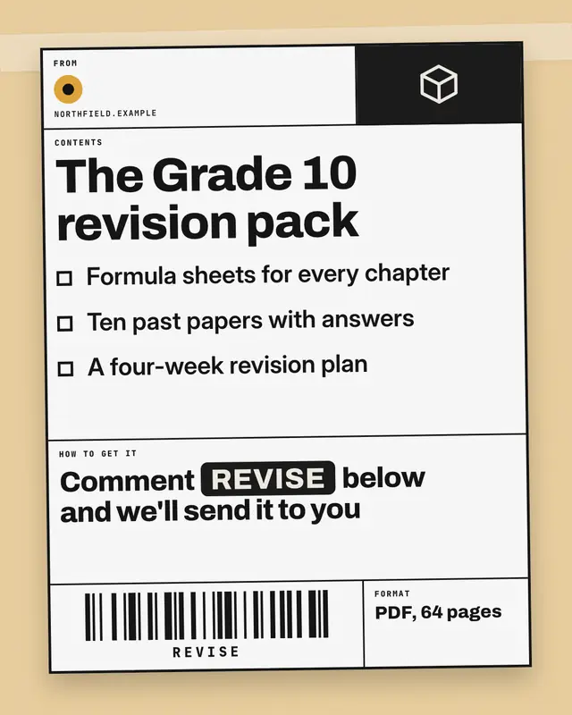
Shipping label
The asset as a parcel ready to ship: a black-ruled shipping label taped to a brand-tinted box
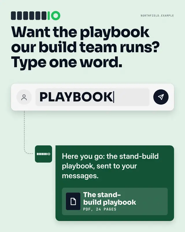
Comment composer
The whole mechanic in one picture: a generic comment box with the post's keyword typed in and a send button, a dashed path down to the brand's reply bubble
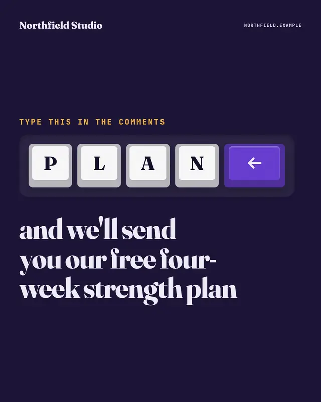
Keycaps
The comment keyword spelled out on big white keyboard keys, one letter per key, ending in a brand-colour enter key, set in a dark keyboard deck
Make a Checklist preview with your brand.
MarketiQ writes the post, picks the template that carries it best — this one, when it fits — and fills it with your logo, colours, facts and copy.