Ingredient spotlight
The hero ingredient as a periodic-table 'element tile': its percentage in the corner, a big serif two-letter symbol, the ingredient's name and INCI name beneath, set on a deep brand ground beside what it does — two to four points — and the product it is in. Makes one ingredient the star.
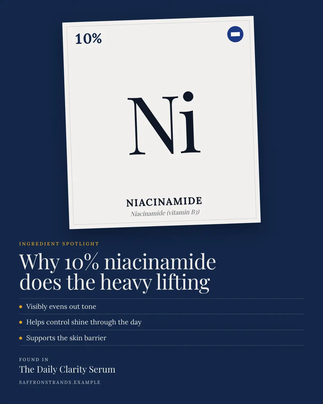
When the AI picks it
MarketiQ’s Creative Director favours the Ingredient spotlight for posts that teach, prove a point or get people to act, when the message is one sharp insight, one product in the spotlight or a list. It is built first to teach.
It reads each post’s goal and shape first, then its own words, the platform and the facts you have, and offers this template only where it fits.
Who it’s for
Made for Beauty & personal care. The Director offers it only to brands of that kind, so it never turns up for a business it does not suit.
Platforms and sizes
| Size | Where |
|---|---|
| 4:51080 × 1350 px | Instagram, Facebook, LinkedIn, Threads, Reddit |
| 1:11080 × 1080 px | X, Ads |
| 9:161080 × 1920 px | TikTok |
| 2:31000 × 1500 px | |
| 1.91:11200 × 628 px | Newsletter, Blog |
Single image. Each size is laid out for its canvas, not cropped; the sample above is the 4:5 version.
What it needs
Only your post. It is made from your copy and your brand kit — there is nothing else to prepare.
Rules the AI follows
Word for word from the template library. The Director follows the copy rules when it writes into the template, and the visual review checks every creative against the visual rules.
Copy rules
- The ingredient, its INCI name and percentage are exactly as the post states them.
- What it does uses the post's own claims — no 'clinically proven', 'dermatologist tested' or cure claims it does not make.
Visual rules
- A deep brand ground; a large off-white element tile (slightly tilted on portrait) with an inner keyline: the percentage in the brand colour top-left, the logo top-right, a huge serif two-letter symbol, the name in spaced caps and the INCI name in italic.
- Beside or below it: a spaced-caps label, a serif headline, two to four points on hairlines with brand dots and the product it is found in.
More Swatches & finders templates
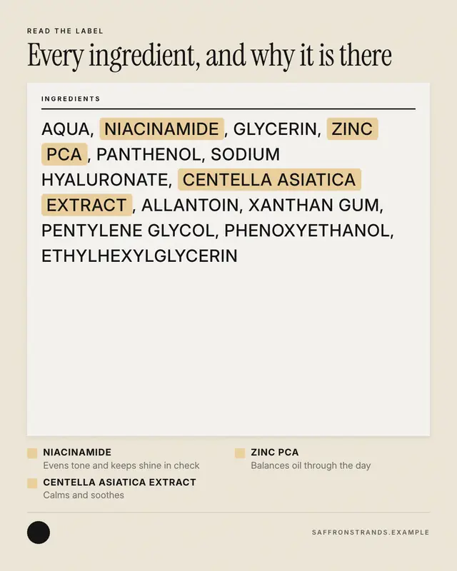
Read the label
'Read the label': the product's full ingredient list set like the back of the pack
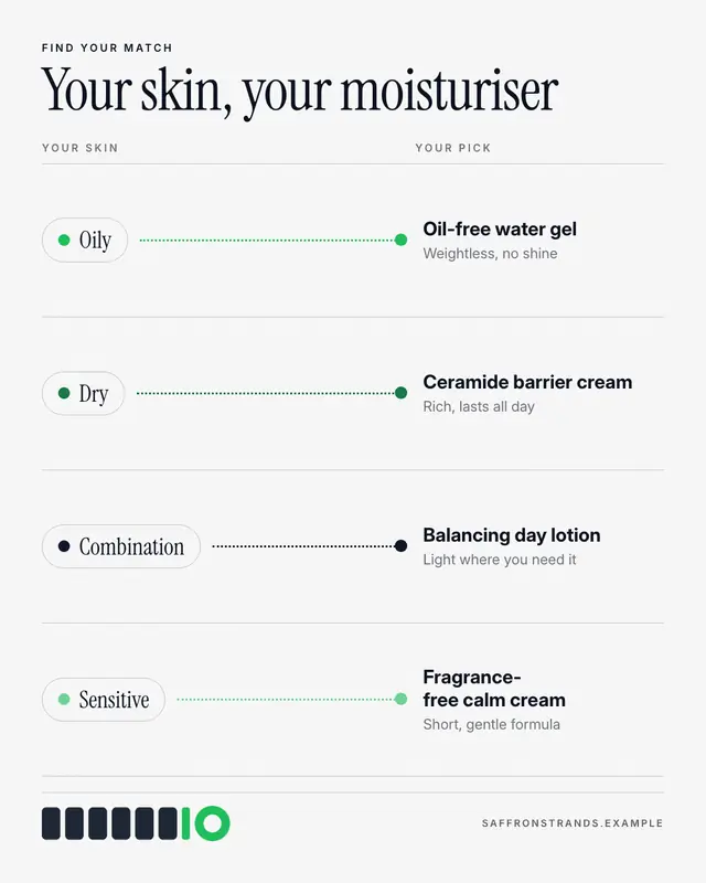
Skin-type matcher
A 'skin type' matcher: each skin type as a pill on the left joined by a dotted line to the product made for it on the right, with one line on why.
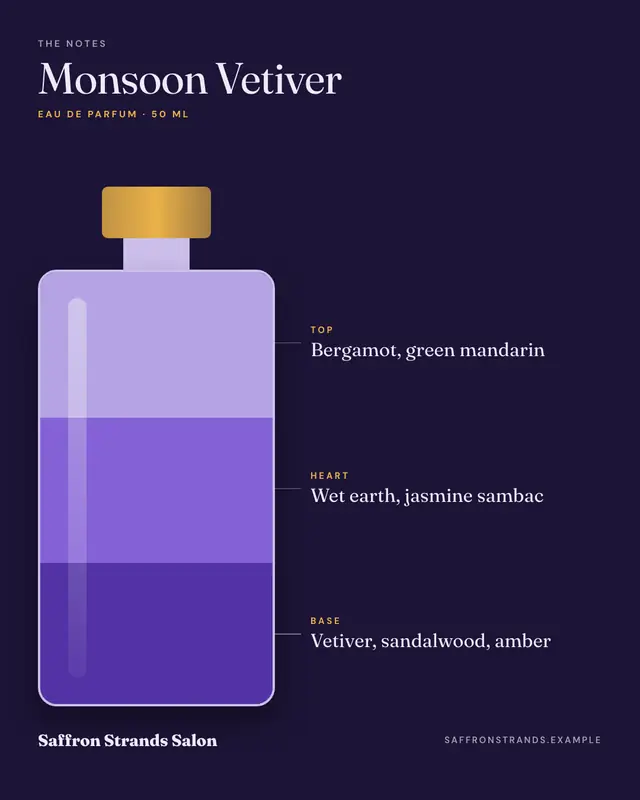
Fragrance notes
'Fragrance notes' as layers in the bottle: a simple drawn bottle on a night ground filled in three bands of the brand colour
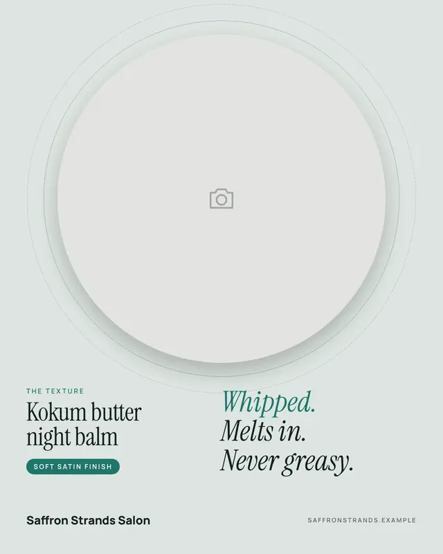
Texture shot
A 'texture shot': the brand's own macro photograph of the formula in a big round window ringed like a lens, beside the product's name and how it feels in three large…
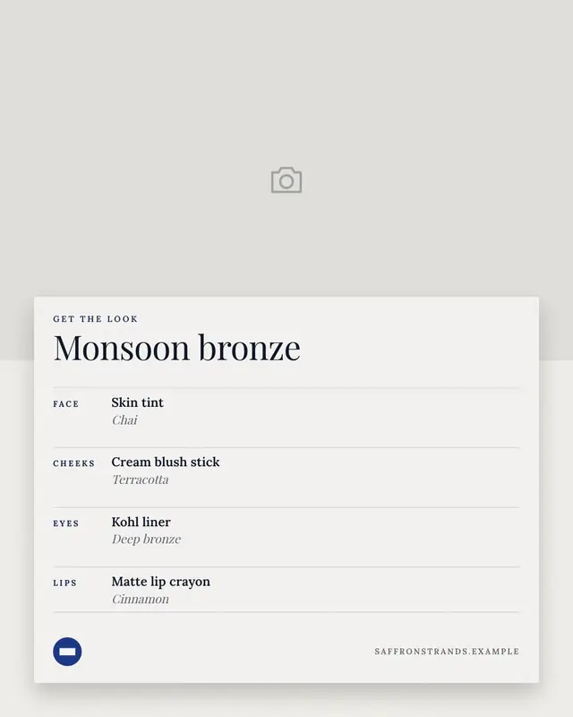
Get the look
'Get the look': the brand's own photograph of a finished makeup or hair look with a white card pulled over it
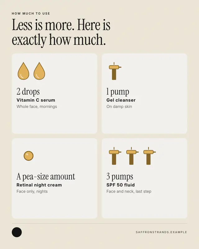
How much to use
'How much to use', drawn: one card per product with the dose pictured
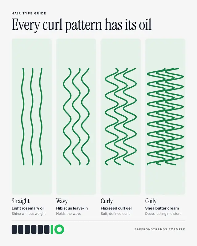
Hair-type finder
A 'hair type' finder: drawn strands in a row of soft tiles, from straight through wavy and curly to coily, each named in a serif with the brand's product for it and why.
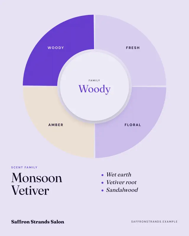
Scent wheel
A 'scent family' wheel: fresh, floral, amber and woody (or the brand's own families) as segments of a ring, the family this fragrance belongs to filled in the brand…
Make a Ingredient spotlight with your brand.
MarketiQ writes the post, picks the template that carries it best — this one, when it fits — and fills it with your logo, colours, facts and copy.