Get the look
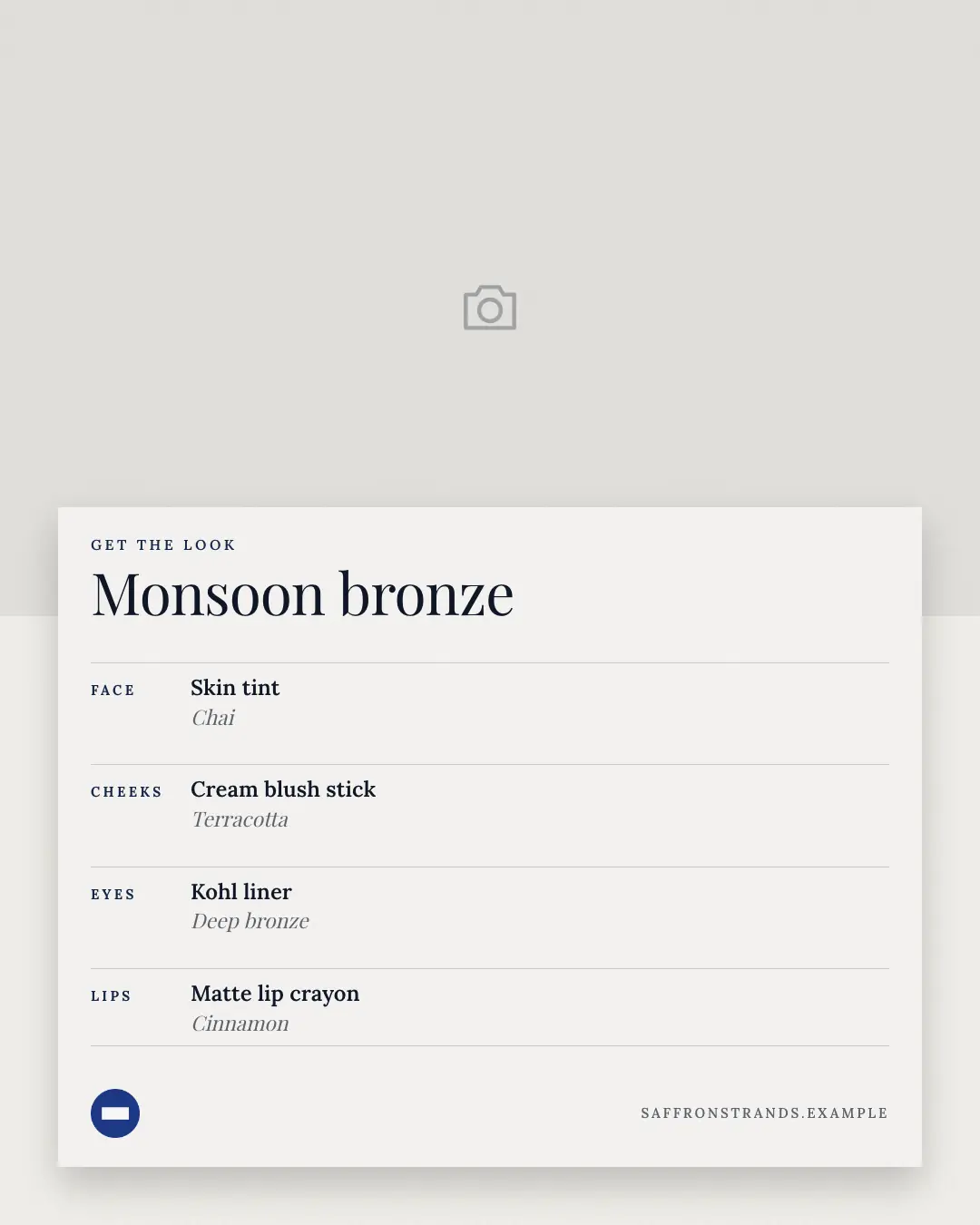
'Get the look': the brand's own photograph of a finished makeup or hair look with a white card pulled over it — the look's name in a serif, then face, eyes, lips (or hair steps) on ruled lines, each with the brand's product and shade. The recipe for a look people want to copy.
When the AI picks it
MarketiQ’s Creative Director favours the Get the look for posts that get people to act, teach or start a conversation, when the message is several products or a menu, one product in the spotlight or steps or a process. It is built first to get people to act.
It reads each post’s goal and shape first, then its own words, the platform and the facts you have, and offers this template only where it fits.
Who it’s for
Made for Beauty & personal care. The Director offers it only to brands of that kind, so it never turns up for a business it does not suit.
Platforms and sizes
| Size | Where |
|---|---|
| 4:51080 × 1350 px | Instagram, Facebook, LinkedIn, Threads, Reddit |
| 1:11080 × 1080 px | X, Ads |
| 9:161080 × 1920 px | TikTok |
| 2:31000 × 1500 px | |
| 1.91:11200 × 628 px | Newsletter, Blog |
Single image. Each size is laid out for its canvas, not cropped; the sample above is the 4:5 version.
What it needs
The Director offers it only when these exist. Without them it simply picks another template.
- A real product or service you sell
- A real photo or screenshot of your product
- One of your own photos
The sample shows a text-free stand-in where the screens go; MarketiQ only ever places real screens of your own app or website.
Rules the AI follows
Word for word from the template library. The Director follows the copy rules when it writes into the template, and the visual review checks every creative against the visual rules.
Copy rules
- Products and shades are the brand's own, exactly as the post names them; never add one.
- Describe the look, never the person's features; no 'fairer', 'slimmer' or 'flawless' language.
Visual rules
- The brand's own photo of the look fills the top (the left on square and landscape); a white card with a soft shadow overlaps it.
- On the card: a spaced-caps label, the look's name in a serif, and ruled rows — the area in brand-colour spaced caps, the product in bold, the shade in muted italic; logo and website at the card's foot.
More Swatches & finders templates
How much to use
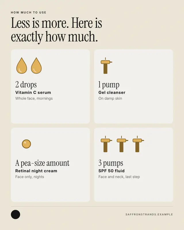
'How much to use', drawn: one card per product with the dose pictured
Hair-type finder
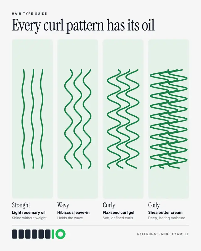
A 'hair type' finder: drawn strands in a row of soft tiles, from straight through wavy and curly to coily, each named in a serif with the brand's product for it and why.
Scent wheel
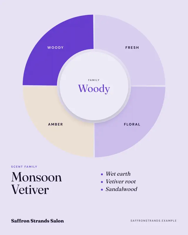
A 'scent family' wheel: fresh, floral, amber and woody (or the brand's own families) as segments of a ring, the family this fragrance belongs to filled in the brand…
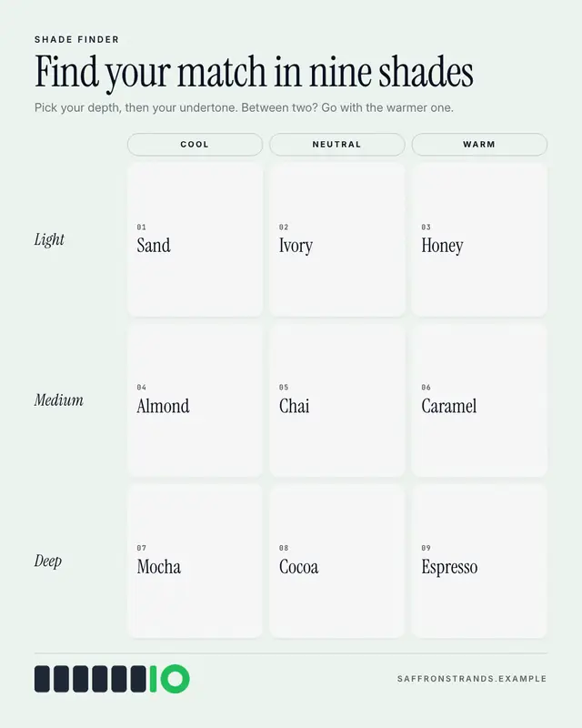
Shade finder
A 'shade finder' grid: undertones across the top as pills, depths down the side in italic serif, and every shade's name in its cell
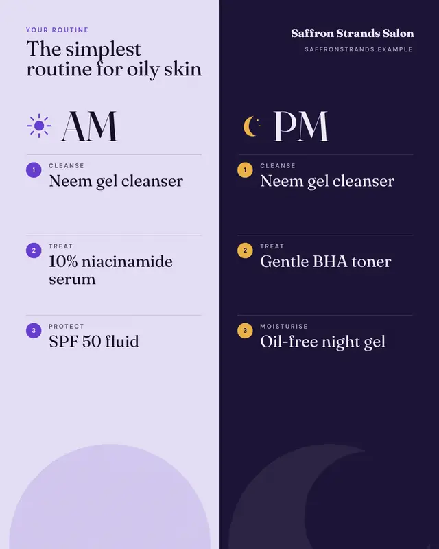
AM / PM routine
The 'AM / PM routine' as a split screen: a pale morning half with a sun and a night half with a moon, each listing its numbered steps
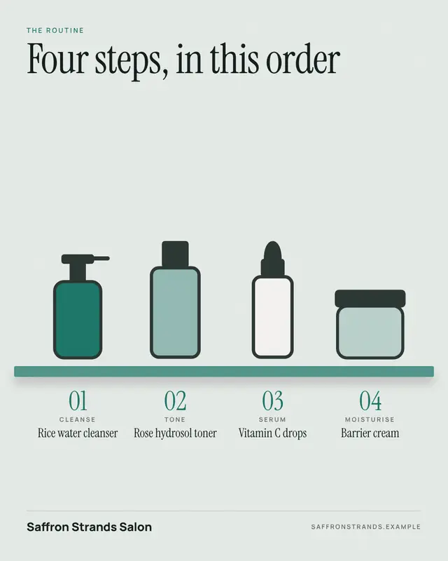
Shelfie
A routine 'shelfie': the steps lined up in order on a bathroom shelf as simple outlined bottles, jars and droppers in the brand's colours, each numbered in a serif with…
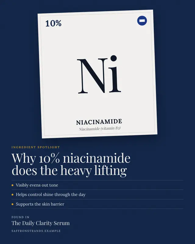
Ingredient spotlight
The hero ingredient as a periodic-table 'element tile': its percentage in the corner, a big serif two-letter symbol, the ingredient's name and INCI name beneath, set on…
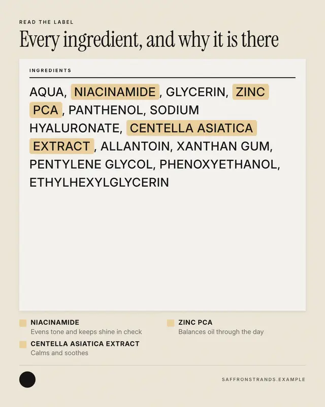
Read the label
'Read the label': the product's full ingredient list set like the back of the pack
Make a Get the look with your brand.
MarketiQ writes the post, picks the template that carries it best — this one, when it fits — and fills it with your logo, colours, facts and copy.