Gantt chart
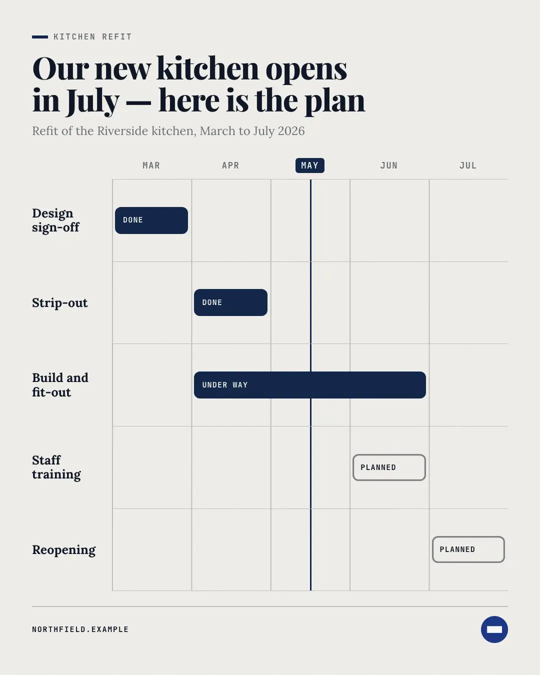
A Gantt chart: the real periods of a plan across the top, one lane per piece of work with a rounded bar from its start to its end — done, under way or planned — and a brand 'now' line, so anyone sees what happens when and what overlaps.
When the AI picks it
MarketiQ’s Creative Director favours the Gantt chart for posts that teach or announce news, when the message is a timeline or steps or a process. It is built first to teach.
It reads each post’s goal and shape first, then its own words, the platform and the facts you have, and offers this template only where it fits.
Who it’s for
Any business. Nothing in it assumes what you sell, so the Director can offer it to a software company, a café or a coaching centre alike — whenever the post fits.
Platforms and sizes
| Size | Where |
|---|---|
| 4:51080 × 1350 px | Instagram, Facebook, LinkedIn, Threads, Reddit |
| 1:11080 × 1080 px | Ads |
| 9:161080 × 1920 px | TikTok |
| 2:31000 × 1500 px | |
| 16:91600 × 900 px | X, YouTube |
| 1.91:11200 × 628 px | Newsletter, Blog |
Single image. Each size is laid out for its canvas, not cropped; the sample above is the 4:5 version.
What it needs
The Director offers it only when these exist. Without them it simply picks another template.
- A real number from your post or your brand facts
Rules the AI follows
Word for word from the template library. The Director follows the copy rules when it writes into the template, and the visual review checks every creative against the visual rules.
Copy rules
- Periods and every start and end come from the post — never invent dates or durations.
- Status words are done, now or next, matching what the post says.
- The headline says what the plan delivers and when, in words from the post.
Visual rules
- Period heads in mono caps across the top with faint column rules; one ruled lane per piece of work with its name on the left and a rounded bar spanning its periods.
- Done bars are dark, the bar under way brand-coloured, planned bars outlined; a brand line marks the current period.
More Charts & graphs templates
Small multiples
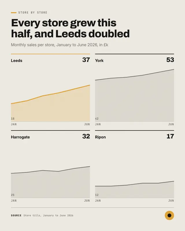
Small multiples: a grid of three to six mini area charts on one shared scale
Diverging bars
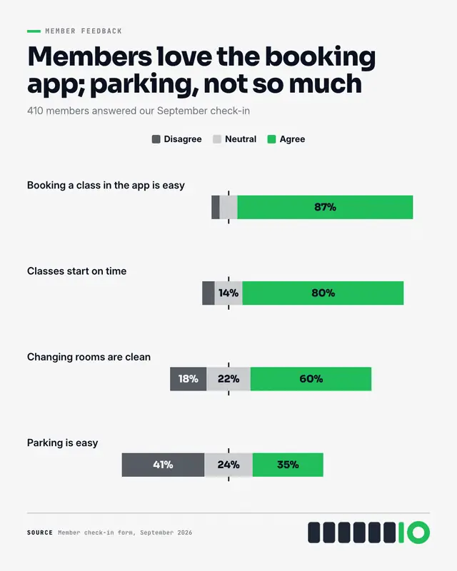
Diverging bars: each statement people rated as one bar centred on a middle line
Proportional squares
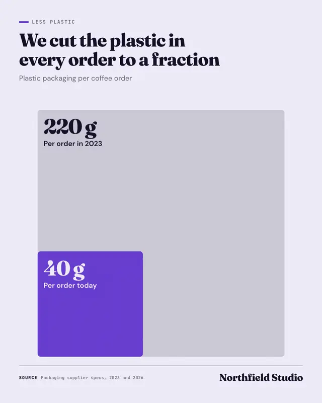
Proportional squares: two to four real amounts drawn as nested squares from one corner, each square's area true to its value
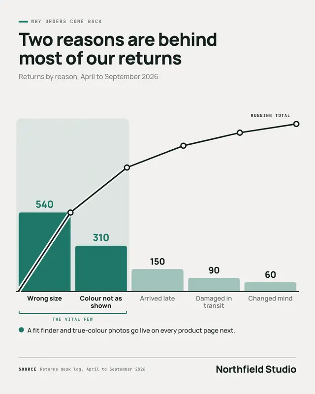
Pareto chart
A Pareto chart: four to eight causes as columns sorted largest first, each printed with its real count, a running-total line climbing over them, and the first few that…
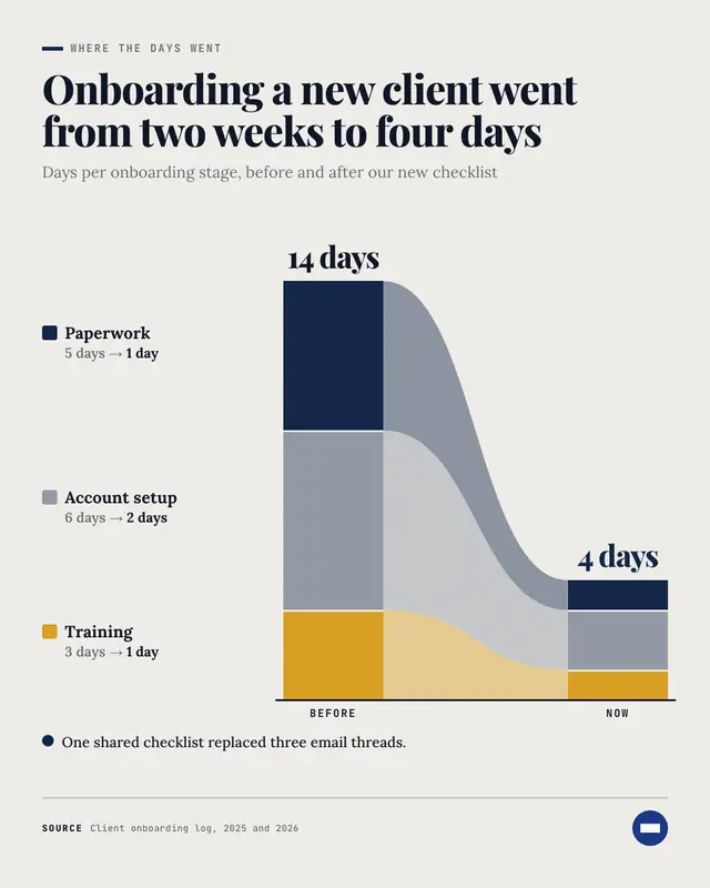
Breakdown bars
Breakdown bars: the same total split into its parts twice
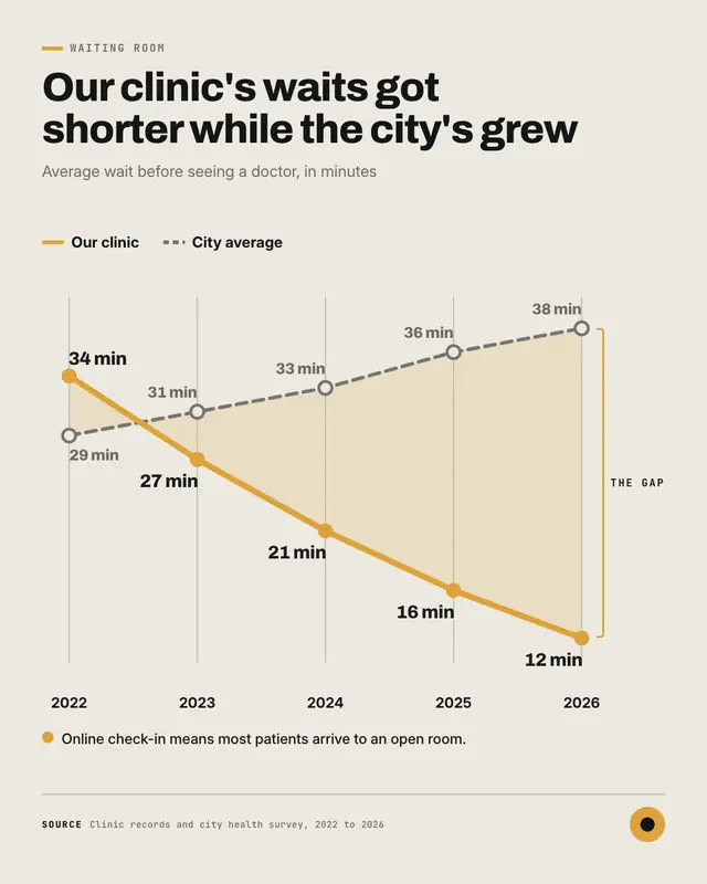
Gap chart
A gap chart: two lines over three to seven periods
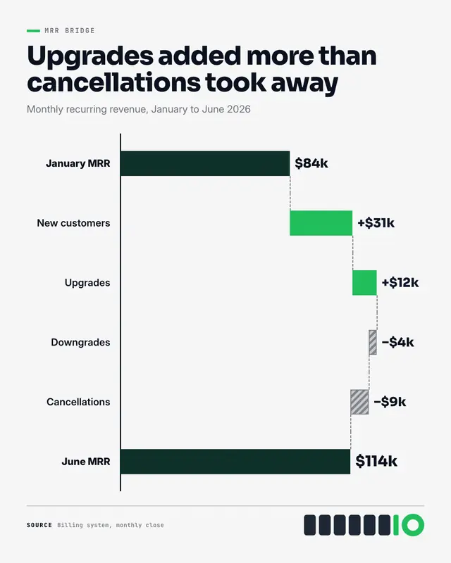
Waterfall chart
A waterfall chart: the starting total, then each real gain and loss as a floating bar stepping up or down from the last, joined by dashed level lines, to the closing…
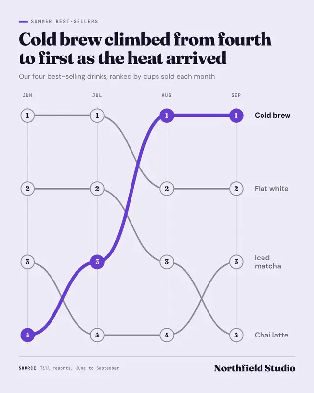
Bump chart
A bump chart: how things ranked over three to six periods
Make a Gantt chart with your brand.
MarketiQ writes the post, picks the template that carries it best — this one, when it fits — and fills it with your logo, colours, facts and copy.