Charts & graphs templates
Waterfalls, heatmaps, Sankeys and more — every mark drawn from the real numbers in the post. MarketiQ’s Creative Director picks from these 20 templates whenever a post’s message fits one of them, then fills it with your brand, facts and copy.
All Charts & graphs templates
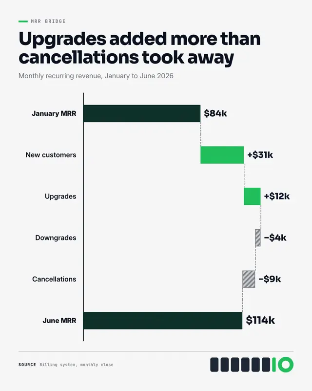
Waterfall chart
A waterfall chart: the starting total, then each real gain and loss as a floating bar stepping up or down from the last, joined by dashed level lines, to the closing…
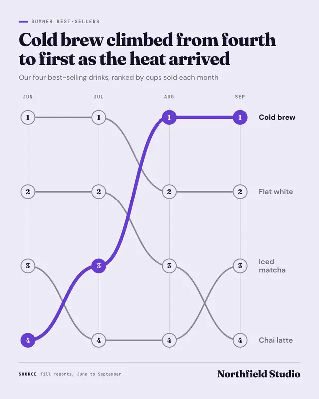
Bump chart
A bump chart: how things ranked over three to six periods
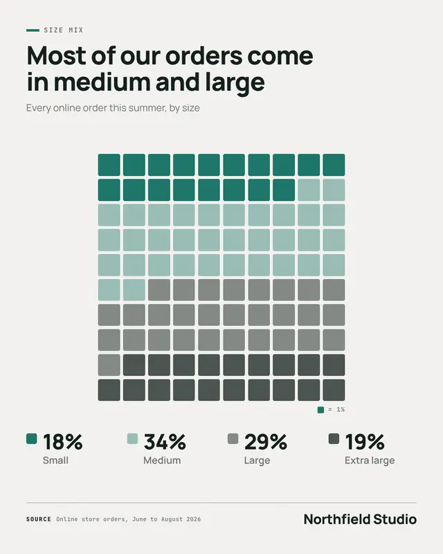
Waffle chart
A waffle chart: a ten-by-ten grid of rounded squares, one square per percent, filled in a palette colour per part, beside a legend of each real share
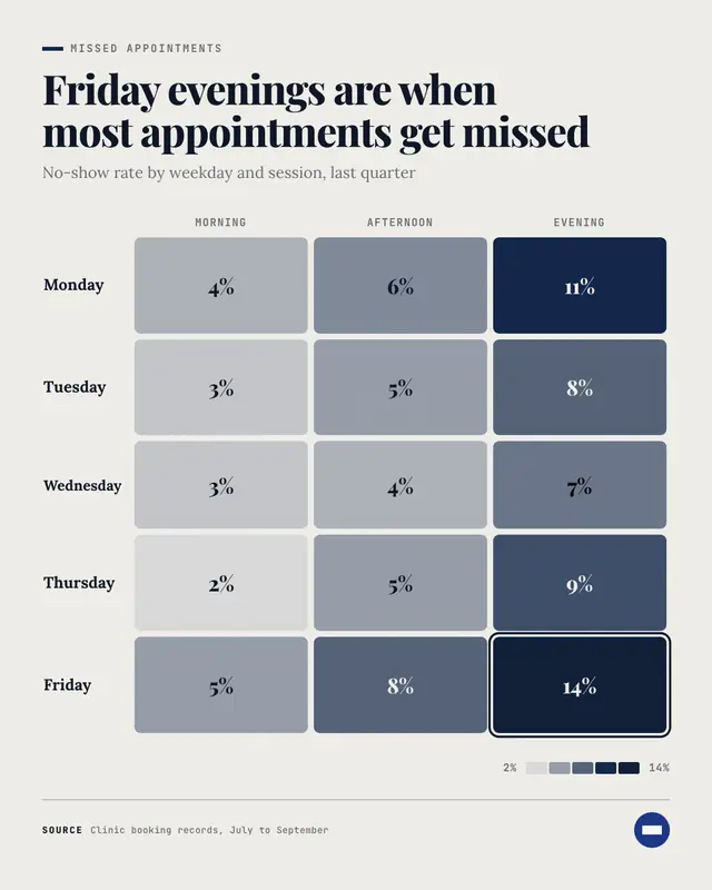
Heatmap
A heatmap: rows against two to five columns, every cell a rounded tile printed with its real value and shaded from a pale tint to deep brand by size, the hottest cell…
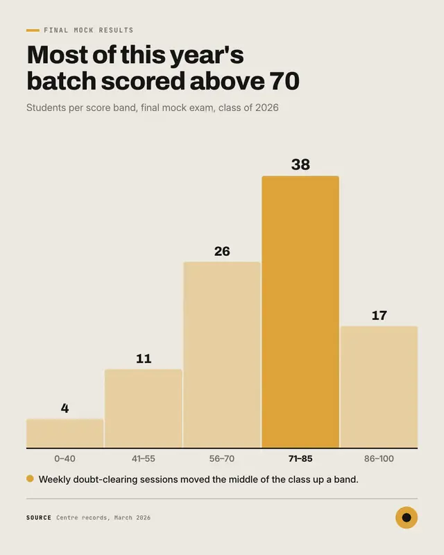
Histogram
A histogram: four to eight touching columns, one per range of a real distribution (scores, delivery days, basket sizes), each labelled with its count and range, the…
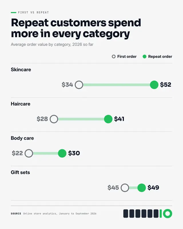
Dumbbell chart
A dumbbell chart: one ruled row per item, two dots on a shared scale
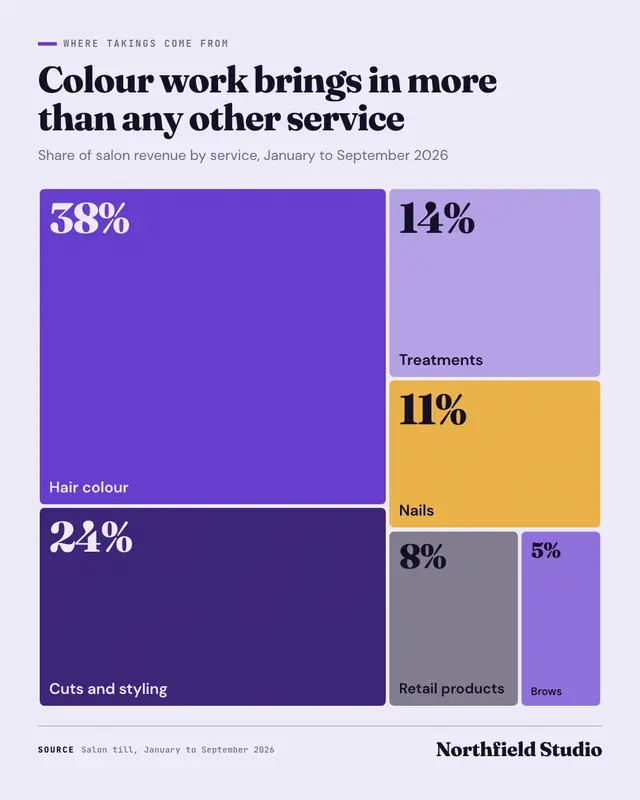
Treemap
A treemap: the whole as one block cut into tiles sized by each part's real value
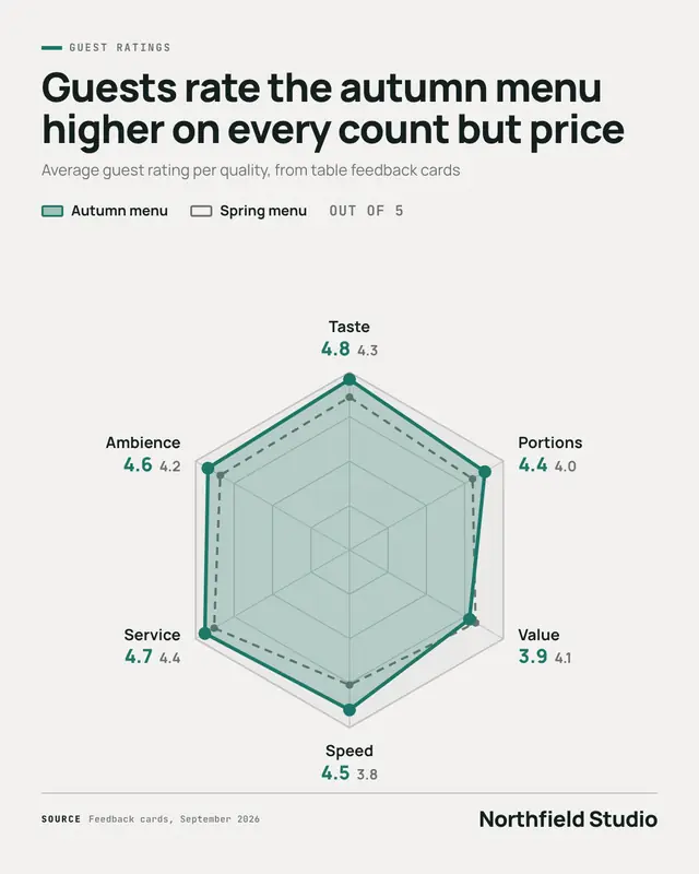
Radar chart
A radar chart (a 'spider chart'): five to eight qualities on spokes of one web, real scores on a stated scale joined into a brand-colour shape (and an optional dashed…
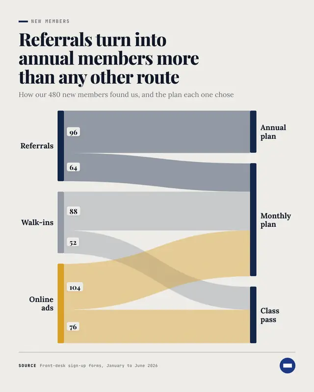
Sankey diagram
A Sankey diagram: where things came from on the left, where they went on the right, joined by flowing bands as thick as each real count
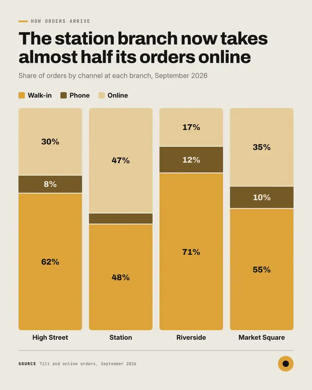
100% stacked columns
100% stacked columns (a 'stacked bar' chart stood upright): one full-height column per group
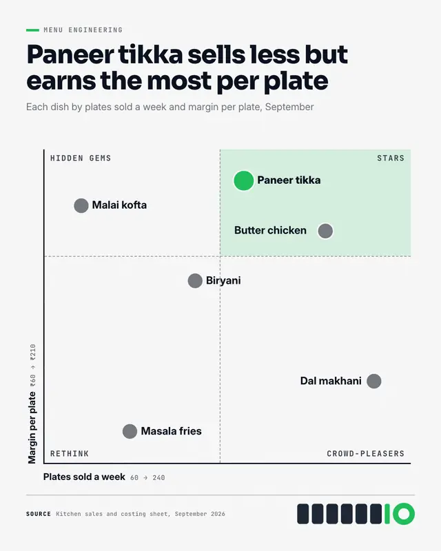
Quadrant scatter plot
A quadrant scatter plot (a 'scatter chart' cut in four): every item placed by two real measures, dashed cross-hairs splitting the field into four named quadrants, each…
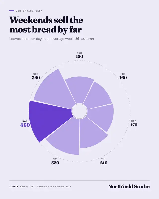
Rose chart
A rose chart (a 'Nightingale rose', or coxcomb): one petal per day, month or category around a circle, each petal's area true to its real value, the biggest in brand…
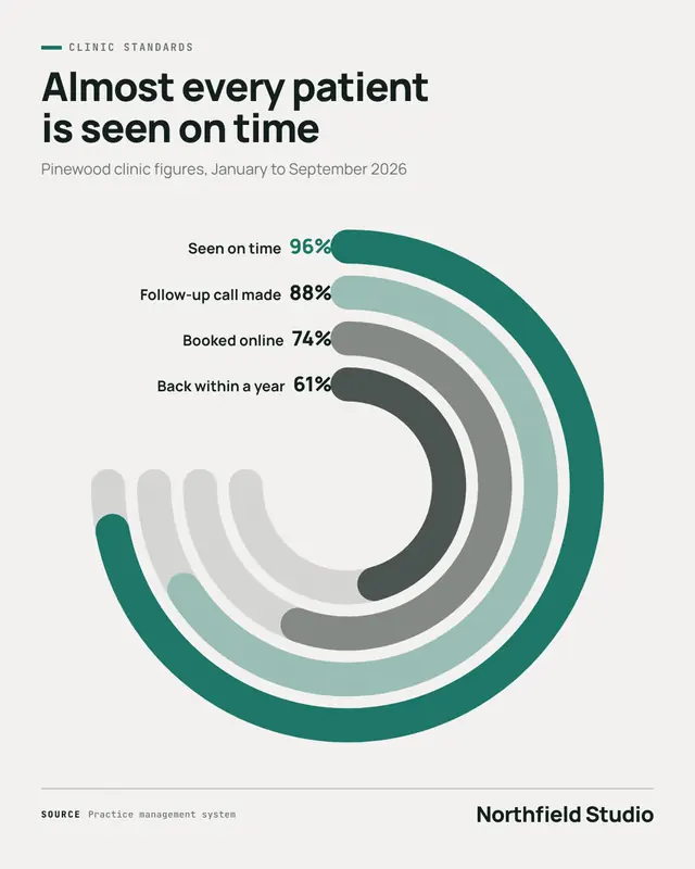
Radial bar chart
A radial bar chart: two to five real percentages as concentric rings, each arc sweeping its share of a three-quarter track (the full track is 100%), named with its value…
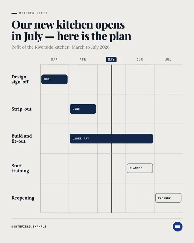
Gantt chart
A Gantt chart: the real periods of a plan across the top, one lane per piece of work with a rounded bar from its start to its end
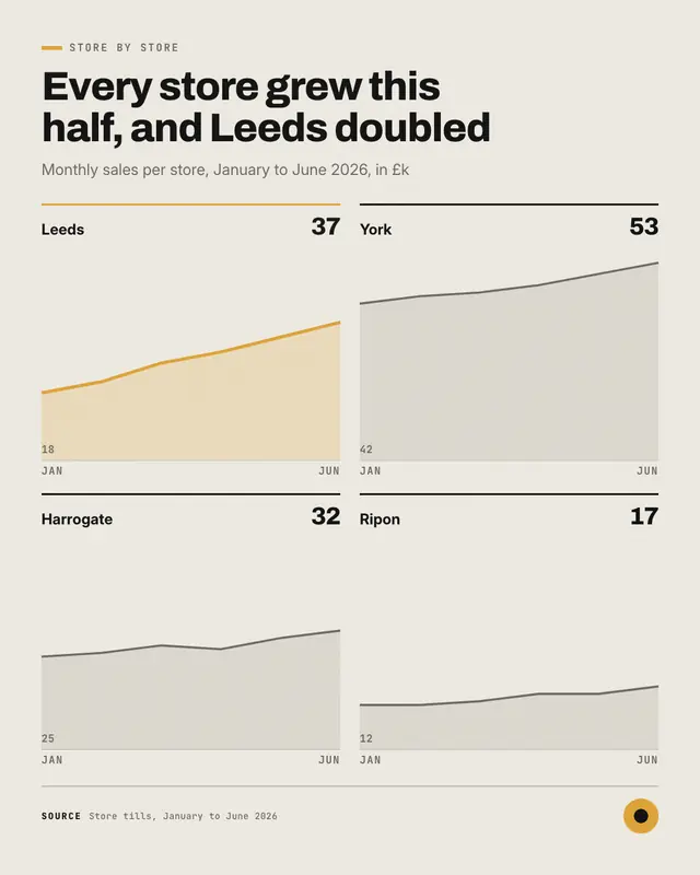
Small multiples
Small multiples: a grid of three to six mini area charts on one shared scale
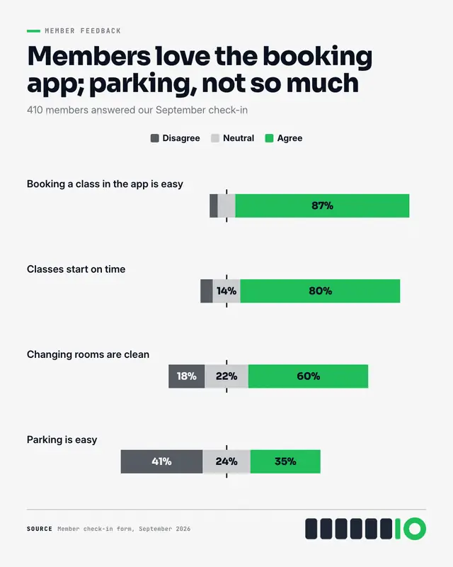
Diverging bars
Diverging bars: each statement people rated as one bar centred on a middle line
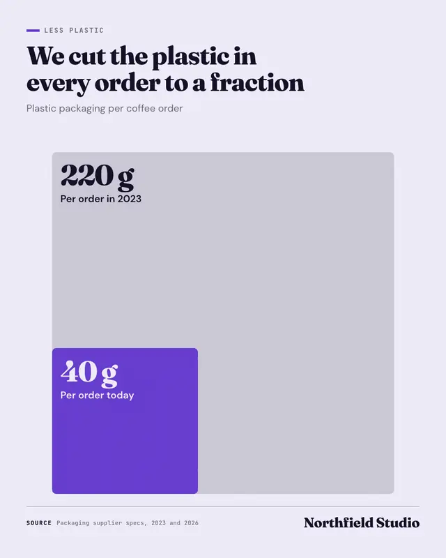
Proportional squares
Proportional squares: two to four real amounts drawn as nested squares from one corner, each square's area true to its value
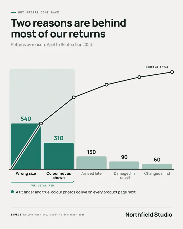
Pareto chart
A Pareto chart: four to eight causes as columns sorted largest first, each printed with its real count, a running-total line climbing over them, and the first few that…
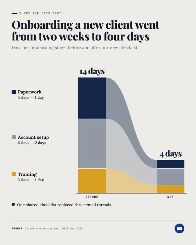
Breakdown bars
Breakdown bars: the same total split into its parts twice
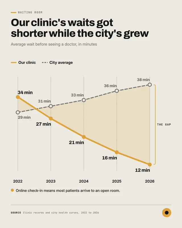
Gap chart
A gap chart: two lines over three to seven periods
Samples use fictional brands; MarketiQ fills each template with your brand, facts and copy.
More ways to carry a message
Let the AI pick the right Charts & graphs template.
Write the post, or let your AI team write it. The Creative Director reads it, picks the template that carries it best and fills it with your brand; it goes out on the approval rules you set.