Gap chart
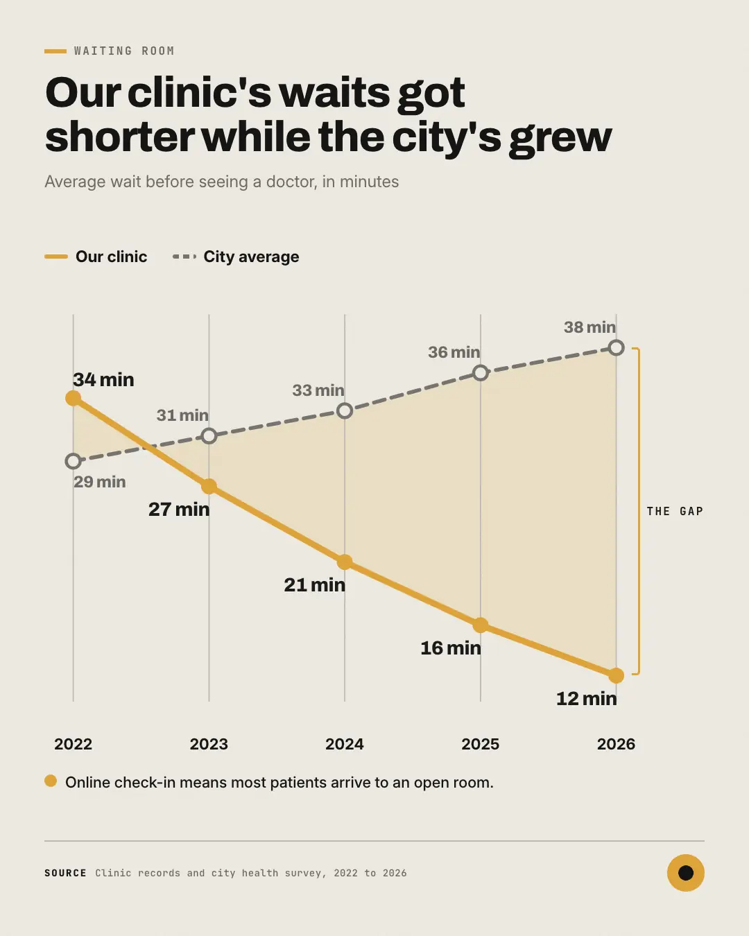
A gap chart: two lines over three to seven periods — the brand's own in its colour, the one it is measured against dashed in quiet ink — with the space between them shaded and every point printed with its real value — a gap opening up over time, or a brand starting to 'close the gap'.
When the AI picks it
MarketiQ’s Creative Director favours the Gap chart for posts that prove a point or teach, when the message is a side-by-side comparison, a contrast (this, not that) or a timeline. It is built first to prove a point.
It reads each post’s goal and shape first, then its own words, the platform and the facts you have, and offers this template only where it fits.
Who it’s for
Any business. Nothing in it assumes what you sell, so the Director can offer it to a software company, a café or a coaching centre alike — whenever the post fits.
Platforms and sizes
| Size | Where |
|---|---|
| 4:51080 × 1350 px | Instagram, Facebook, LinkedIn, Threads, Reddit |
| 1:11080 × 1080 px | Ads |
| 9:161080 × 1920 px | TikTok |
| 2:31000 × 1500 px | |
| 16:91600 × 900 px | X, YouTube |
| 1.91:11200 × 628 px | Newsletter, Blog |
Single image. Each size is laid out for its canvas, not cropped; the sample above is the 4:5 version.
What it needs
The Director offers it only when these exist. Without them it simply picks another template.
- A real number from your post or your brand facts
Rules the AI follows
Word for word from the template library. The Director follows the copy rules when it writes into the template, and the visual review checks every creative against the visual rules.
Copy rules
- Every value is a real figure from the post or the brand's facts, written as the source writes it.
- Both lines measure the same thing in the same unit over the same periods.
- The headline says whether the gap opened or closed, in words; never a computed difference the copy does not state.
Visual rules
- Two lines across evenly spaced periods — a solid brand line with filled dots and a dashed quiet-ink line with ringed dots — the band between them softly tinted; every point carries its printed value.
- A key names both lines at the top, periods sit under the plot, and a brand bracket marks the gap at the last period with its label.
More Charts & graphs templates
Waterfall chart
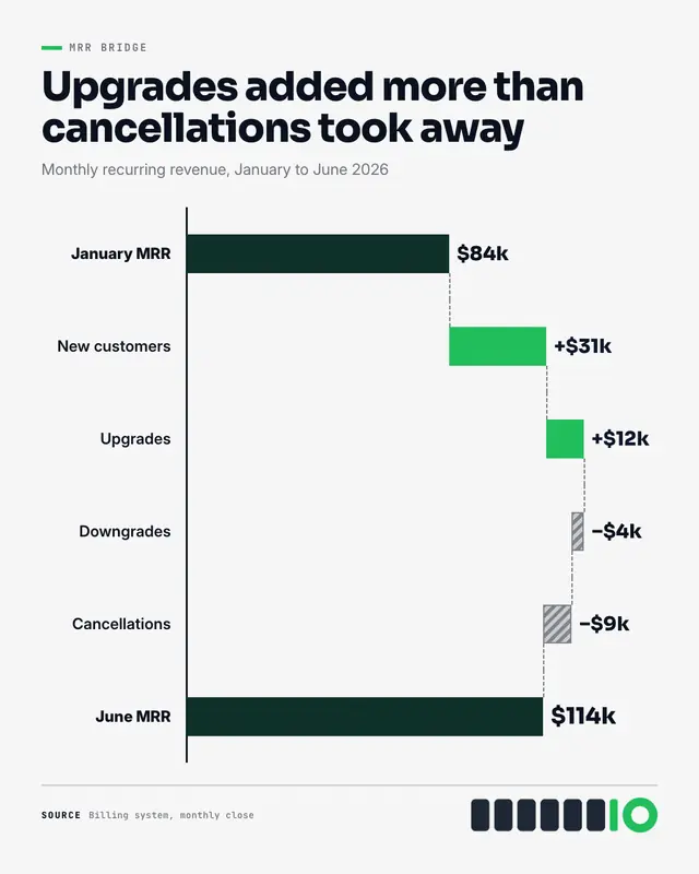
A waterfall chart: the starting total, then each real gain and loss as a floating bar stepping up or down from the last, joined by dashed level lines, to the closing…
Bump chart
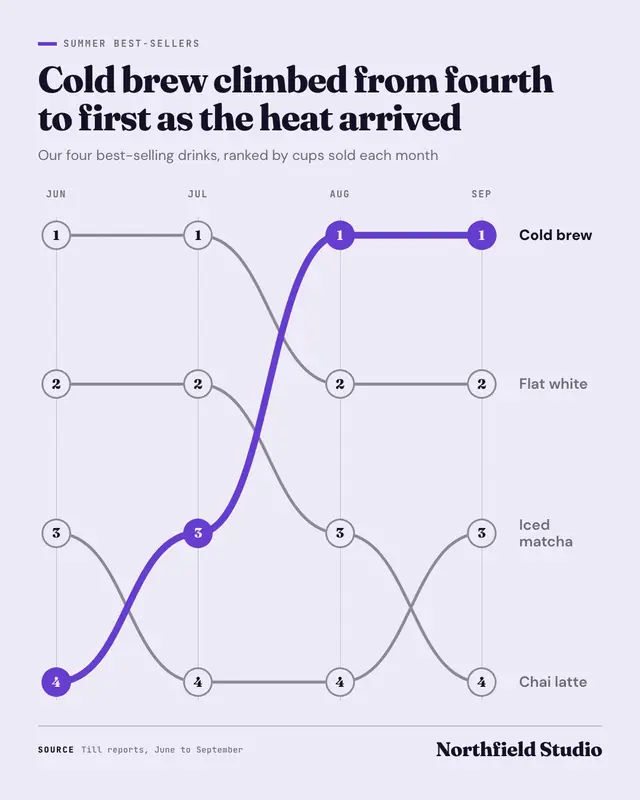
A bump chart: how things ranked over three to six periods
Waffle chart
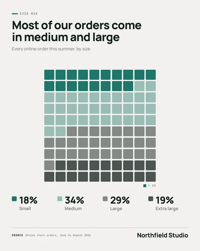
A waffle chart: a ten-by-ten grid of rounded squares, one square per percent, filled in a palette colour per part, beside a legend of each real share
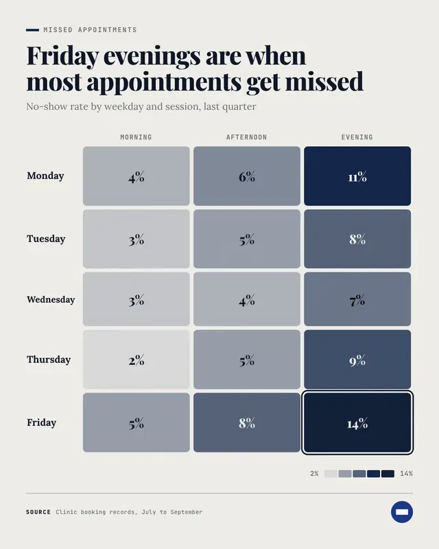
Heatmap
A heatmap: rows against two to five columns, every cell a rounded tile printed with its real value and shaded from a pale tint to deep brand by size, the hottest cell…
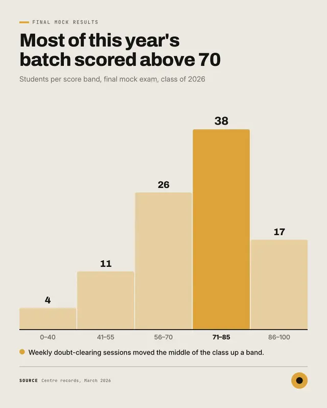
Histogram
A histogram: four to eight touching columns, one per range of a real distribution (scores, delivery days, basket sizes), each labelled with its count and range, the…
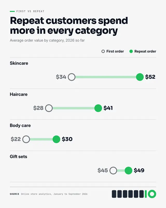
Dumbbell chart
A dumbbell chart: one ruled row per item, two dots on a shared scale
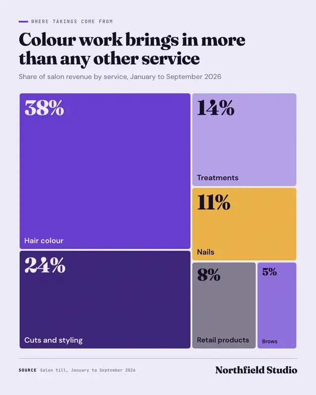
Treemap
A treemap: the whole as one block cut into tiles sized by each part's real value
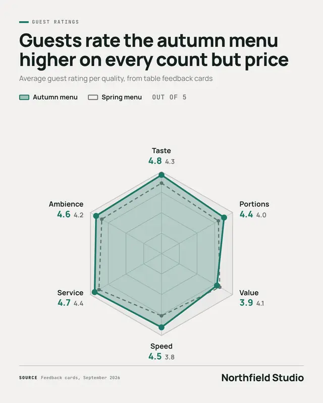
Radar chart
A radar chart (a 'spider chart'): five to eight qualities on spokes of one web, real scores on a stated scale joined into a brand-colour shape (and an optional dashed…
Make a Gap chart with your brand.
MarketiQ writes the post, picks the template that carries it best — this one, when it fits — and fills it with your logo, colours, facts and copy.