Pricing table
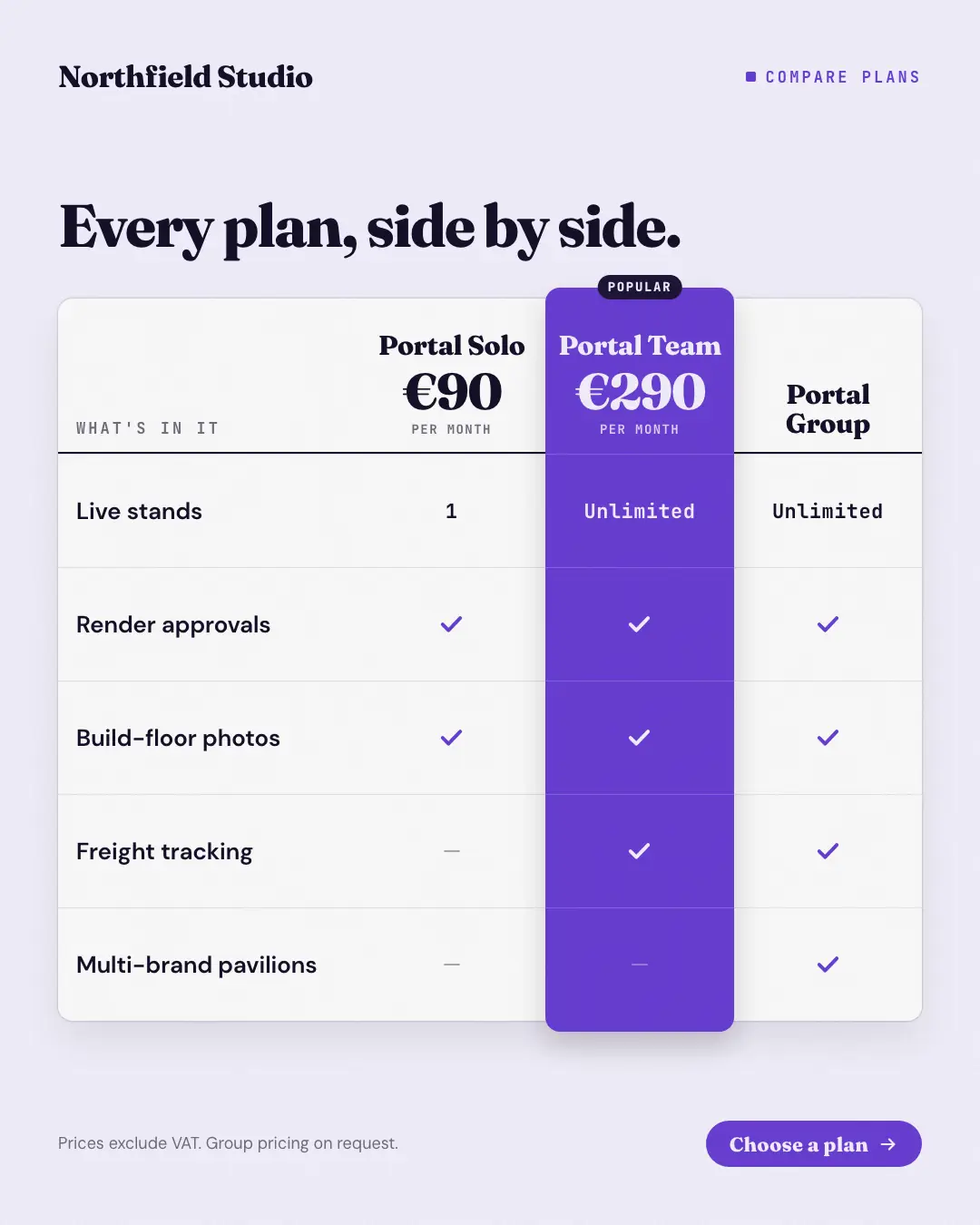
The plan comparison table buyers scroll to on a pricing page: plans across the top with their prices, features down the side, ticks, dashes and short values in each cell — the recommended plan's whole column lifted and filled in the brand colour with a badge. Lets a buyer find their row and their plan in seconds.
When the AI picks it
MarketiQ’s Creative Director favours the Pricing table for posts that get people to act or teach, when the message is a side-by-side comparison or several products or a menu. It is built first to get people to act.
It reads each post’s goal and shape first, then its own words, the platform and the facts you have, and offers this template only where it fits.
Who it’s for
Any business. Nothing in it assumes what you sell, so the Director can offer it to a software company, a café or a coaching centre alike — whenever the post fits.
Platforms and sizes
| Size | Where |
|---|---|
| 4:51080 × 1350 px | Instagram, Facebook, LinkedIn, Threads, Pinterest, Reddit |
| 1:11080 × 1080 px | Ads |
| 9:161080 × 1920 px | TikTok |
| 16:91600 × 900 px | X, YouTube |
| 1.91:11200 × 628 px | Newsletter, Blog |
Single image. Each size is laid out for its canvas, not cropped; the sample above is the 4:5 version.
What it needs
The Director offers it only when these exist. Without them it simply picks another template.
- A real product or service you sell
- A real price from your catalogue
Rules the AI follows
Word for word from the template library. The Director follows the copy rules when it writes into the template, and the visual review checks every creative against the visual rules.
Copy rules
- Plan names and prices exactly as the brand's catalog states them; cells say only what each plan really includes.
- Use 'yes'/'no' for ticks and dashes, or a short value ('5 seats') only when the catalog states it.
Visual rules
- A white comparison table: plan names and big prices across the top over a heavy ink rule, features down the left in body type, hairline rows, brand ticks and grey dashes in the cells.
- The recommended plan's full column is lifted as a brand-colour pill-ended band with a dark badge above it and its ticks in the on-brand colour; headline above, button and small print below.
More Pricing & integrations templates
New-price shelf label
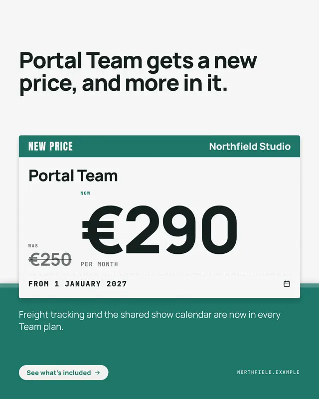
A price change announced on the shelf-edge label shoppers already trust: a brand-colour header with 'NEW PRICE', the plan's name, the old price struck through beside the…
Tear-off coupon
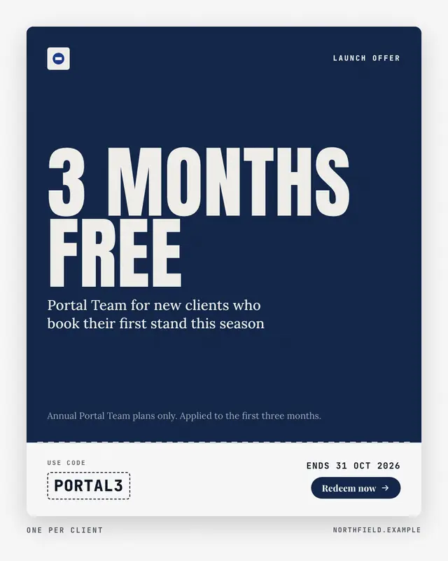
An introductory offer cut out as a coupon: a brand-colour face with the offer set in huge condensed capitals and what it applies to, a perforated tear-off stub with the…
Co-brand lockup
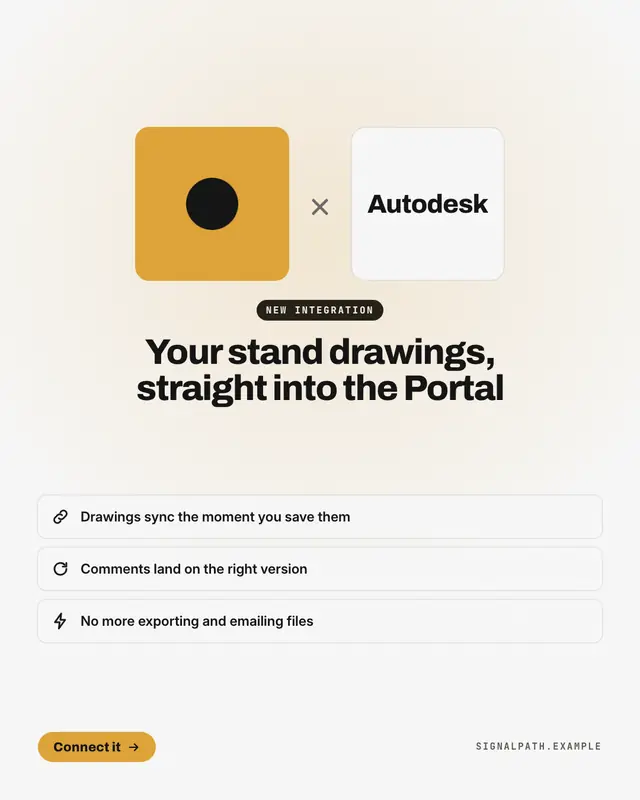
A new integration or a 'partnership with' another brand, announced the way brands announce it to each other: the co-branded lockup
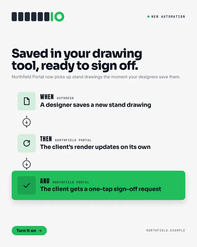
Automation recipe
An integration explained as the automation it enables: a recipe card of two or three steps joined by a dashed line
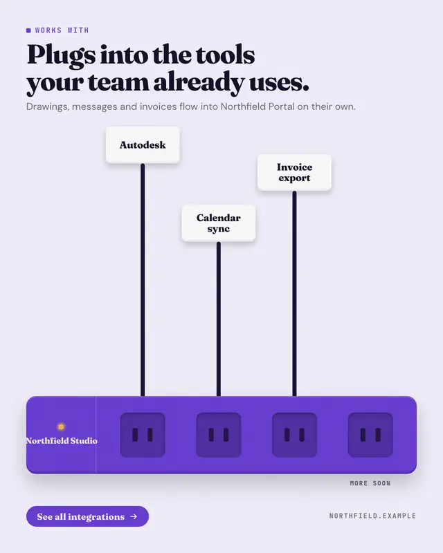
Plugs into your stack
'Works with' drawn as a power strip in the brand colour
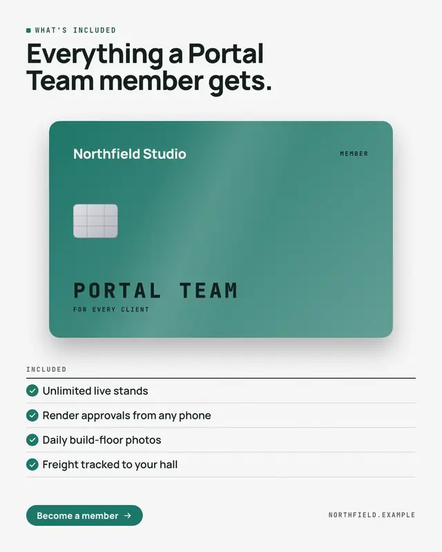
Membership card
'What's included' as the member card a customer gets: a premium card in the brand colour
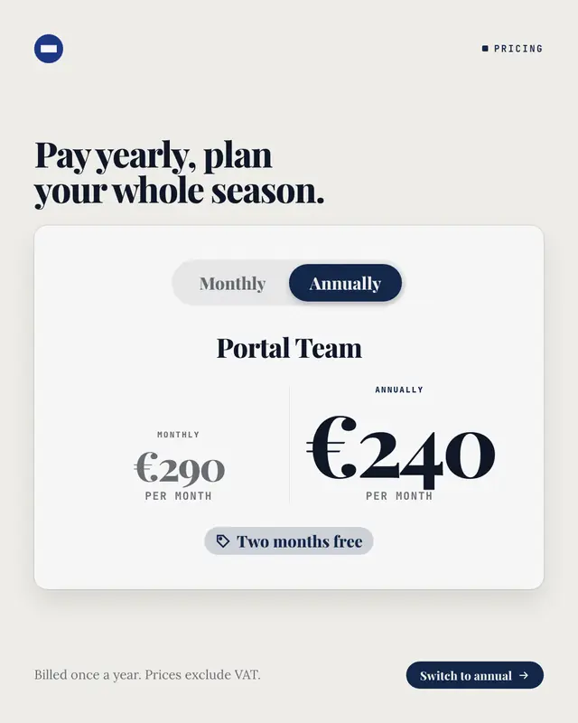
Monthly or annual switch
The billing switch from a pricing page, flipped to annual: a pill toggle with 'Monthly' and the selected 'Annually' in the brand colour, the plan's name, both prices…
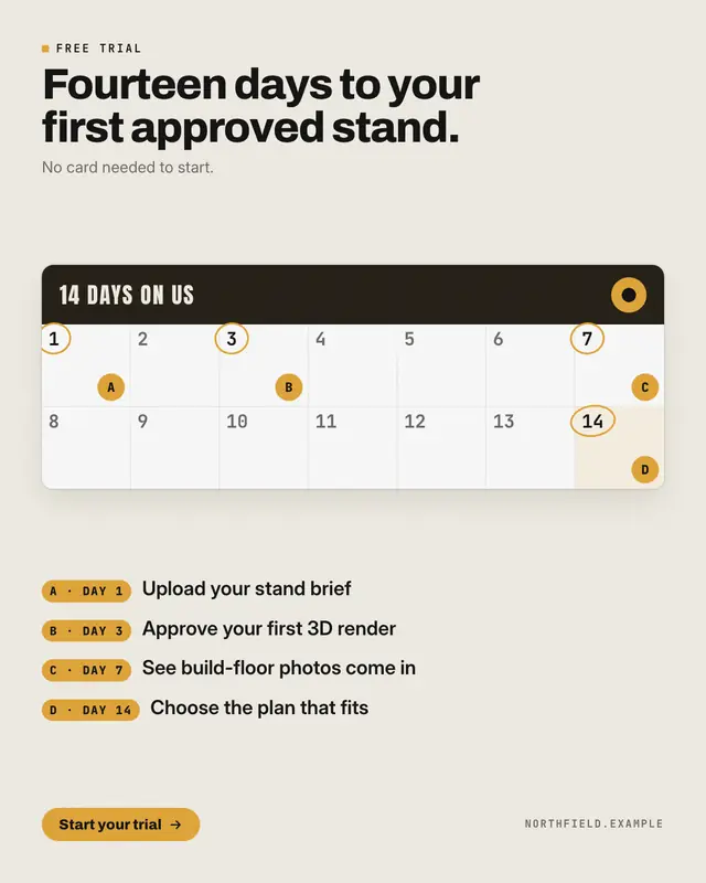
Free-trial calendar
A free trial laid out on the calendar it lasts: a card with every day of the trial numbered
Make a Pricing table with your brand.
MarketiQ writes the post, picks the template that carries it best — this one, when it fits — and fills it with your logo, colours, facts and copy.