Co-brand lockup
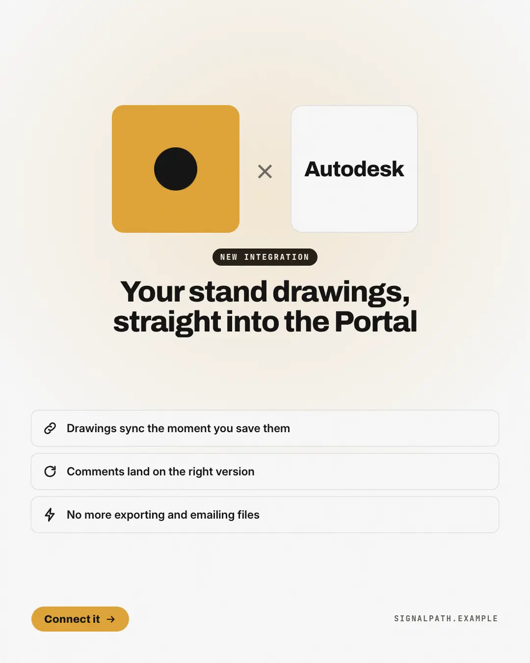
A new integration or a 'partnership with' another brand, announced the way brands announce it to each other: the co-branded lockup — the brand's logo on its own colour tile, a thin '×', and the partner's name set in type on a white tile (never their logo) — over a 'new integration' tag, the headline and what the two now do together. Instantly reads as two products that now work as one.
When the AI picks it
MarketiQ’s Creative Director favours the Co-brand lockup for posts that announce news or get people to act, when the message is one sharp insight or a list. It is built first to announce news.
It reads each post’s goal and shape first, then its own words, the platform and the facts you have, and offers this template only where it fits.
Who it’s for
Made for Software & apps. The Director offers it only to brands of that kind, so it never turns up for a business it does not suit.
Platforms and sizes
| Size | Where |
|---|---|
| 4:51080 × 1350 px | Instagram, Facebook, LinkedIn, Threads, Pinterest, Reddit |
| 1:11080 × 1080 px | Ads |
| 9:161080 × 1920 px | TikTok |
| 16:91600 × 900 px | X, YouTube |
| 1.91:11200 × 628 px | Newsletter, Blog |
Single image. Each size is laid out for its canvas, not cropped; the sample above is the 4:5 version.
What it needs
The Director offers it only when these exist. Without them it simply picks another template.
- The tools your product really connects with
Rules the AI follows
Word for word from the template library. The Director follows the copy rules when it writes into the template, and the visual review checks every creative against the visual rules.
Copy rules
- The partner is a tool the brand's own facts list as an integration — set in type, never a logo.
- Benefits say what the two do together, from the post; no invented customers or numbers.
Visual rules
- A centred lockup: the brand logo on a rounded brand-colour tile, a thin '×', and the partner's name in the heading face on a white tile of the same size, under a soft brand halo on a pale ground.
- A dark 'new integration' pill, the headline centred, then up to three white benefit cards with brand icons; button and website at the foot (lockup on the left on landscape).
More Pricing & integrations templates
Automation recipe
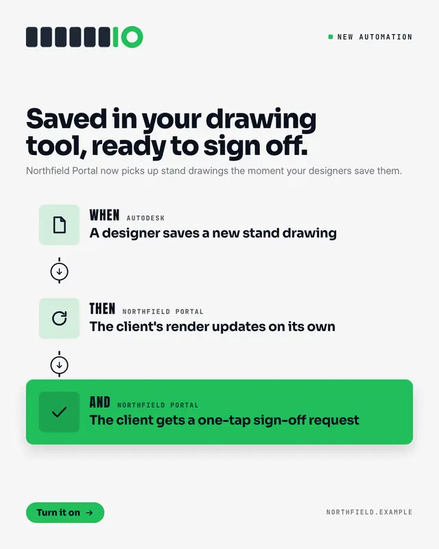
An integration explained as the automation it enables: a recipe card of two or three steps joined by a dashed line
Plugs into your stack
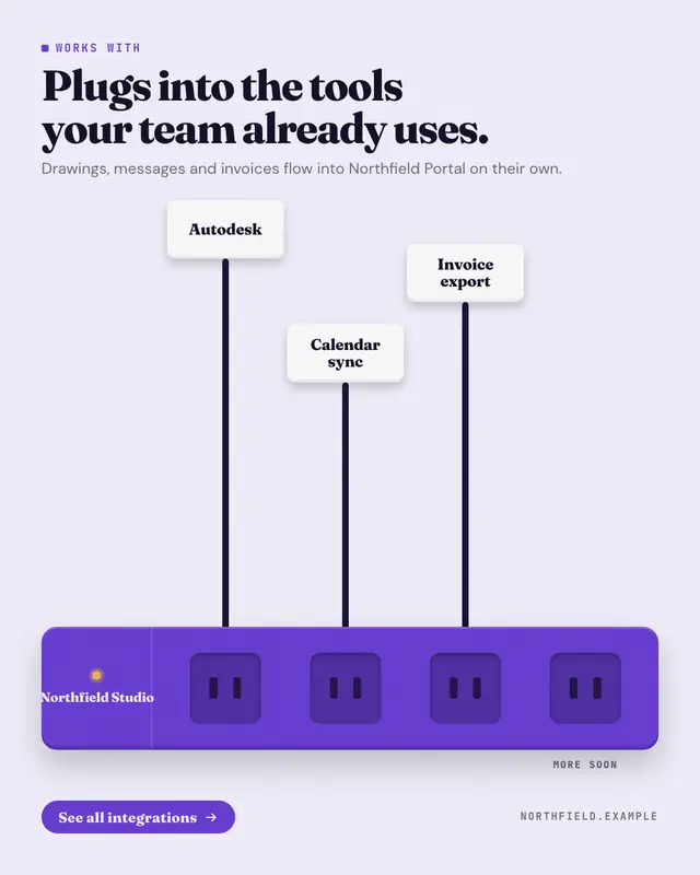
'Works with' drawn as a power strip in the brand colour
Membership card
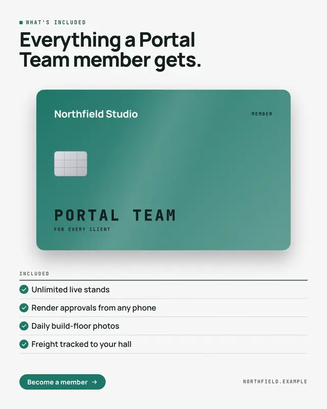
'What's included' as the member card a customer gets: a premium card in the brand colour
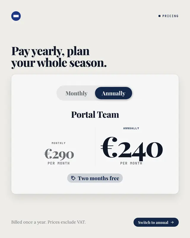
Monthly or annual switch
The billing switch from a pricing page, flipped to annual: a pill toggle with 'Monthly' and the selected 'Annually' in the brand colour, the plan's name, both prices…
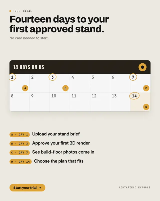
Free-trial calendar
A free trial laid out on the calendar it lasts: a card with every day of the trial numbered
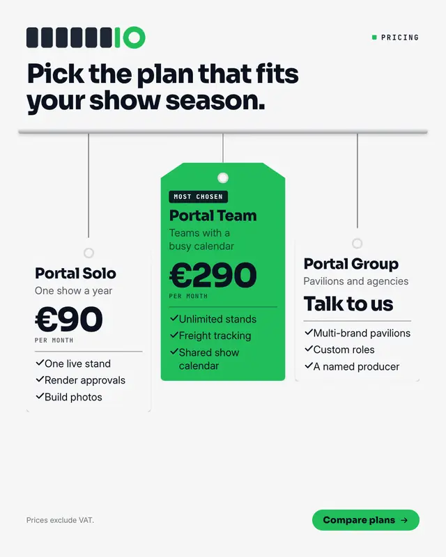
Price swing tags
Plans as swing tags hanging from a rail on strings of different lengths: each tag punched with a hole and carrying the plan's name, who it is for, the price set big and…
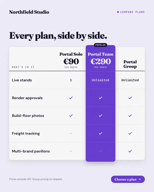
Pricing table
The plan comparison table buyers scroll to on a pricing page: plans across the top with their prices, features down the side, ticks, dashes and short values in each cell
New-price shelf label
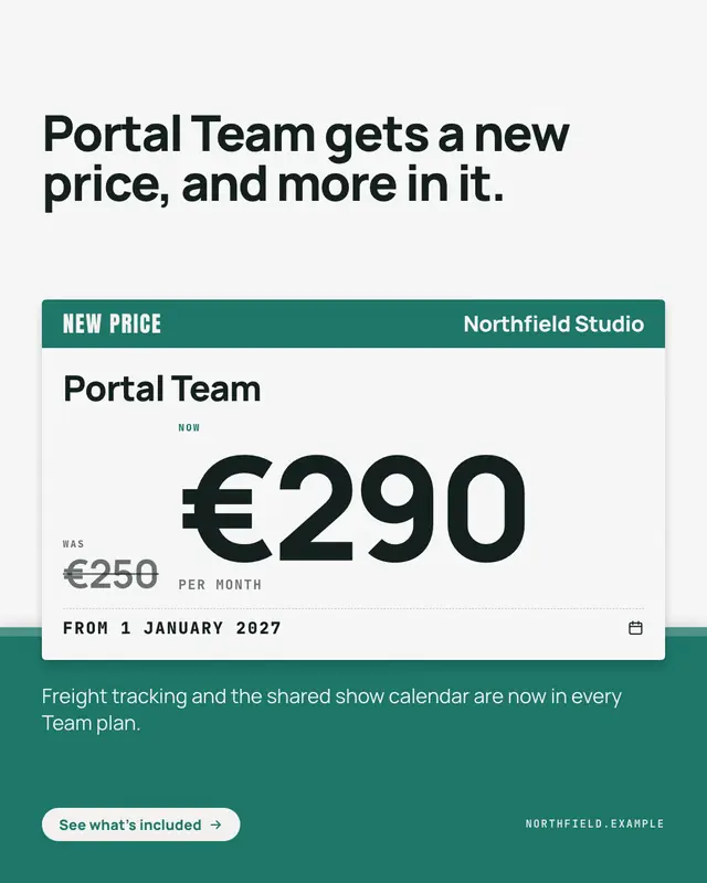
A price change announced on the shelf-edge label shoppers already trust: a brand-colour header with 'NEW PRICE', the plan's name, the old price struck through beside the…
Make a Co-brand lockup with your brand.
MarketiQ writes the post, picks the template that carries it best — this one, when it fits — and fills it with your logo, colours, facts and copy.