File window
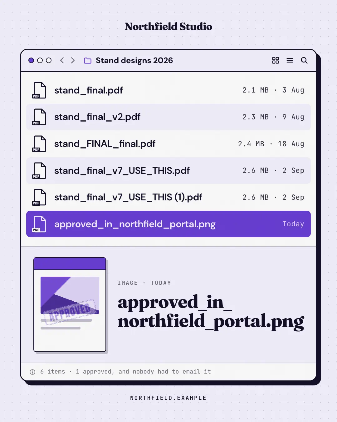
A desktop file window whose file names tell the story — final.pdf, final_v2.pdf, FINAL_final_v7.pdf — ending on the one selected file the brand delivers. Everyone has lived this folder.
When the AI picks it
MarketiQ’s Creative Director favours the File window for posts that entertain, start a conversation or teach, when the message is a story, a list, a contrast (this, not that) or a timeline. It is built first to entertain.
It reads each post’s goal and shape first, then its own words, the platform and the facts you have, and offers this template only where it fits.
Who it’s for
Any business. Nothing in it assumes what you sell, so the Director can offer it to a software company, a café or a coaching centre alike — whenever the post fits.
Platforms and sizes
| Size | Where |
|---|---|
| 4:51080 × 1350 px | Instagram, Facebook, LinkedIn, Threads, Reddit |
| 1:11080 × 1080 px | Ads |
| 9:161080 × 1920 px | TikTok |
| 2:31000 × 1500 px | |
| 16:91600 × 900 px | X, YouTube, Blog |
Single image. Each size is laid out for its canvas, not cropped; the sample above is the 4:5 version.
What it needs
Only your post. It is made from your copy and your brand kit — there is nothing else to prepare.
Rules the AI follows
Word for word from the template library. The Director follows the copy rules when it writes into the template, and the visual review checks every creative against the visual rules.
Copy rules
- File names are realistic (lower case, underscores, versions, extensions) and get more desperate down the list.
- The last file is the brand's answer; no invented numbers in the status line unless they are counts of the files shown.
- Short canvases drop files from the middle of the list (square keeps 6, landscape 4); the last always stays.
Visual rules
- A white desktop window with an ink outline and hard shadow: dot buttons (one brand), path with folder icon, zebra-striped rows with document icons and extension badges; the last file selected in the brand colour.
- A preview pane repeats the selected file's name big in the heading face beside a document thumbnail (optional stamp) — below the list on portrait, beside it on landscape; square shows the list alone.
More UI mimic templates
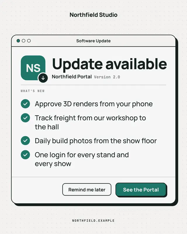
Update available
A clean, OS-agnostic software-update window: the brand as the app icon, 'Update available', a ruled What's-new list of what the offering now does and an 'Update now'…
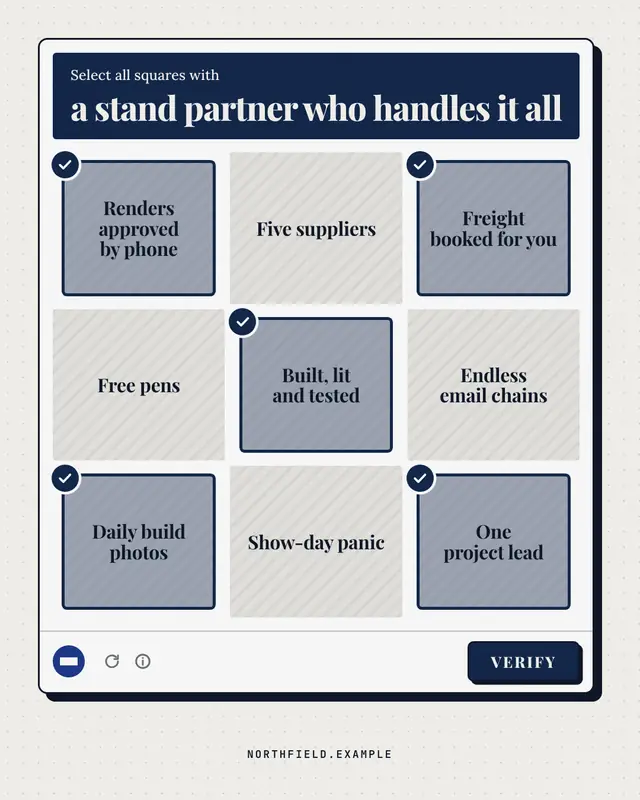
Are you human? check
A generic 'select all squares with…' verification panel: the challenge names what a good choice looks like, nine text tiles mix the brand's real strengths (ticked) with…
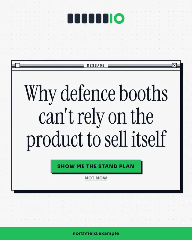
System dialog
A crisp OS alert box with the insight as the message and two buttons as the punchline
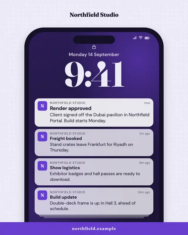
Push notification stack
A phone lock screen with a stack of notifications from the brand
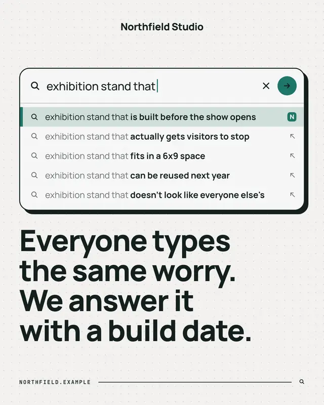
Search autocomplete
A search box mid-query with the autocomplete dropdown revealing what people really search for
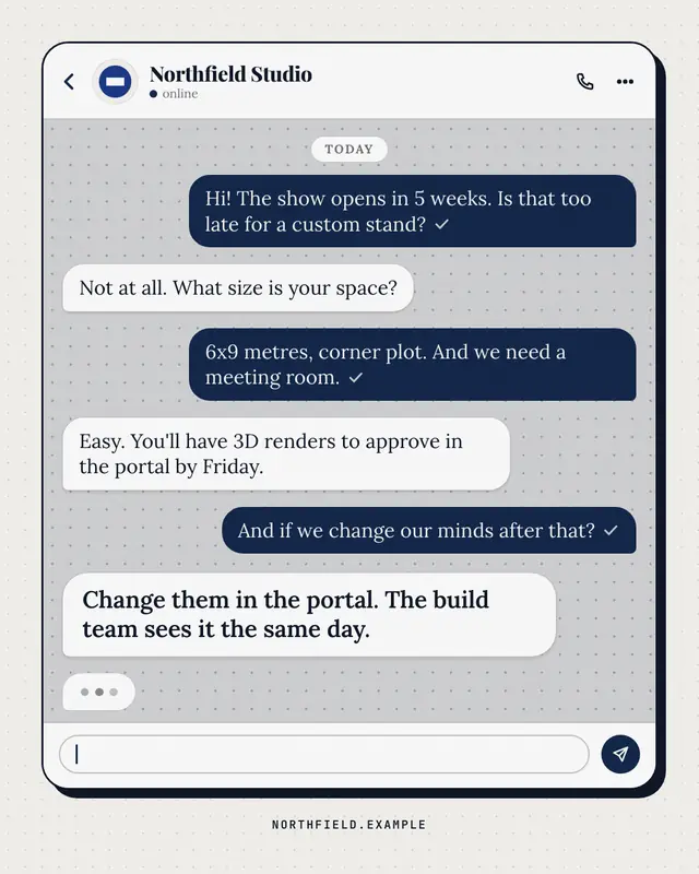
Chat thread
A generic messaging thread between a customer and the brand
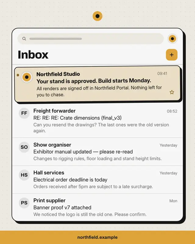
Inbox
An email inbox full of the buyer's everyday noise
Calendar invite
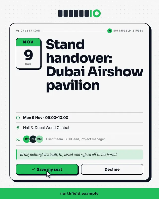
A calendar invitation card
Make a File window with your brand.
MarketiQ writes the post, picks the template that carries it best — this one, when it fits — and fills it with your logo, colours, facts and copy.