Inbox
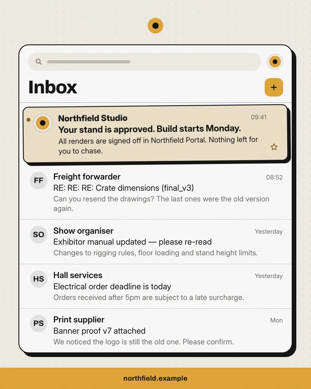
An email inbox full of the buyer's everyday noise — chasers, deadlines, 'RE: RE:' — with one highlighted unread message from the brand that says exactly what they wanted to hear.
When the AI picks it
MarketiQ’s Creative Director favours the Inbox for posts that entertain, start a conversation, get people to act or announce news, when the message is a contrast (this, not that), a list, one sharp insight or a story. It is built first to entertain.
It reads each post’s goal and shape first, then its own words, the platform and the facts you have, and offers this template only where it fits.
Who it’s for
Any business. Nothing in it assumes what you sell, so the Director can offer it to a software company, a café or a coaching centre alike — whenever the post fits.
Platforms and sizes
| Size | Where |
|---|---|
| 4:51080 × 1350 px | Instagram, Facebook, LinkedIn, Threads, Reddit |
| 1:11080 × 1080 px | Ads |
| 9:161080 × 1920 px | TikTok |
| 2:31000 × 1500 px | |
| 16:91600 × 900 px | X, YouTube, Blog |
Single image. Each size is laid out for its canvas, not cropped; the sample above is the 4:5 version.
What it needs
Only your post. It is made from your copy and your brand kit — there is nothing else to prepare.
Rules the AI follows
Word for word from the template library. The Director follows the copy rules when it writes into the template, and the visual review checks every creative against the visual rules.
Copy rules
- The brand's email is the calm answer; the other subjects are recognisable pains of the buyer's job.
- Senders are companies or roles, never invented people; no invented numbers in subjects.
- Put the brand's email first; square shows four emails and 16:9 the brand's email plus the next two.
Visual rules
- A white mail app with an ink outline and hard shadow; read emails in regular weight with neutral initials, the brand's unread email tinted with a brand dot, bold subject and the brand's avatar.
- Logo above; brand footer bar with the website (a mono sign-off on stories).
More UI mimic templates
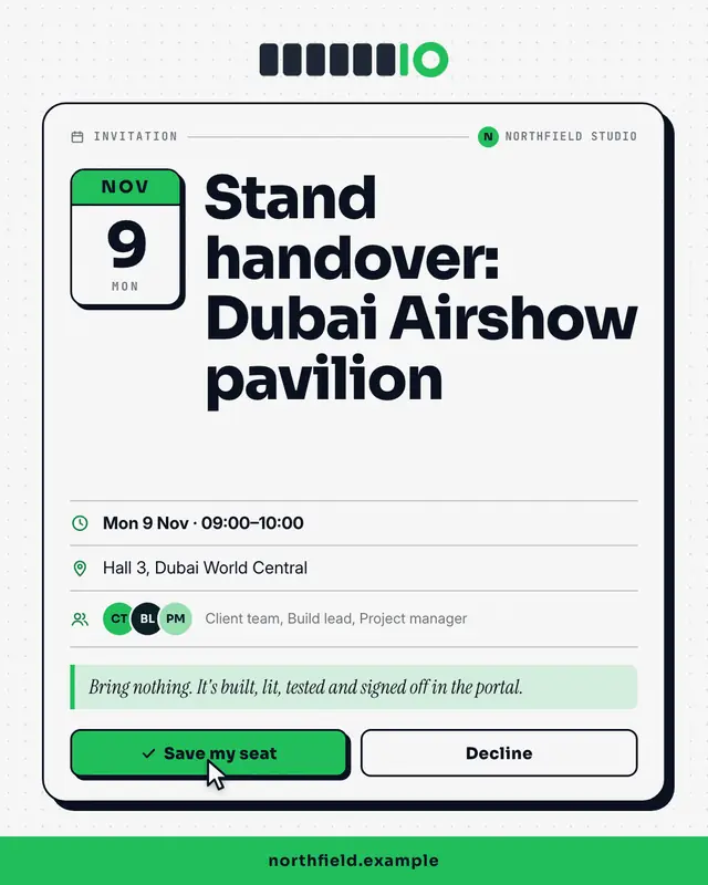
Calendar invite
A calendar invitation card
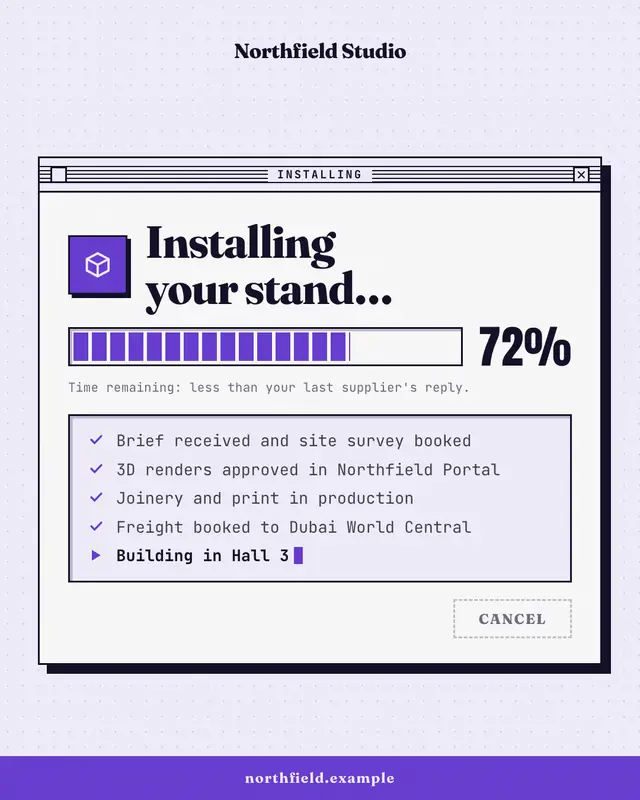
Progress dialog
A retro installer window
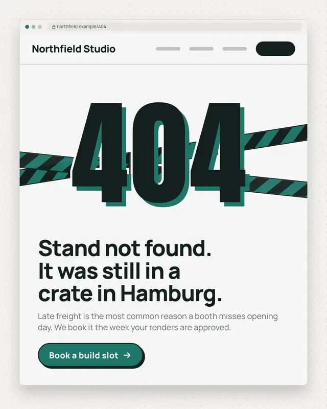
Error page
A browser window showing a 404-style error page
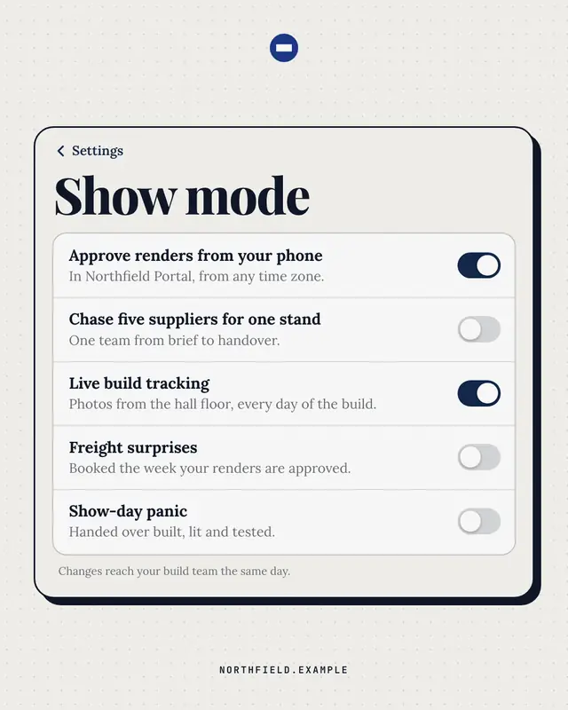
Settings toggles
A phone settings screen whose switches say it all
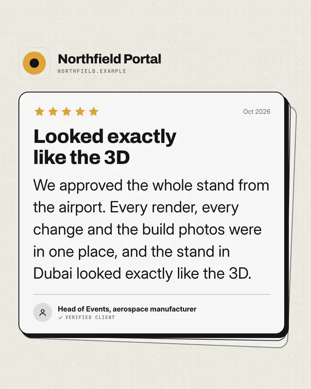
App review
An app-store review card
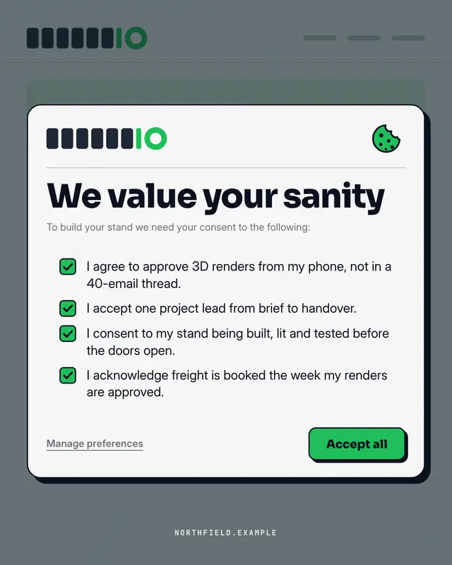
Consent modal
A cookie / terms consent pop-up over the brand's own site
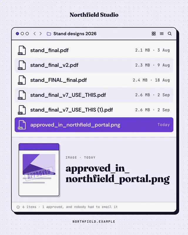
File window
A desktop file window whose file names tell the story
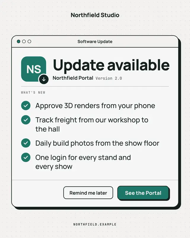
Update available
A clean, OS-agnostic software-update window: the brand as the app icon, 'Update available', a ruled What's-new list of what the offering now does and an 'Update now'…
Make a Inbox with your brand.
MarketiQ writes the post, picks the template that carries it best — this one, when it fits — and fills it with your logo, colours, facts and copy.