Benchmark
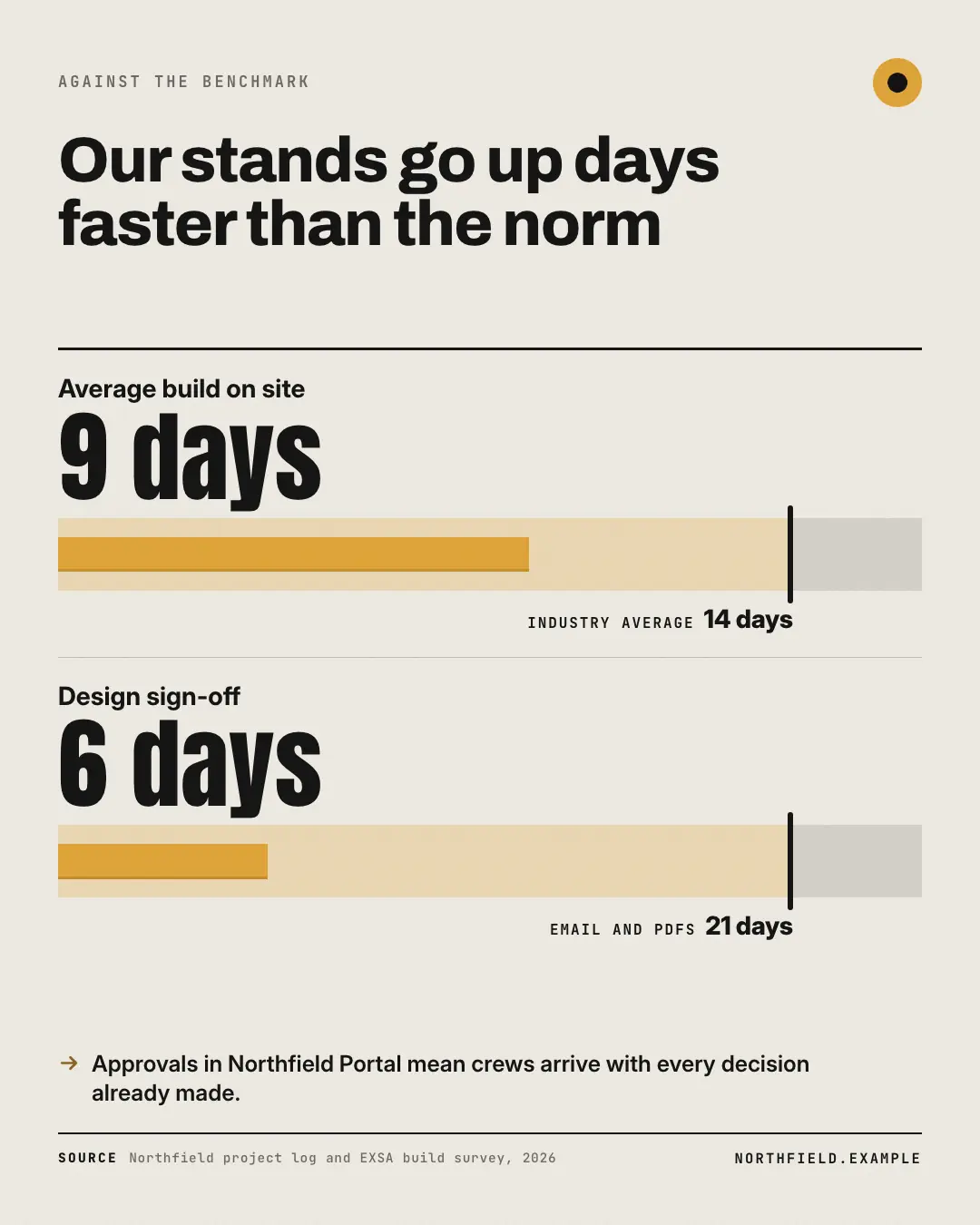
A bullet chart: each measure's real value as a brand bar across a track split at the benchmark — the better side tinted, the other grey — with the benchmark as an ink marker carrying its own label. 'Us versus the norm' read in one glance.
When the AI picks it
MarketiQ’s Creative Director favours the Benchmark for posts that prove a point, get people to act or teach, when the message is a number, a side-by-side comparison or a contrast (this, not that). It is built first to prove a point.
It reads each post’s goal and shape first, then its own words, the platform and the facts you have, and offers this template only where it fits.
Who it’s for
Any business. Nothing in it assumes what you sell, so the Director can offer it to a software company, a café or a coaching centre alike — whenever the post fits.
Platforms and sizes
| Size | Where |
|---|---|
| 4:51080 × 1350 px | Instagram, Facebook, LinkedIn, Threads, Pinterest, Reddit |
| 1:11080 × 1080 px | Ads |
| 9:161080 × 1920 px | TikTok |
| 16:91600 × 900 px | X, YouTube |
| 1.91:11200 × 628 px | Newsletter, Blog |
Single image. Each size is laid out for its canvas, not cropped; the sample above is the 4:5 version.
What it needs
The Director offers it only when these exist. Without them it simply picks another template.
- A real number from your post or your brand facts
Rules the AI follows
Word for word from the template library. The Director follows the copy rules when it writes into the template, and the visual review checks every creative against the visual rules.
Copy rules
- Both the value and its benchmark are verbatim from the source, measured the same way and in the same unit.
- Name the benchmark as the source does (industry average, last year, the brief); never invent one.
Visual rules
- A track split at the benchmark into a brand-tint 'better' band and a grey band, the brand value bar drawn to scale inside it and an ink marker standing proud at the benchmark with its label beneath.
- Big condensed value left of each track under a bold label; ruled rows; takeaway and source below.
More Data & proof templates
Slope chart
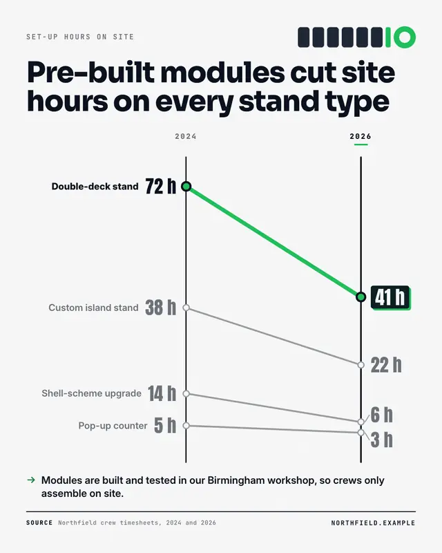
Before and after for several things at once: two ink columns joined by a line per item, drawn to scale from the real values, the biggest change in thick brand colour and…

Pictogram
A share made countable: the real figure set huge ('7 in 10', '70%') over an icon array
Goal tracker
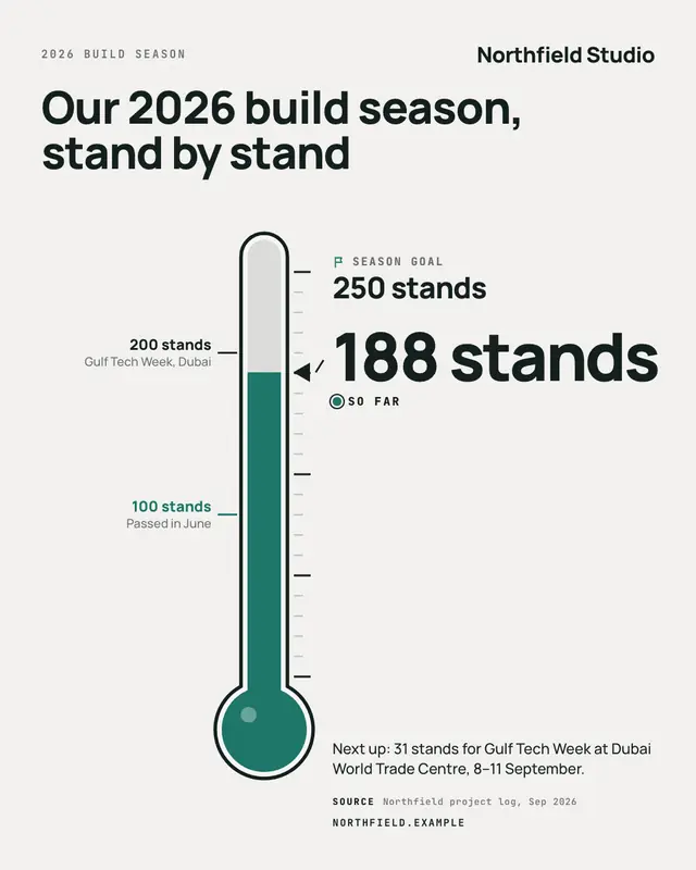
A goal you can watch fill: a big thermometer (a long gauge on landscape) filled in brand colour to exactly where the real figure stands against the real target…
Big stat
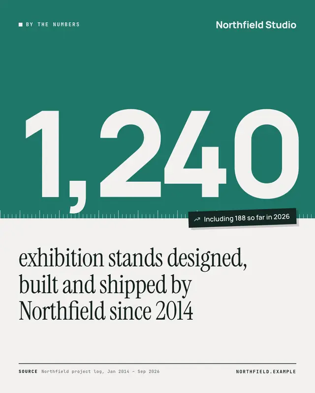
One real number set as a monument on a brand-colour field with a measuring-rule edge, the claim it proves in a large serif and the source as a footnote
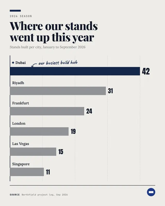
Bar chart
An editorial horizontal bar chart (brand tab, headline, measure line, dashed quartile guides) whose bars are scaled from the printed values
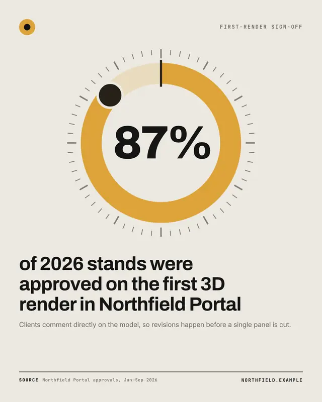
Percentage dial
One real percentage drawn as a brand-colour donut inside an instrument dial (minute ticks, start notch, a knob where the arc ends) with the figure in the centre and the…
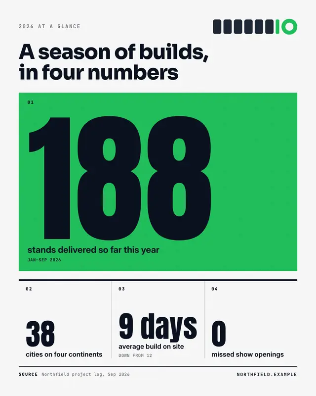
Metric grid
An annual-report KPI page: one hero metric on a brand-colour block, the supporting metrics in ruled editorial columns beneath
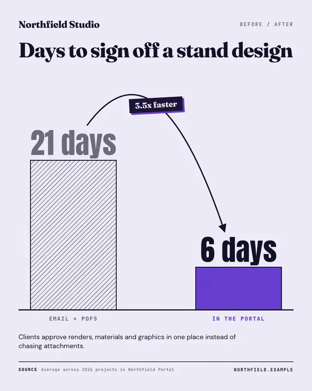
Before / after metric
One metric, two real values: a hatched 'before' column and a brand 'after' column drawn to scale on one baseline, joined by a jump arrow carrying the delta
Make a Benchmark with your brand.
MarketiQ writes the post, picks the template that carries it best — this one, when it fits — and fills it with your logo, colours, facts and copy.