Comparison matrix
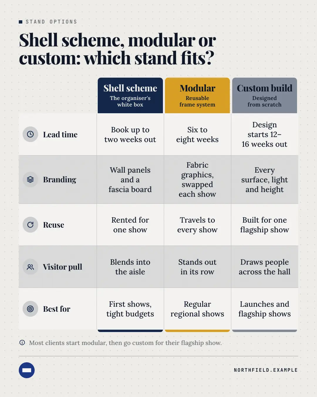
A premium comparison table: each option heads its column as a solid block in its own palette colour, criteria run down the left with tinted icons, and short phrases fill banded, hairline-ruled cells — the explainer people save because the differences read at a glance.
When the AI picks it
MarketiQ’s Creative Director favours the Comparison matrix for posts that teach, prove a point, get people to act or start a conversation, when the message is a side-by-side comparison, a contrast (this, not that) or a list. It is built first to teach.
It reads each post’s goal and shape first, then its own words, the platform and the facts you have, and offers this template only where it fits.
Who it’s for
Any business. Nothing in it assumes what you sell, so the Director can offer it to a software company, a café or a coaching centre alike — whenever the post fits.
Platforms and sizes
| Size | Where |
|---|---|
| 4:51080 × 1350 px | Instagram, Facebook, LinkedIn, Threads, Pinterest, Reddit |
| 1:11080 × 1080 px | Ads |
| 9:161080 × 1920 px | TikTok |
| 16:91600 × 900 px | X, YouTube |
| 1.91:11200 × 628 px | Newsletter, Blog |
Single image. Each size is laid out for its canvas, not cropped; the sample above is the 4:5 version.
What it needs
Only your post. It is made from your copy and your brand kit — there is nothing else to prepare.
Rules the AI follows
Word for word from the template library. The Director follows the copy rules when it writes into the template, and the visual review checks every creative against the visual rules.
Copy rules
- Every cell is a short phrase (2–6 words) about the same criterion for that option — no full sentences.
- Options and criteria are named the way the source names them; facts and numbers only from the copy.
- The headline asks or answers the comparison; the footnote (optional) says who each option is best for.
Visual rules
- Option headers are solid blocks in distinct palette colours (brand, second colour, night, brand tints/shades).
- Criteria on the left with tinted icon discs; banded rows and hairline rules; all cells share one type size.
- Each column is closed by a thin cap in its colour; a missing cell shows a muted dash, never invented copy.
More Infographics templates
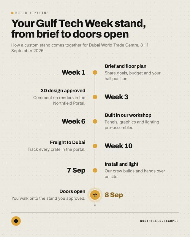
Timeline
A clean milestone timeline
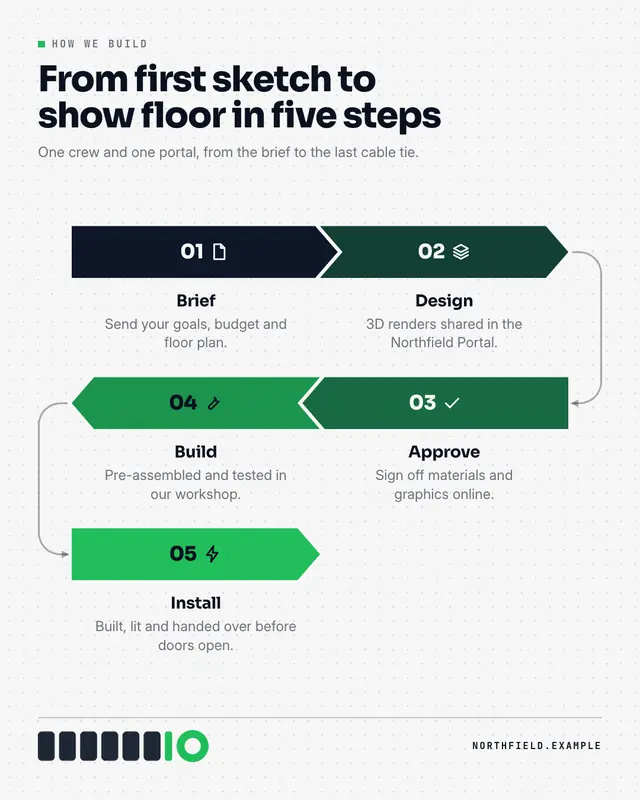
Process flow
A pipeline of interlocking chevrons
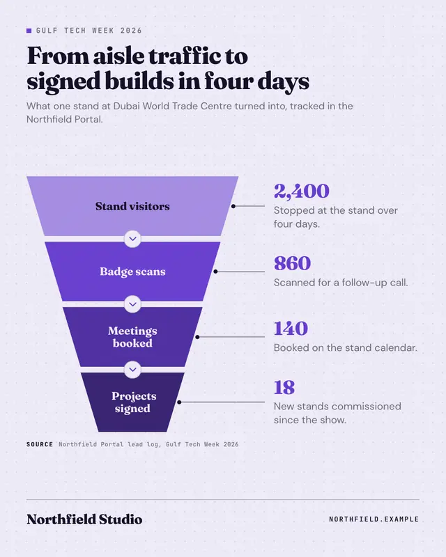
Funnel
A stacked funnel of three to five trapezoids narrowing downward and deepening in colour
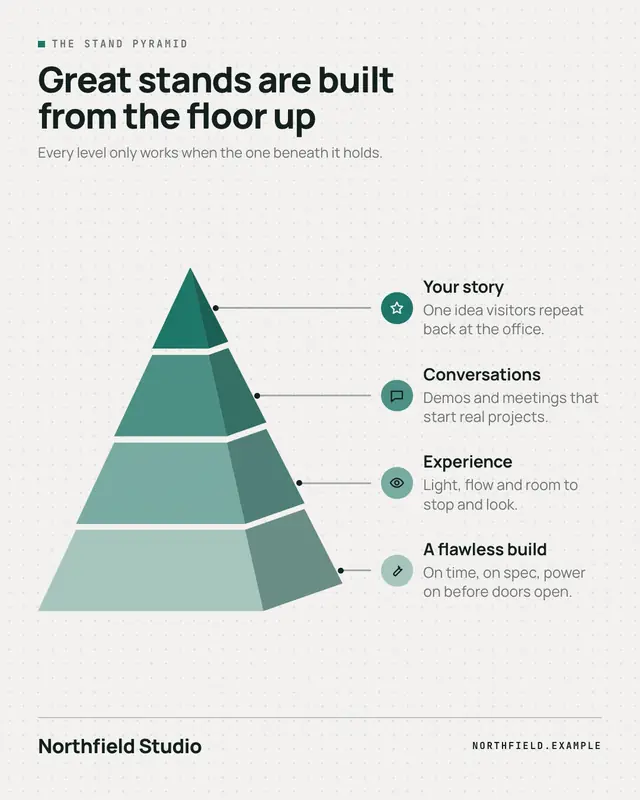
3D pyramid
A segmented 3D pyramid
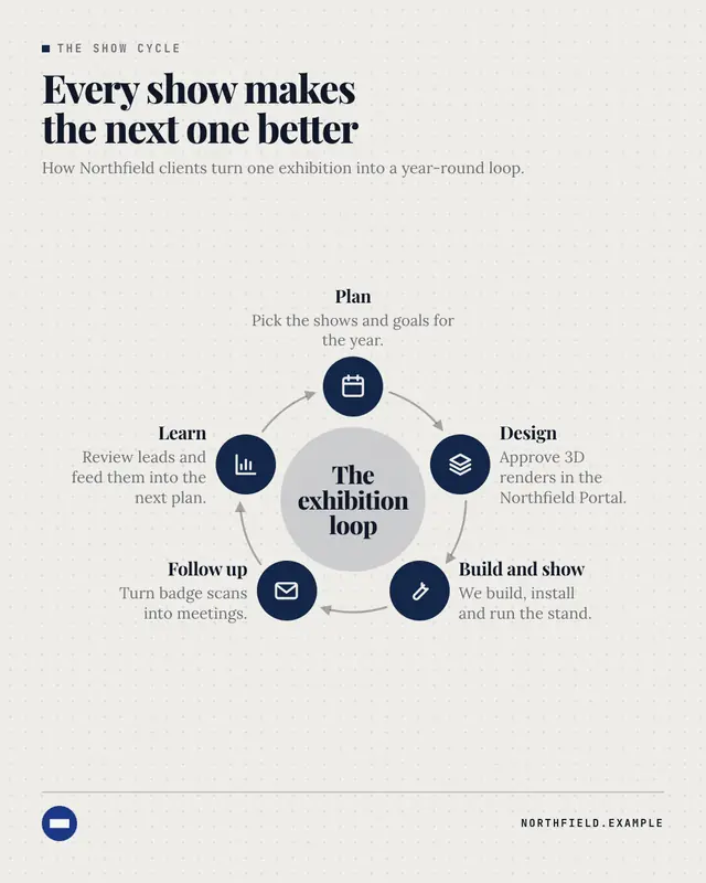
Cycle
A loop diagram: three to six brand-coloured icon nodes around a ring, joined clockwise by curved arrows, with the loop's name in a tinted centre disc and each stage's…
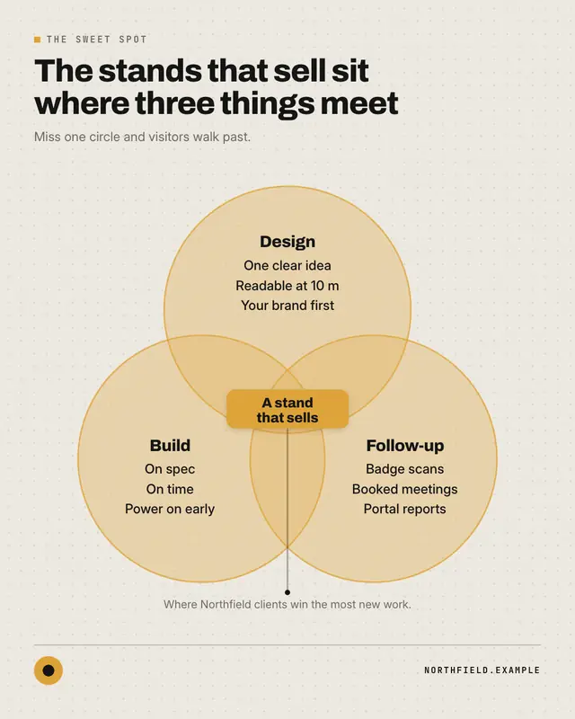
Venn diagram
Two or three overlapping translucent circles in palette tints with crisp coloured rims, each holding its name and up to three short items, and the overlap called out in…
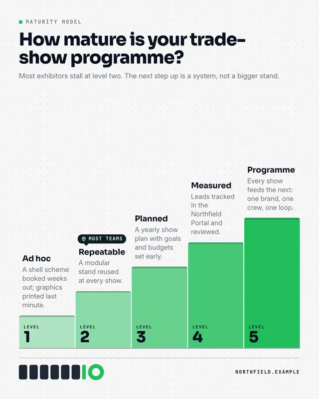
Maturity model
A staircase of three to five levels rising left to right
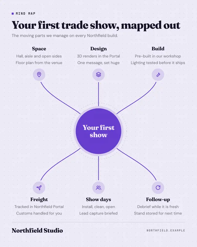
Mind map
A flat-vector mind map: the central idea in a big brand-colour circle, four to six branches sweeping out on smooth curves to tint icon nodes, each with a bold label and…
Make a Comparison matrix with your brand.
MarketiQ writes the post, picks the template that carries it best — this one, when it fits — and fills it with your logo, colours, facts and copy.