Release diff
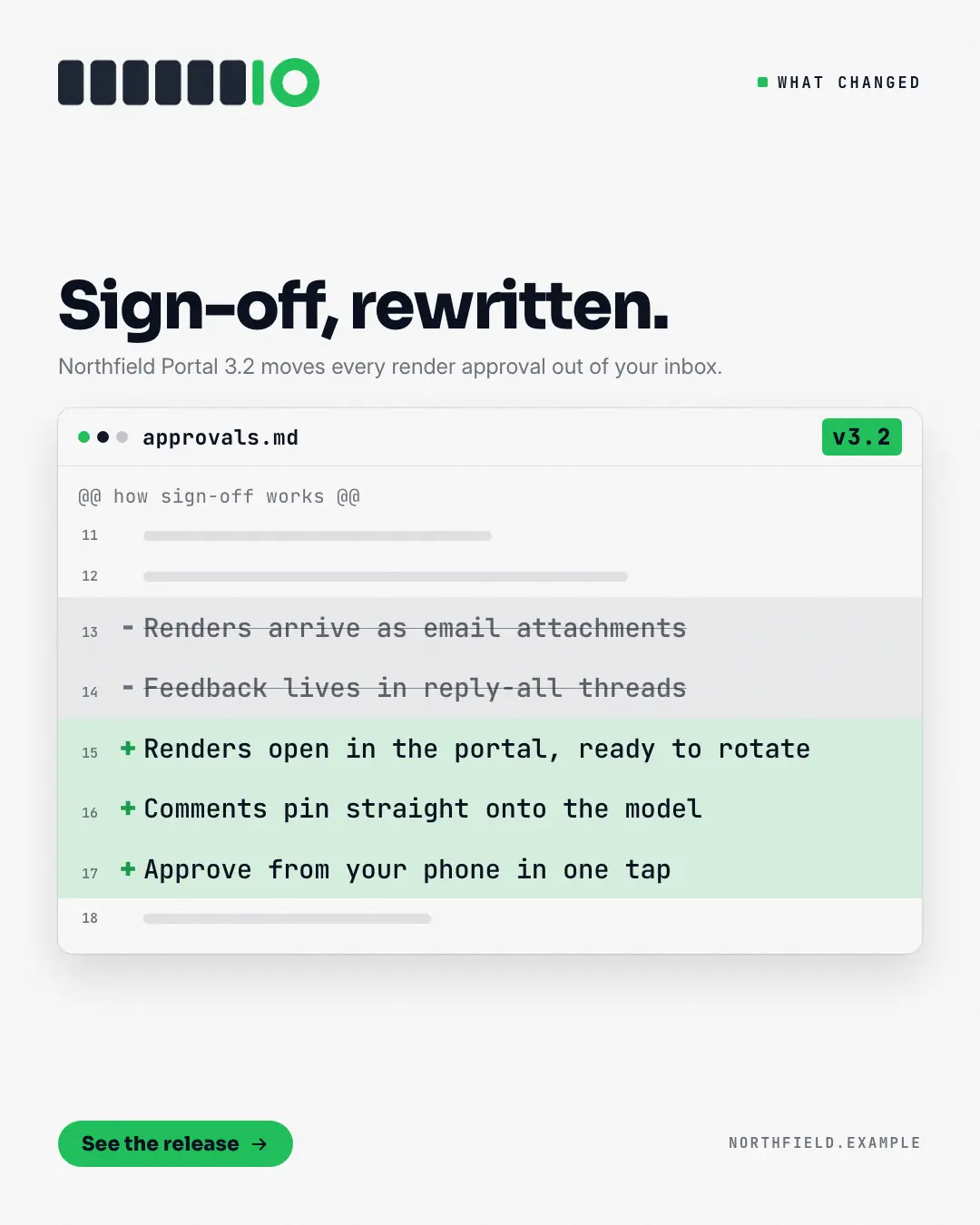
What changed, shown as a reviewed diff in a code-review window: the old behaviour on struck-out '−' lines in grey, the new behaviour on '+' lines tinted in the brand colour, a version tag in the window bar and the change named in the headline. Builders and buyers read a diff instantly — before and after, line for line.
When the AI picks it
MarketiQ’s Creative Director favours the Release diff for posts that announce news or teach, when the message is a contrast (this, not that), a side-by-side comparison or a list. It is built first to announce news.
It reads each post’s goal and shape first, then its own words, the platform and the facts you have, and offers this template only where it fits.
Who it’s for
Made for Software & apps. The Director offers it only to brands of that kind, so it never turns up for a business it does not suit.
Platforms and sizes
| Size | Where |
|---|---|
| 4:51080 × 1350 px | Instagram, Facebook, LinkedIn, Threads, Pinterest, Reddit |
| 1:11080 × 1080 px | Ads |
| 9:161080 × 1920 px | TikTok |
| 16:91600 × 900 px | X, YouTube |
| 1.91:11200 × 628 px | Newsletter, Blog |
Single image. Each size is laid out for its canvas, not cropped; the sample above is the 4:5 version.
What it needs
Only your post. It is made from your copy and your brand kit — there is nothing else to prepare.
Rules the AI follows
Word for word from the template library. The Director follows the copy rules when it writes into the template, and the visual review checks every creative against the visual rules.
Copy rules
- Removed lines describe the old behaviour, added lines the new — both from the post, in plain words.
- The version only when the post states it; never invent version numbers.
Visual rules
- A white code-review window with three window dots, a mono file name and a brand version tag in its bar; mono lines with gutter numbers — grey struck-through '−' lines above brand-tinted '+' lines.
- Headline and kicker above the window (left column on landscape); button and website below.
More Releases & roadmaps templates
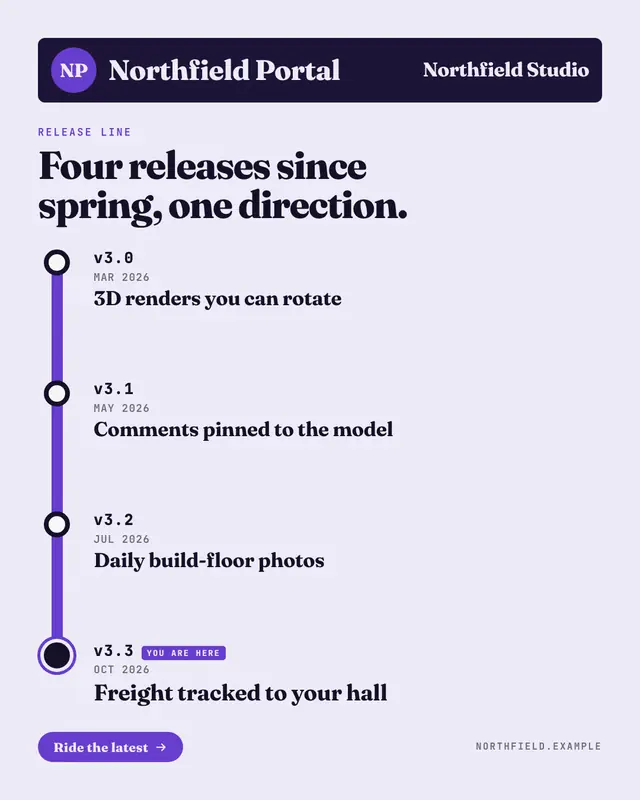
Release line
A product's releases drawn as a transit line: a station sign with a round line bullet and the product's name, then a thick brand-colour line whose stations are the…
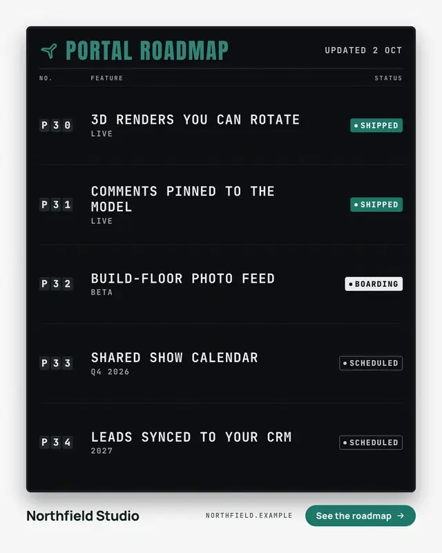
Departures board
Shipped versus planned as an airport departures board: dark split-flap code tiles, the features in white mono caps and a status chip for each
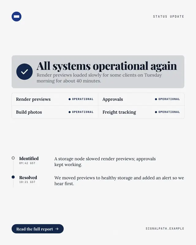
Status: resolved
An incident update in the shape of a status page: a check-mark all-clear banner, the affected components each marked operational, and the update timeline
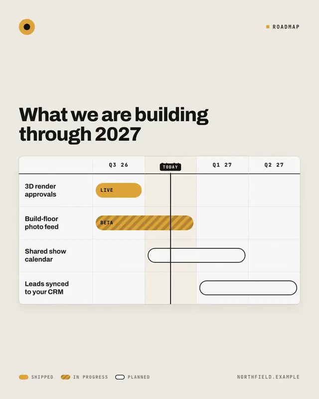
Quarter roadmap
The roadmap as the Gantt chart a product team actually plans with: workstreams down the left, the quarters across the top, a bar for each piece of work
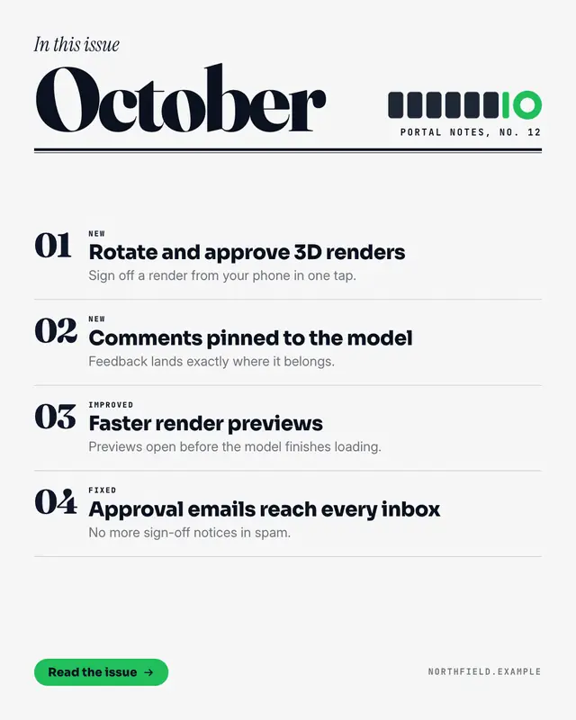
What's new magazine
A month of product updates set as a magazine's table of contents: an in-this-issue line in italic serif over the month in huge editorial type, a heavy double rule, then…
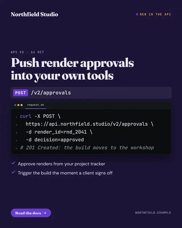
API release card
A developer release on a dark grid: the endpoint as a method chip and a mono path, the request in a code editor with line numbers and quiet highlighting, the headline…
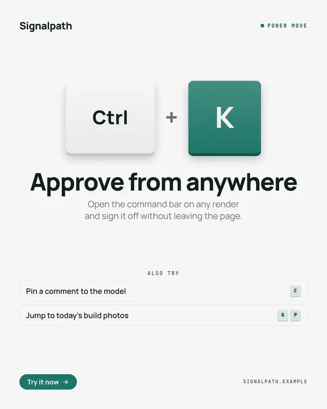
Hotkey keycaps
A power feature taught as the keys to press: two or three big chunky keycaps
We're-moving card
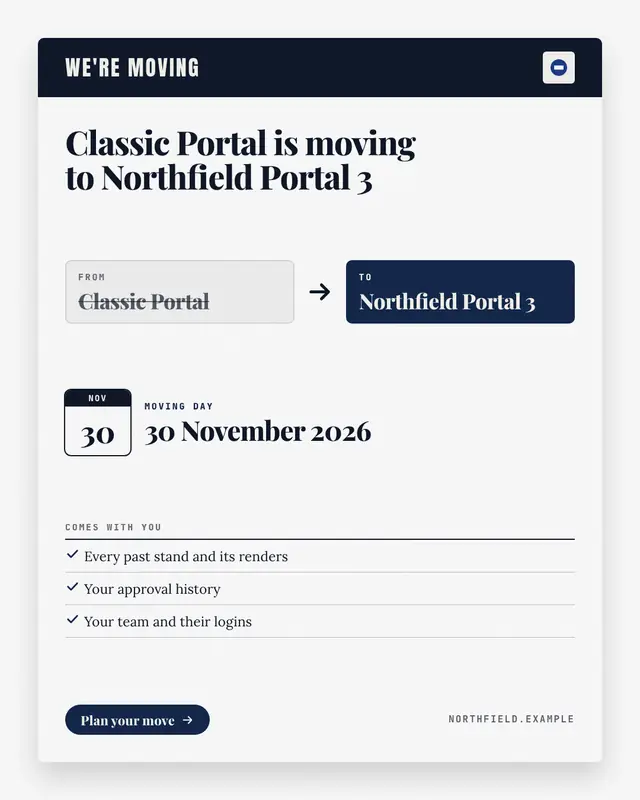
A sunset or migration notice written as a 'change of address' card: the old product or plan in a struck-through FROM box, an arrow to the new one in a brand-colour TO…
Make a Release diff with your brand.
MarketiQ writes the post, picks the template that carries it best — this one, when it fits — and fills it with your logo, colours, facts and copy.