Hotkey keycaps
A power feature taught as the keys to press: two or three big chunky keycaps — the last one lit in the brand colour — joined by plus signs, what the 'keyboard shortcut' does in a bold line, and two or three more shortcuts as small key chips. The reader can try it the moment they see it.
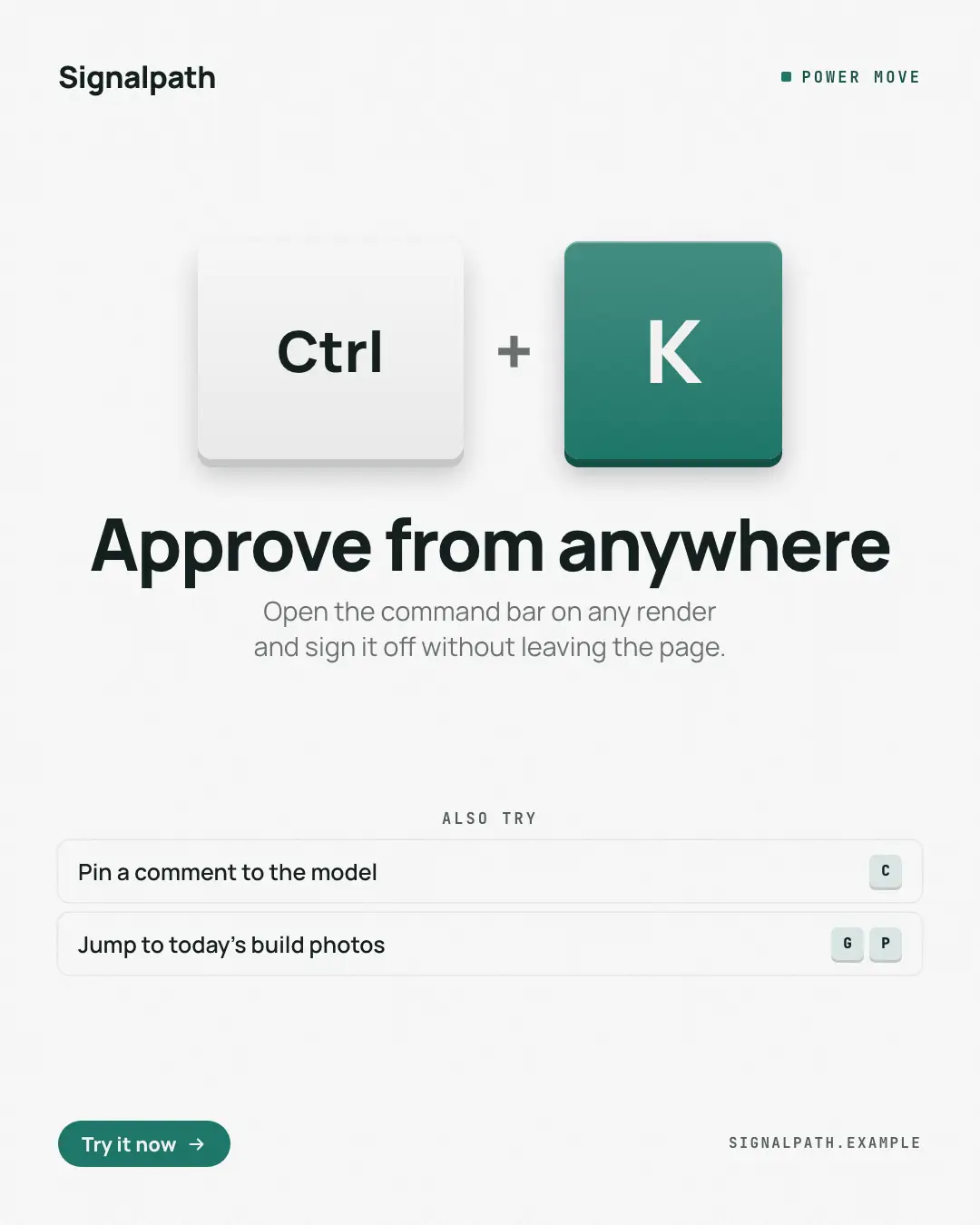
When the AI picks it
MarketiQ’s Creative Director favours the Hotkey keycaps for posts that teach, announce news or start a conversation, when the message is one sharp insight or a list. It is built first to teach.
It reads each post’s goal and shape first, then its own words, the platform and the facts you have, and offers this template only where it fits.
Who it’s for
Made for Software & apps. The Director offers it only to brands of that kind, so it never turns up for a business it does not suit.
Platforms and sizes
| Size | Where |
|---|---|
| 4:51080 × 1350 px | Instagram, Facebook, LinkedIn, Threads, Pinterest, Reddit |
| 1:11080 × 1080 px | Ads |
| 9:161080 × 1920 px | TikTok |
| 16:91600 × 900 px | X, YouTube |
| 1.91:11200 × 628 px | Newsletter, Blog |
Single image. Each size is laid out for its canvas, not cropped; the sample above is the 4:5 version.
What it needs
Only your post. It is made from your copy and your brand kit — there is nothing else to prepare.
Rules the AI follows
Word for word from the template library. The Director follows the copy rules when it writes into the template, and the visual review checks every creative against the visual rules.
Copy rules
- Keys exactly as the product uses them, from the post — never invent shortcuts.
- The headline names the action; the line under it says what happens.
Visual rules
- Two or three large rounded keycaps with a solid lower edge and soft shadow, the last one filled in the brand colour, joined by plus signs, centred on a pale brand ground.
- The action in a large centred heading-face line, a muted line under it, then white rows of more shortcuts with small tinted key chips; logo and kicker at the top, button and website at the foot.
More Releases & roadmaps templates
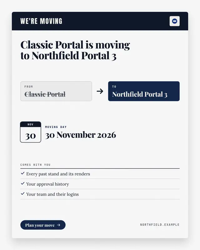
We're-moving card
A sunset or migration notice written as a 'change of address' card: the old product or plan in a struck-through FROM box, an arrow to the new one in a brand-colour TO…
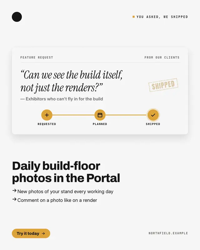
You asked, it's here
A customer-requested feature told through its request ticket: the ask quoted in italic serif, who asked, a three-stop tracker
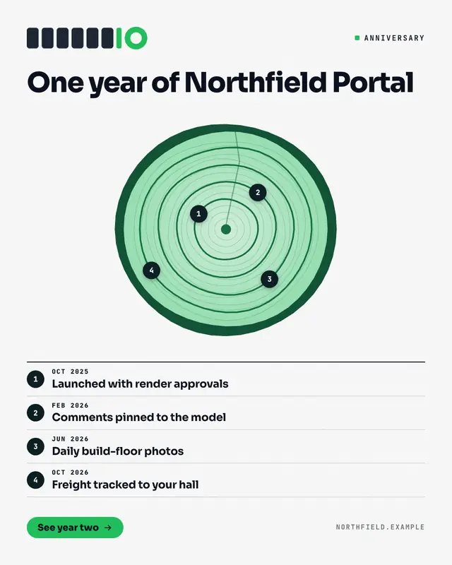
Tree-ring timeline
A product's first year drawn as the cross-section of a trunk: bark in the deep brand colour, pale wood, fine 'growth rings' and one heavier ring per milestone, each…
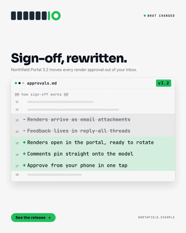
Release diff
What changed, shown as a reviewed diff in a code-review window: the old behaviour on struck-out '−' lines in grey, the new behaviour on '+' lines tinted in the brand…
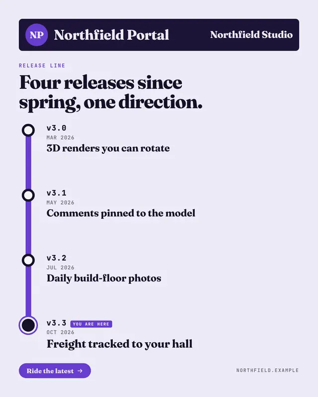
Release line
A product's releases drawn as a transit line: a station sign with a round line bullet and the product's name, then a thick brand-colour line whose stations are the…
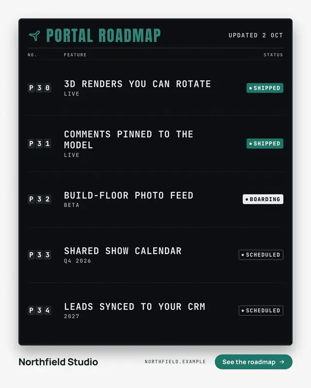
Departures board
Shipped versus planned as an airport departures board: dark split-flap code tiles, the features in white mono caps and a status chip for each
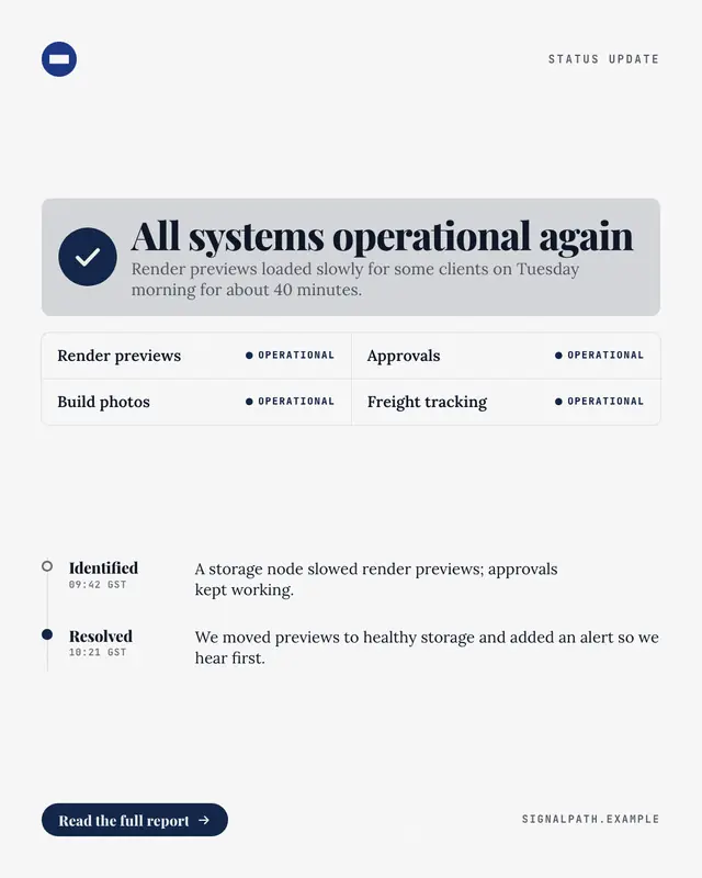
Status: resolved
An incident update in the shape of a status page: a check-mark all-clear banner, the affected components each marked operational, and the update timeline
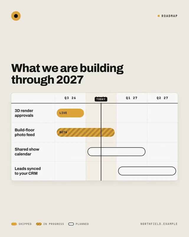
Quarter roadmap
The roadmap as the Gantt chart a product team actually plans with: workstreams down the left, the quarters across the top, a bar for each piece of work
Make a Hotkey keycaps with your brand.
MarketiQ writes the post, picks the template that carries it best — this one, when it fits — and fills it with your logo, colours, facts and copy.