App review
An app-store review card — stars, title, the customer's own words and their initials — stacked on a pile of more reviews. Social proof in the format people already trust when they choose an app.
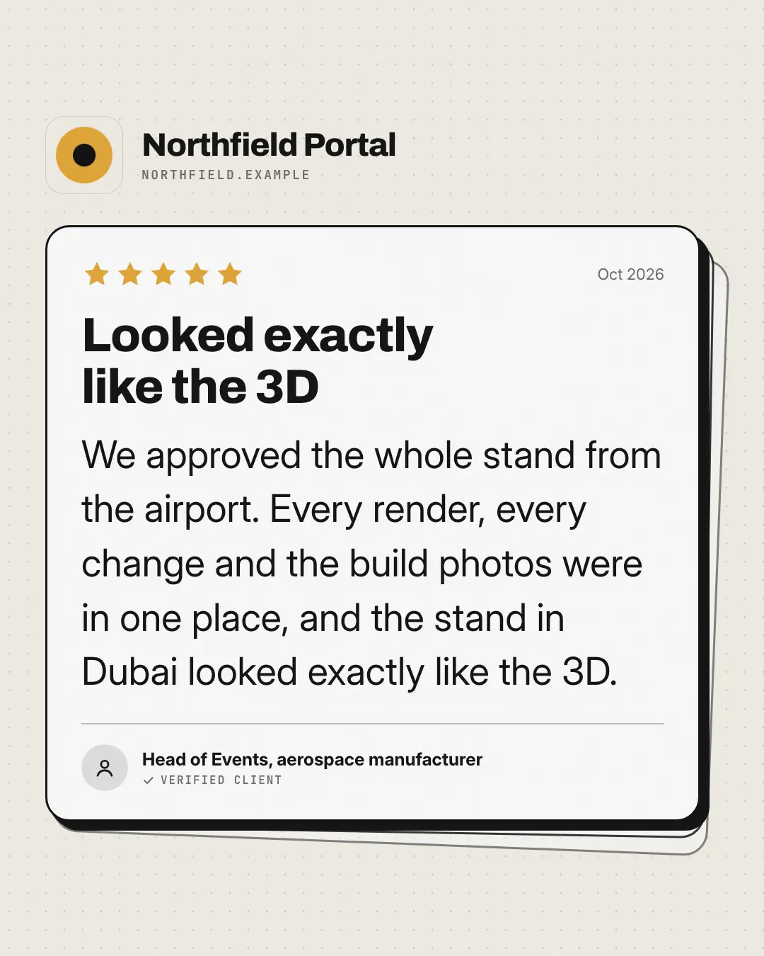
When the AI picks it
MarketiQ’s Creative Director favours the App review for posts that prove a point or get people to act, when the message is a quote or one sharp insight. It is built first to prove a point.
It reads each post’s goal and shape first, then its own words, the platform and the facts you have, and offers this template only where it fits.
Who it’s for
Made for Software & apps. The Director offers it only to brands of that kind, so it never turns up for a business it does not suit.
Platforms and sizes
| Size | Where |
|---|---|
| 4:51080 × 1350 px | Instagram, Facebook, LinkedIn, Threads, Reddit |
| 1:11080 × 1080 px | Ads |
| 9:161080 × 1920 px | TikTok |
| 2:31000 × 1500 px | |
| 16:91600 × 900 px | X, YouTube, Blog |
Single image. Each size is laid out for its canvas, not cropped; the sample above is the 4:5 version.
What it needs
The Director offers it only when these exist. Without them it simply picks another template.
- Real proof to show: a testimonial, a review or a result
Rules the AI follows
Word for word from the template library. The Director follows the copy rules when it writes into the template, and the visual review checks every creative against the visual rules.
Copy rules
- The review text, reviewer and title are verbatim from a real testimonial — never written by us.
- Stars only when the source gives a rating; the date only when the source gives one.
Visual rules
- The product's app tile and name above a white review card with an ink outline and hard shadow, two ghost cards stacked behind; brand-coloured stars, a bold title, large review text and initials for the reviewer.
More UI mimic templates
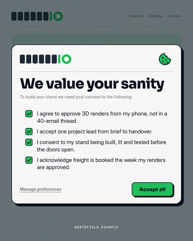
Consent modal
A cookie / terms consent pop-up over the brand's own site
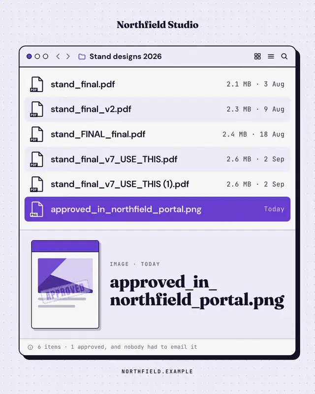
File window
A desktop file window whose file names tell the story
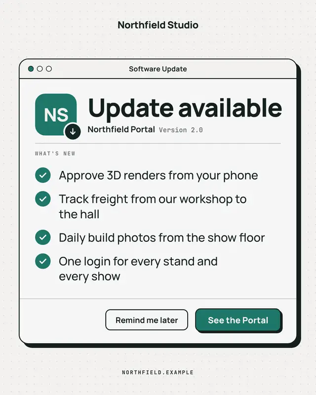
Update available
A clean, OS-agnostic software-update window: the brand as the app icon, 'Update available', a ruled What's-new list of what the offering now does and an 'Update now'…
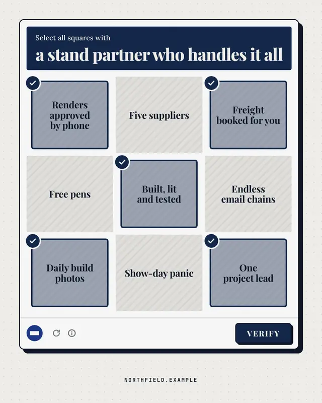
Are you human? check
A generic 'select all squares with…' verification panel: the challenge names what a good choice looks like, nine text tiles mix the brand's real strengths (ticked) with…
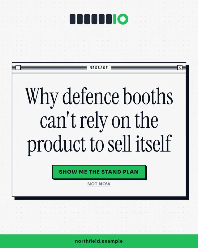
System dialog
A crisp OS alert box with the insight as the message and two buttons as the punchline
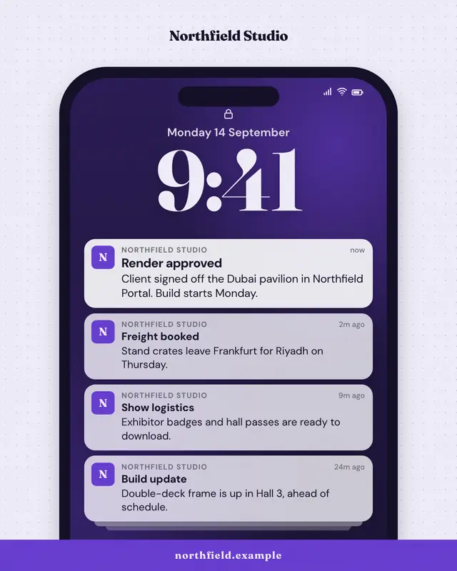
Push notification stack
A phone lock screen with a stack of notifications from the brand
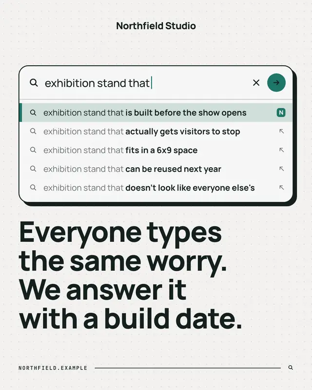
Search autocomplete
A search box mid-query with the autocomplete dropdown revealing what people really search for
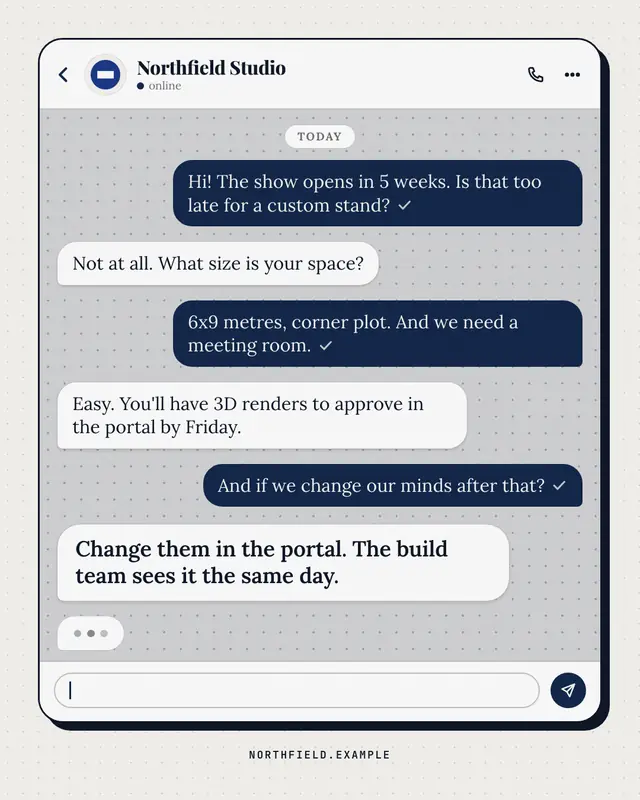
Chat thread
A generic messaging thread between a customer and the brand
Make a App review with your brand.
MarketiQ writes the post, picks the template that carries it best — this one, when it fits — and fills it with your logo, colours, facts and copy.