Anatomy of…
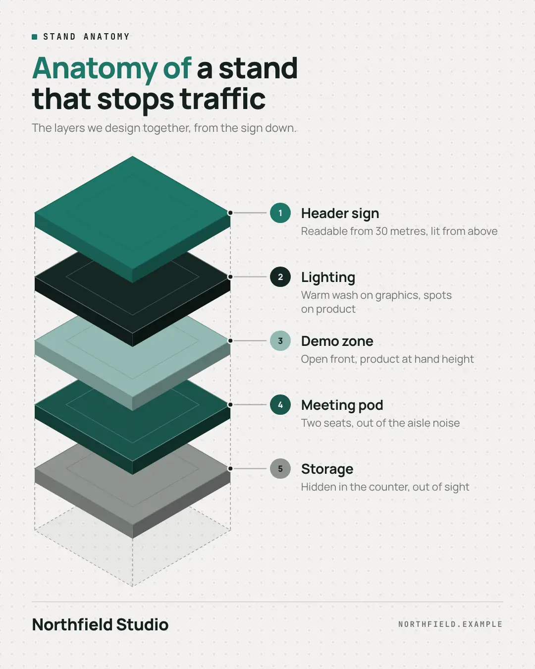
An isometric exploded view: three to six layered plates with real thickness in palette colours, floating over a dashed footprint with alignment guides, each called out by a leader line to a numbered label with a one-line description — 'Anatomy of a …' made tangible.
When the AI picks it
MarketiQ’s Creative Director favours the Anatomy of… for posts that teach, prove a point or get people to act, when the message is a list, steps or a process or one sharp insight. It is built first to teach.
It reads each post’s goal and shape first, then its own words, the platform and the facts you have, and offers this template only where it fits.
Who it’s for
Any business. Nothing in it assumes what you sell, so the Director can offer it to a software company, a café or a coaching centre alike — whenever the post fits.
Platforms and sizes
| Size | Where |
|---|---|
| 4:51080 × 1350 px | Instagram, Facebook, LinkedIn, Threads, Pinterest, Reddit |
| 1:11080 × 1080 px | Ads |
| 9:161080 × 1920 px | TikTok |
| 16:91600 × 900 px | X, YouTube |
| 1.91:11200 × 628 px | Newsletter, Blog |
Single image. Each size is laid out for its canvas, not cropped; the sample above is the 4:5 version.
What it needs
Only your post. It is made from your copy and your brand kit — there is nothing else to prepare.
Rules the AI follows
Word for word from the template library. The Director follows the copy rules when it writes into the template, and the visual review checks every creative against the visual rules.
Copy rules
- The headline names the thing being taken apart ('Anatomy of a …'); layers run top to bottom.
- Each layer is a real component the business designs or delivers, named in 1–3 words.
- The detail line says what that layer does for the customer, drawn from the copy.
Visual rules
- Isometric plates with visible thickness in palette colours, exploded apart over a dashed footprint with dashed alignment guides.
- Ink leader lines from each plate's corner to a numbered disc in that plate's colour, name and muted detail.
- Landscape sets the headline in a left column; 'Anatomy of' is picked out in the brand text colour.
More Infographics templates
Comparison matrix
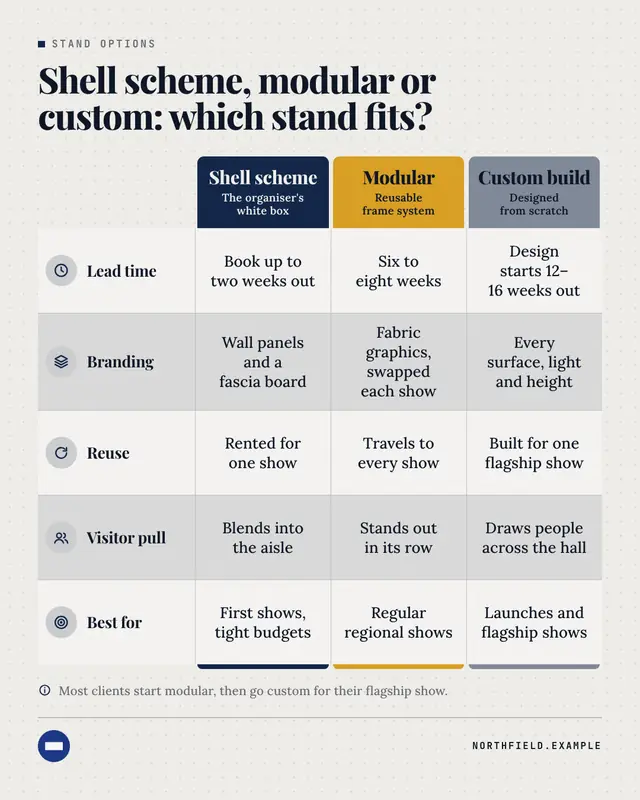
A premium comparison table: each option heads its column as a solid block in its own palette colour, criteria run down the left with tinted icons, and short phrases fill…
Timeline
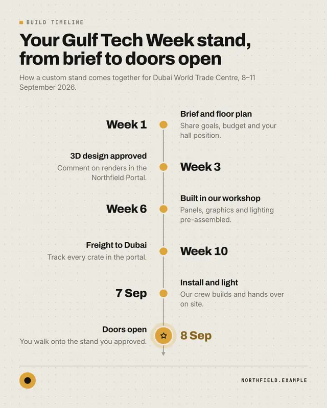
A clean milestone timeline
Process flow
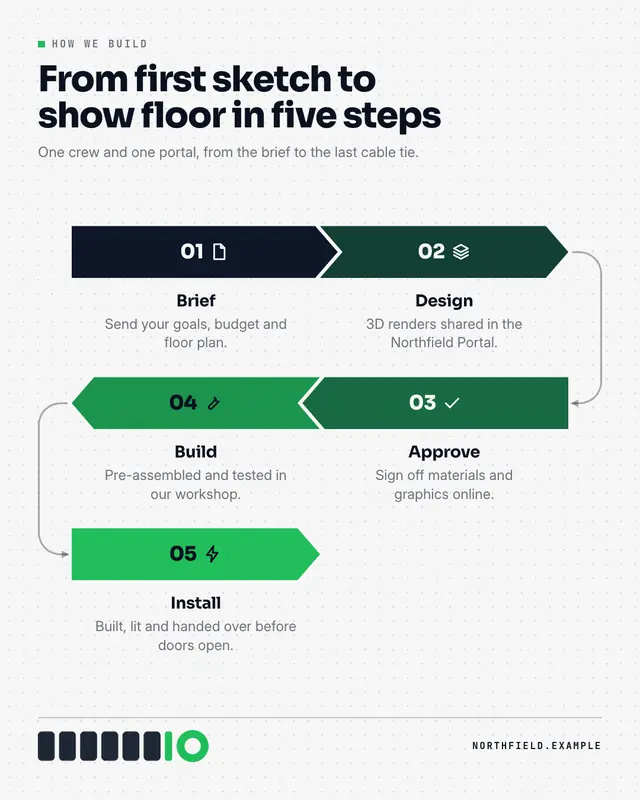
A pipeline of interlocking chevrons
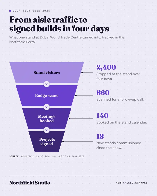
Funnel
A stacked funnel of three to five trapezoids narrowing downward and deepening in colour
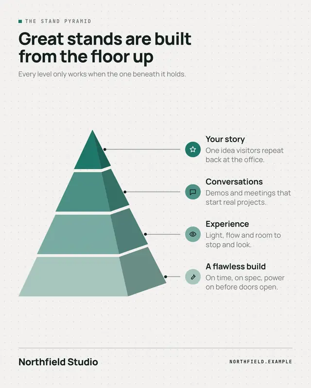
3D pyramid
A segmented 3D pyramid
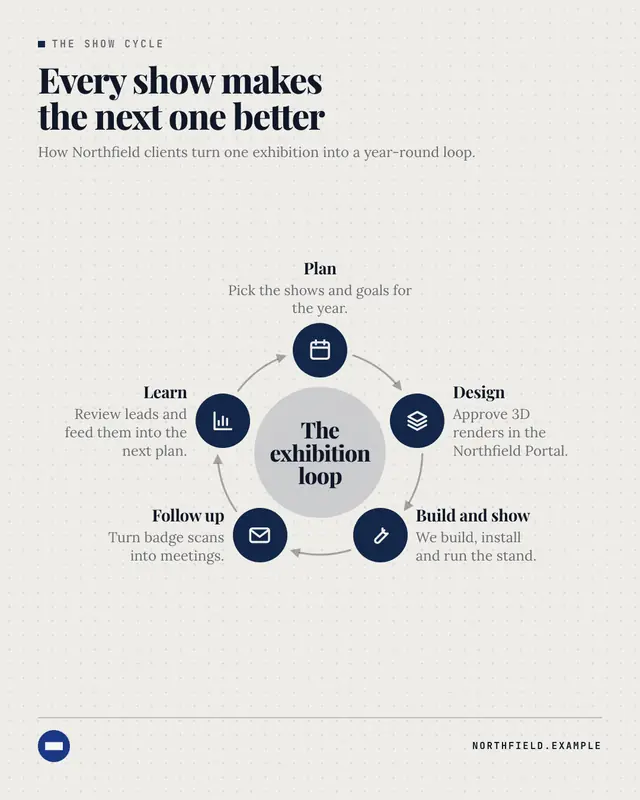
Cycle
A loop diagram: three to six brand-coloured icon nodes around a ring, joined clockwise by curved arrows, with the loop's name in a tinted centre disc and each stage's…
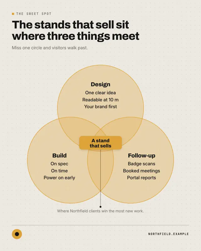
Venn diagram
Two or three overlapping translucent circles in palette tints with crisp coloured rims, each holding its name and up to three short items, and the overlap called out in…
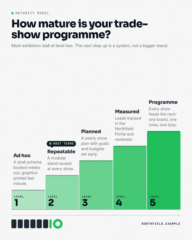
Maturity model
A staircase of three to five levels rising left to right
Make a Anatomy of… with your brand.
MarketiQ writes the post, picks the template that carries it best — this one, when it fits — and fills it with your logo, colours, facts and copy.