Mistakes and fixes ledger
The mistakes, and 'how to fix them', as a two-column ledger: every mistake struck through in a grey column, an arrow across the gutter, and its fix in bold in a brand-tinted column — numbered, row for row. The fix is the hero, so the post reads as help rather than a telling-off.
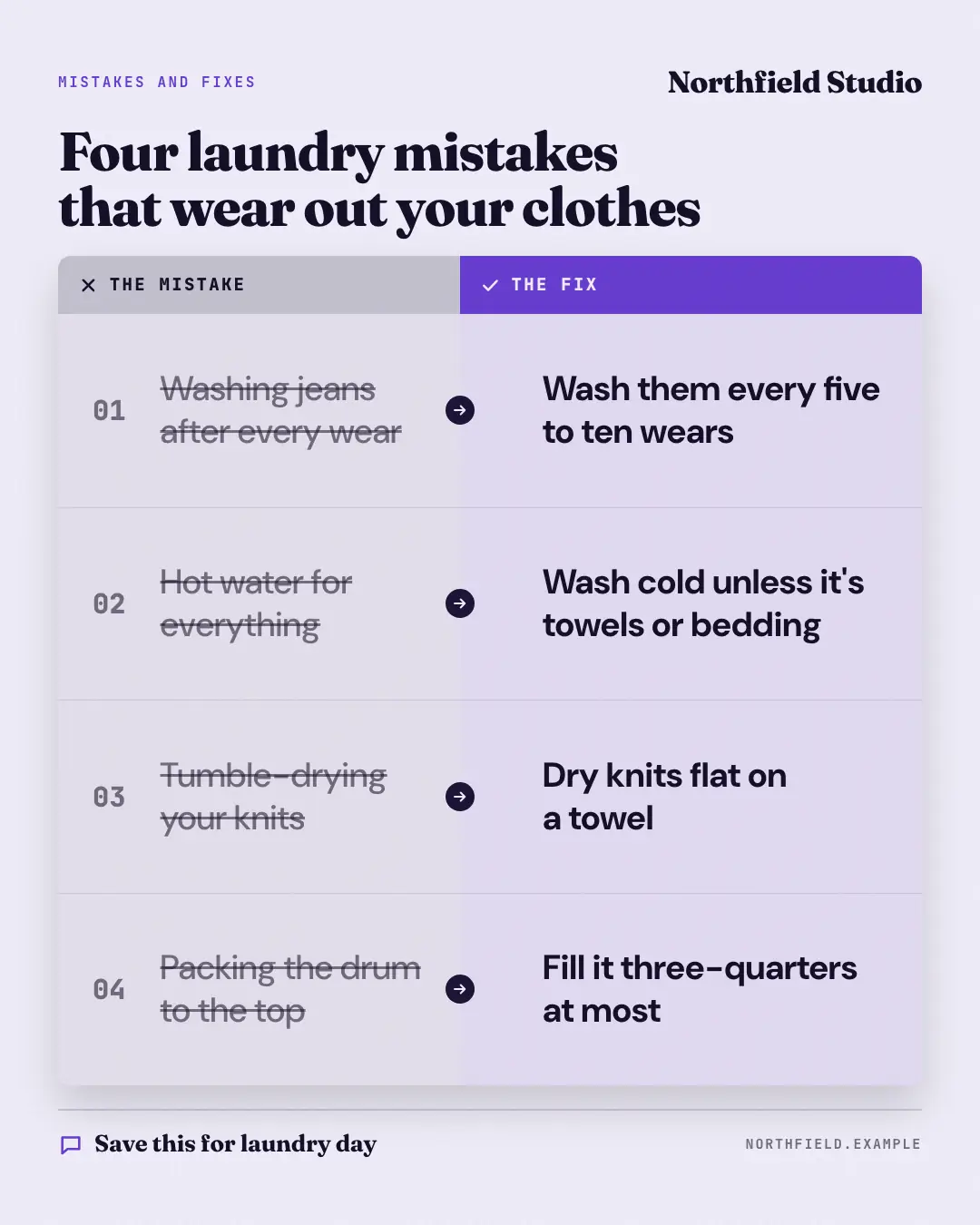
When the AI picks it
MarketiQ’s Creative Director favours the Mistakes and fixes ledger for posts that teach or start a conversation, when the message is a contrast (this, not that), a list or a side-by-side comparison. It is built first to teach.
It reads each post’s goal and shape first, then its own words, the platform and the facts you have, and offers this template only where it fits.
Who it’s for
Any business. Nothing in it assumes what you sell, so the Director can offer it to a software company, a café or a coaching centre alike — whenever the post fits.
Platforms and sizes
| Size | Where |
|---|---|
| 4:51080 × 1350 px | Instagram, Facebook, LinkedIn, Threads, Reddit |
| 1:11080 × 1080 px | Ads |
| 9:161080 × 1920 px | TikTok |
| 2:31000 × 1500 px | |
| 1.91:11200 × 628 px | Newsletter, Blog |
| 16:91600 × 900 px | X, YouTube |
Single image. Each size is laid out for its canvas, not cropped; the sample above is the 4:5 version.
What it needs
Only your post. It is made from your copy and your brand kit — there is nothing else to prepare.
Rules the AI follows
Word for word from the template library. The Director follows the copy rules when it writes into the template, and the visual review checks every creative against the visual rules.
Copy rules
- Every label is the post's own idea in a few words; diagrams carry no number, name or result the post does not.
- Mistakes are what people do, not who does them; every fix is a concrete action.
Visual rules
- A rounded two-column ledger: a grey header with a cross over the struck-through mistakes on a light grey column, a brand header with a tick over the bold fixes on a pale brand column, a dark round arrow on each row's gutter, mono row numbers.
- Kicker, logo and headline on top; the website (and call to action) in the foot.
More Playbooks & explainers templates
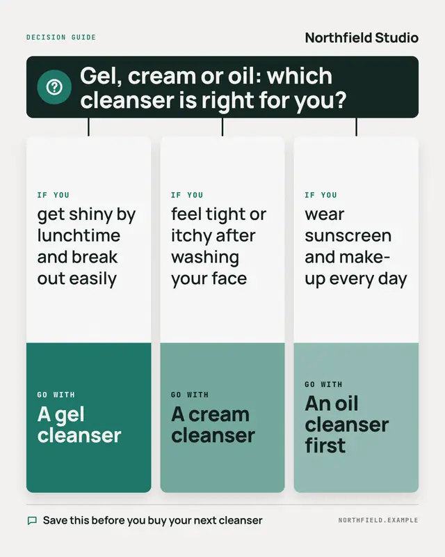
Decision guide
A 'decision guide': the question in a dark banner, a stem down to one card per option
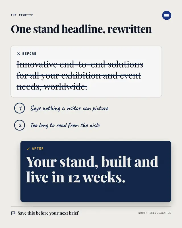
Annotated rewrite
A before-and-after rewrite, marked up like an editor would: the original line struck through on a white card, numbered handwritten notes on what was wrong, and the…
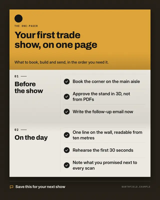
Tri-fold one-pager
The post's guide as an open tri-fold leaflet on a dark desk: a brand-coloured cover panel with the logo, the guide's name and its promise, then two paper panels
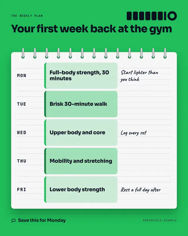
Weekly planner
'Steal my week': the post's routine or plan written into a spiral-bound planner page on the brand's colour
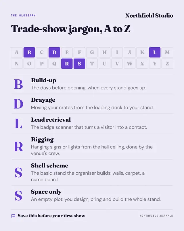
A–Z glossary
'Explain like I'm new' as an A–Z: a strip of the alphabet where only the letters the post's terms start with are lit in the brand colour, then the terms in alphabetical…
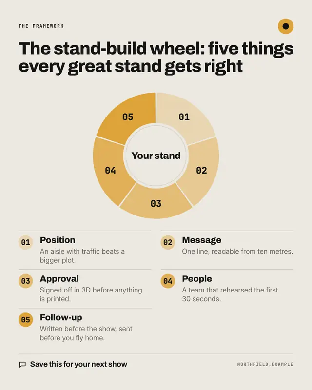
Framework wheel
A named framework drawn as a segmented wheel: one ring segment per part in a pale-to-brand ramp, numbered, around a hub that can hold the framework's core
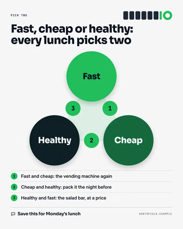
Trade-off triangle
The classic 'pick two' triangle: three things the reader wants at the corners as big filled circles, a dashed triangle between them, numbered markers on each side and a…
Compass framework
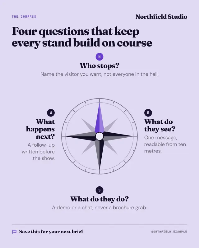
A four-part framework set on a compass rose: the four ideas the post names sit at north, east, south and west with direction badges, north in the brand colour, around a…
Make a Mistakes and fixes ledger with your brand.
MarketiQ writes the post, picks the template that carries it best — this one, when it fits — and fills it with your logo, colours, facts and copy.