Code review
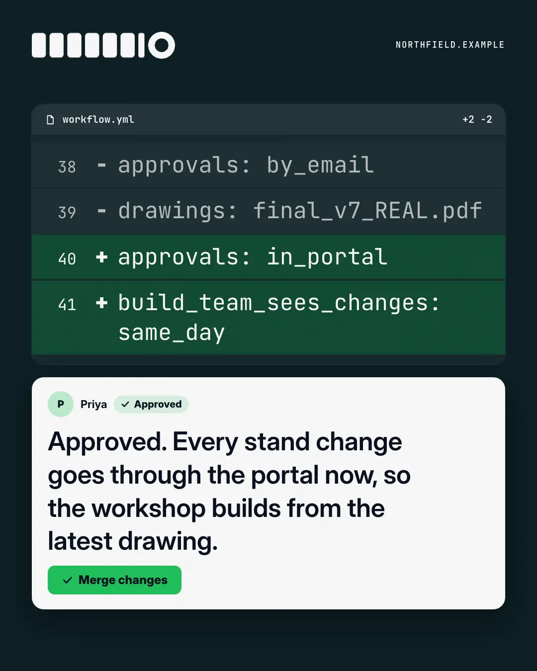
A dark 'pull request' diff — old lines out, new lines in, tinted in the brand colour — with a reviewer's approval and a Merge button: the change from the old way to the new, reviewed and shipped the way engineering teams ship.
When the AI picks it
MarketiQ’s Creative Director favours the Code review for posts that teach, announce news or entertain, when the message is a contrast (this, not that), a side-by-side comparison or one sharp insight. It is built first to teach.
It reads each post’s goal and shape first, then its own words, the platform and the facts you have, and offers this template only where it fits.
Who it’s for
Made for Sells to businesses. The Director offers it only to brands of that kind, so it never turns up for a business it does not suit.
Platforms and sizes
| Size | Where |
|---|---|
| 4:51080 × 1350 px | Instagram, Facebook, LinkedIn, Threads, Pinterest, Reddit |
| 1:11080 × 1080 px | Ads |
| 9:161080 × 1920 px | TikTok |
| 16:91600 × 900 px | X, YouTube |
| 1.91:11200 × 628 px | Newsletter, Blog |
Single image. Each size is laid out for its canvas, not cropped; the sample above is the 4:5 version.
What it needs
Only your post. It is made from your copy and your brand kit — there is nothing else to prepare.
Rules the AI follows
Word for word from the template library. The Director follows the copy rules when it writes into the template, and the visual review checks every creative against the visual rules.
Copy rules
- Diff lines are short and readable to non-engineers (plain words with underscores or colons), old way out, new way in, all from the copy.
- The comment states the post's point in plain language; no invented metrics.
Visual rules
- On a night ground: a dark code panel with a file bar and mono diff lines — grey minus lines, brand-tinted plus lines, small line numbers; a long line wraps after an underscore, never inside a word.
- A white review card with initials, an 'Approved' chip, the comment and a brand Merge button; stacked on portrait, side by side on landscape; logo top-left.
More Work apps templates
Terminal
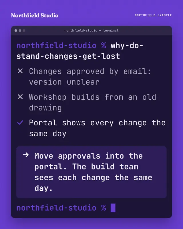
A terminal window on the brand ground: someone types a blunt question as a command, the output ticks through what is and isn't working, and the highlighted last line…
Command palette
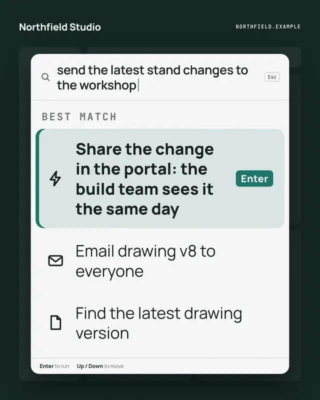
A keyboard command palette over a dimmed app: the reader's intent typed in the search line, and the brand's way to do it as the highlighted first command, one Enter away
Out-of-office autoreply
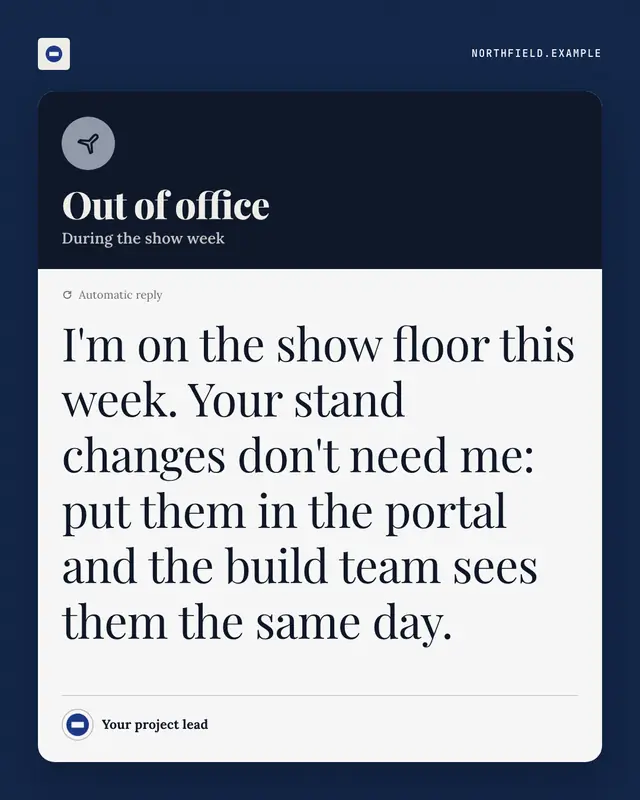
An automatic out-of-office reply
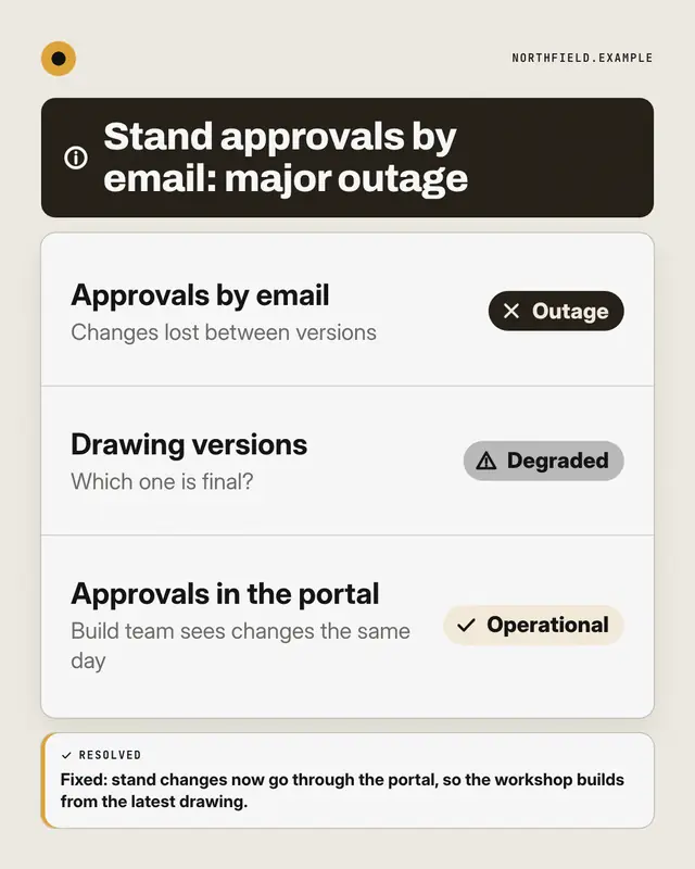
Status page
A public system-status page for the reader's way of working: components listed with Operational, Degraded or Outage pills
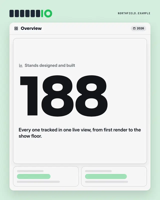
Dashboard KPI tile
An analytics dashboard where one tile is lit: the label, one real number from the post set huge in the brand colour, its change and a line of context
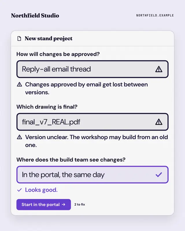
Form validation
A form that won't submit: the reader's old habits typed into its fields, each flagged with an error message, and the brand's way passing with a tick above the submit…
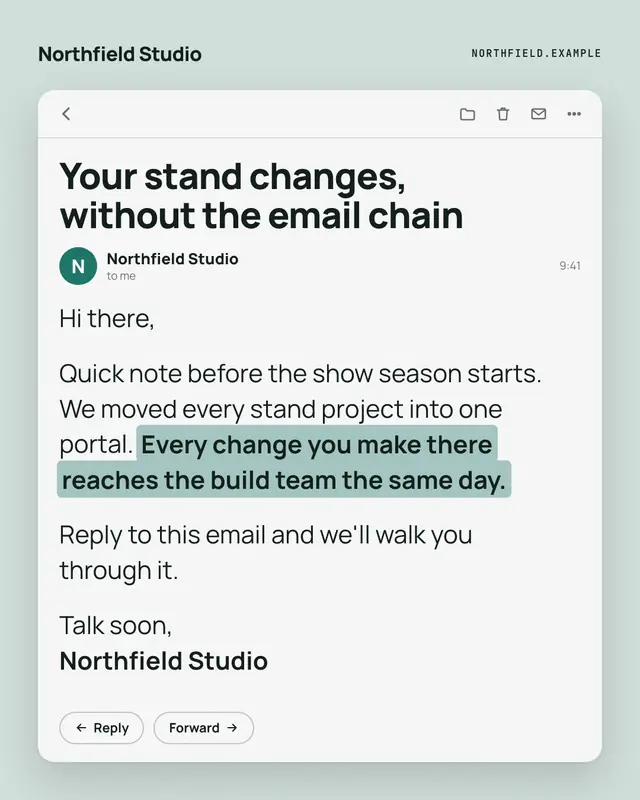
Opened email
An opened email from the brand
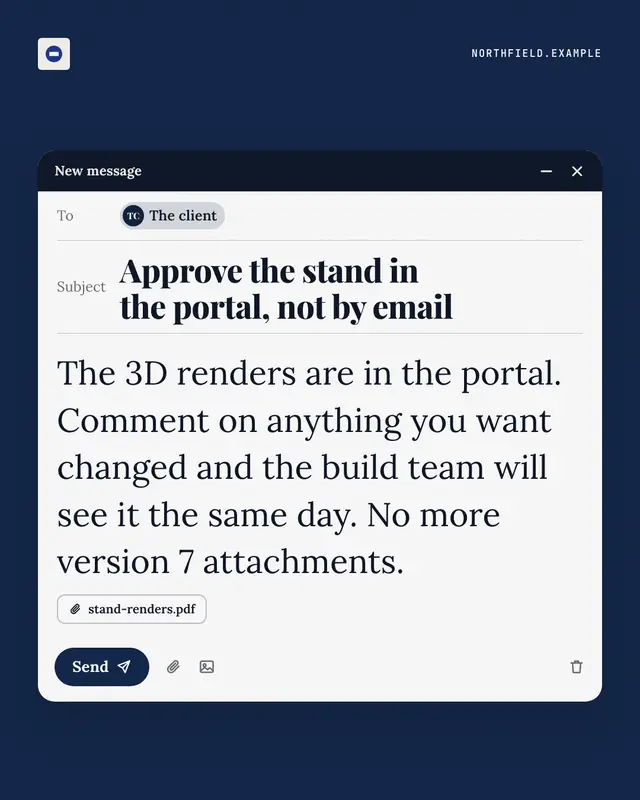
Unsent email
A compose window caught just before sending
Make a Code review with your brand.
MarketiQ writes the post, picks the template that carries it best — this one, when it fits — and fills it with your logo, colours, facts and copy.