Dashboard KPI tile
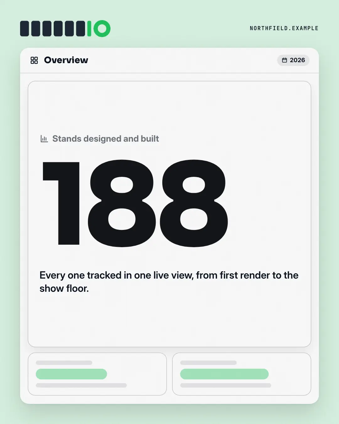
An analytics dashboard where one tile is lit: the label, one real number from the post set huge in the brand colour, its change and a line of context — the other tiles stay as quiet placeholders, so the single metric reads as the one that matters this week.
When the AI picks it
MarketiQ’s Creative Director favours the Dashboard KPI tile for posts that prove a point or announce news, when the message is a number or one sharp insight. It is built first to prove a point.
It reads each post’s goal and shape first, then its own words, the platform and the facts you have, and offers this template only where it fits.
Who it’s for
Any business. Nothing in it assumes what you sell, so the Director can offer it to a software company, a café or a coaching centre alike — whenever the post fits.
Platforms and sizes
| Size | Where |
|---|---|
| 4:51080 × 1350 px | Instagram, Facebook, LinkedIn, Threads, Pinterest, Reddit |
| 1:11080 × 1080 px | Ads |
| 9:161080 × 1920 px | TikTok |
| 16:91600 × 900 px | X, YouTube |
| 1.91:11200 × 628 px | Newsletter, Blog |
Single image. Each size is laid out for its canvas, not cropped; the sample above is the 4:5 version.
What it needs
The Director offers it only when these exist. Without them it simply picks another template.
- A real number from your post or your brand facts
Rules the AI follows
Word for word from the template library. The Director follows the copy rules when it writes into the template, and the visual review checks every creative against the visual rules.
Copy rules
- The number is quoted exactly from the copy or brand facts; the label says what it counts, the period only what the copy says.
- Leave the change empty unless the copy states it; no extra figures anywhere.
Visual rules
- A white dashboard window on a pale brand ground: a bar with the dashboard name and a period chip, one large tile with a chart icon, the label, the number set huge in the brand colour, an optional change pill and context.
- Two quiet placeholder tiles with grey bars and no figures; logo top-left.
More Work apps templates
Form validation
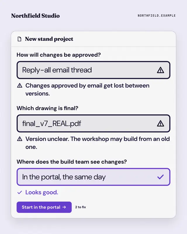
A form that won't submit: the reader's old habits typed into its fields, each flagged with an error message, and the brand's way passing with a tick above the submit…
Opened email
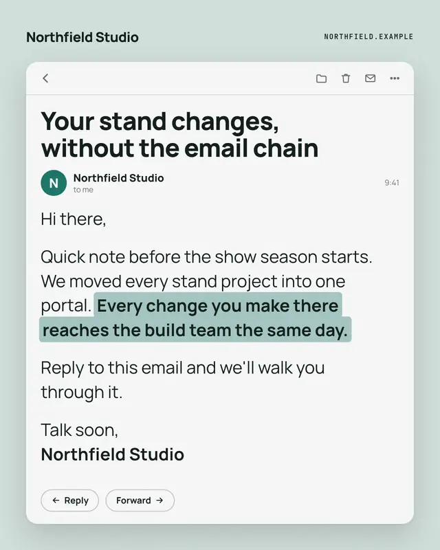
An opened email from the brand
Unsent email
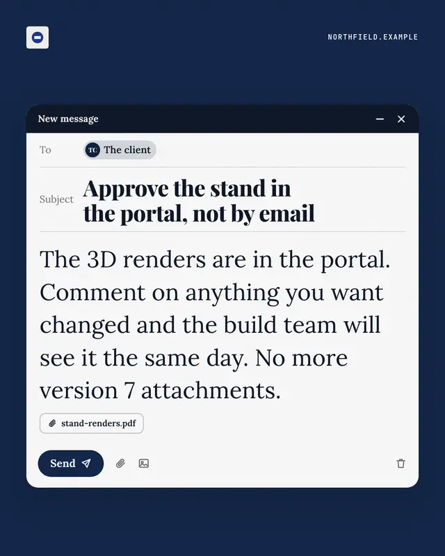
A compose window caught just before sending
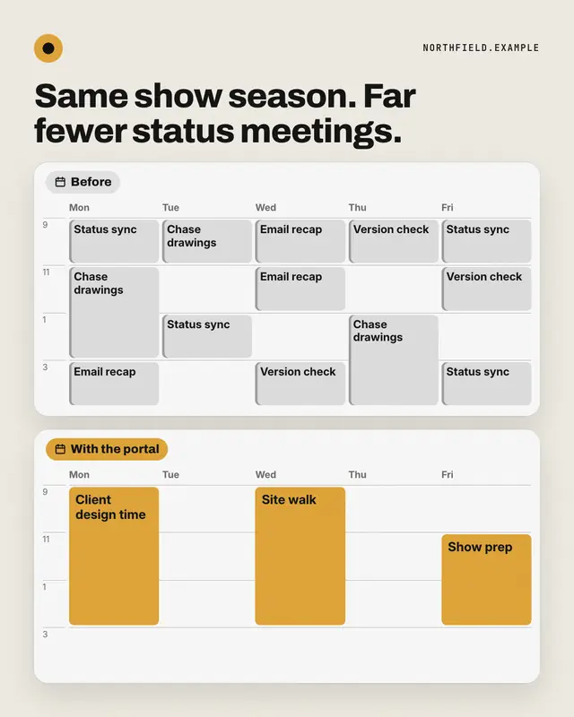
Week before / after
Two weeks in calendar view: before, every day packed with grey status meetings, errands and busywork; after, the same week opened up with a few long brand-coloured…
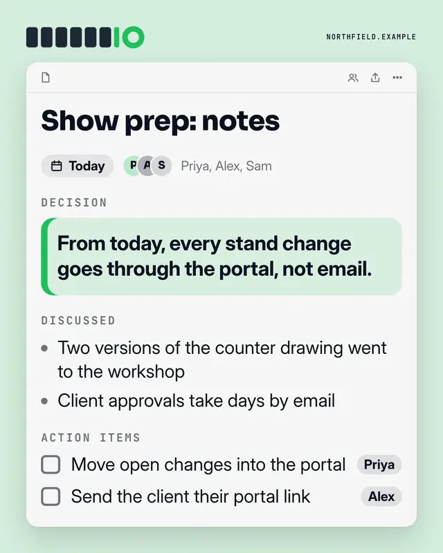
Meeting notes
A shared notes doc from a meeting
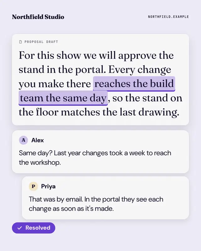
Shared doc, resolved
A shared document with one phrase highlighted and a comment thread beside it: a teammate's doubt, the answer, and a brand 'Resolved' tick.
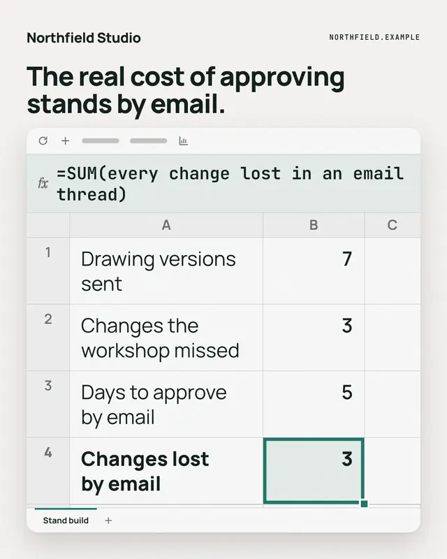
Spreadsheet formula
A spreadsheet with a few rows of the reader's reality, one cell selected in the brand colour
Kanban board
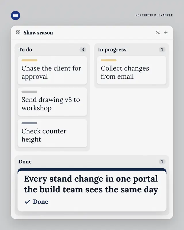
A three-column task board
Make a Dashboard KPI tile with your brand.
MarketiQ writes the post, picks the template that carries it best — this one, when it fits — and fills it with your logo, colours, facts and copy.